Basic Dashboard using Streamlit and Matplotlib
Streamlit is an open-source python library that lets us create a dashboard by integrating charts created by other python libraries like matplotlib, plotly, bokeh, Altair, etc. It even provided extensive supports for interactive widgets like dropdowns, multi-selects, radio buttons, checkboxes, sliders, etc. It takes very few lines of code to create a dashboard using streamlit. The API of streamlit is very easy to use and pythonic. As a part of this tutorial, we'll explain how to create a simple dashboard using streamlit by integrating charts created in matplotlib. We'll be adding interactions to charts which will let us modify charts to explore different relationships.
We have already covered one more tutorial where we explain how to create a basic dashboard using streamlit and plotly.
We expect that readers have basic knowledge of matplotlib and how to create charts using it to follow along in this tutorial. We'll also be skipping definitions of some of the streamlit functions which we have already covered in the tutorial whose link is given above. We recommend that readers go through that tutorial as well.
We'll be creating charts from pandas’ data frame directly. It'll create charts using matplotlib internally and will also require fewer lines of code to create charts.
Important Sections
- Load Dataset
- Create Individual Charts
- Scatter Plot
- Side by Side Grouped Bar Chart
- Histogram
- Hexbin Chart
- Widgets and Layout Information
- Putting it All Together
We'll start by importing the necessary libraries for our tutorial.
import streamlit as st

import pandas as pd
import numpy as np

import matplotlib.pyplot as plt

from sklearn import datasets

pd.set_option("display.max_columns", 50)
Load Dataset 
We'll be using the breast cancer dataset available from scikit-learn. The dataset has various measures of tumor like radius, texture, perimeter, area, smoothness, etc. The dataset also has a type of tumor available which is either malignant or benign. Dataset has 569 rows where 357 are for malignant tumors and 212 are for benign tumors.
Below we have loaded the dataset into pandas dataframe. We'll be using this dataframe for plotting charts to create our dashboard.
breast_cancer = datasets.load_breast_cancer(as_frame=True)

breast_cancer_df = pd.concat((breast_cancer["data"], breast_cancer["target"]), axis=1)

breast_cancer_df["target"] = [breast_cancer.target_names[val] for val in breast_cancer_df["target"]]

breast_cancer_df.head()
Individual Charts 
In this section, we'll explain the charts that we'll be including in our dashboard separately for explanation purposes.
- Scatter Plot showing the relationship between measurements color encoded by tumor type.
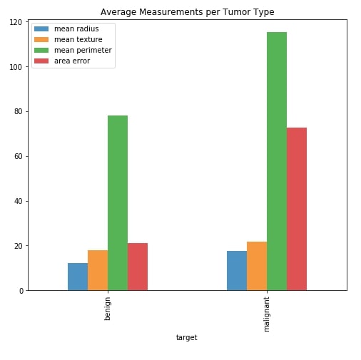
- Side by Side Bar Chart showing average measurements per tumor type.
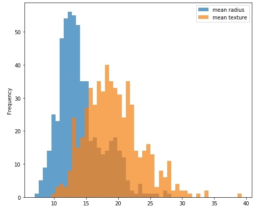
- Histogram showing the distribution of measurements.
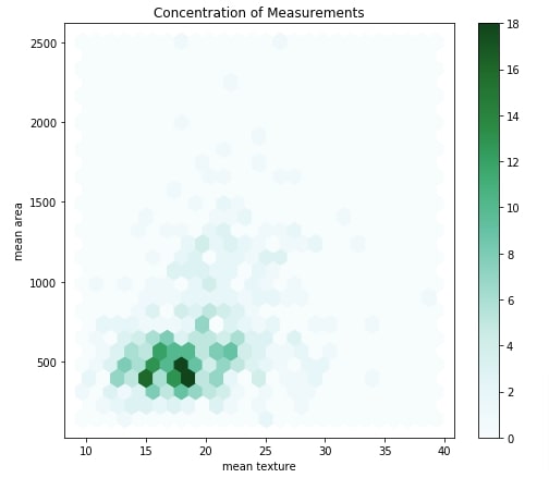
- Hexbin Chart showing the density of relationship between two measurements.
Scatter Plot
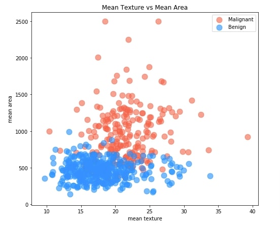
The scatter plot shows relationship between two measurements where each point of scatter point is colored to represent tumor type (malignant or benign). This can help us understand how measurements are varying across two tumor types.
By default, we'll be showing a relationship between measurements mean texture and mean area. When we include this chart in the dashboard, we'll be linking X and Y axes to dropdowns where each dropdown will have a list of all measurements. By selecting different values in dropdowns, we'll be able to explore the relationship between different combinations of measurements.
Our code for creating a scatter chart starts by creating a figure object. We have created an axis object using a figure object on which we'll be drawing a scatter chart. Then We have divided our original dataframe into two dataframe where one has an entry for malignant tumors and one has an entry for benign tumors. We have then created a scatter plot first using malignant tumors dataframe and then using benign tumor dataframe. We have created a chart directly by calling .plot.scatter() method on pandas dataframe. This method internally creates a plot using matplotlib and reduces the number of lines of code that we need to write if we do it using matplotlib directly. We have colored malignant tumor points with tomato color and benign tumor points with dodgerblue color. We have provided axis object that we created at the beginning to both functions calls so that both creates chart on the same axis.
scatter_fig = plt.figure(figsize=(8,7))

scatter_ax = scatter_fig.add_subplot(111)

malignant_df = breast_cancer_df[breast_cancer_df["target"] == "malignant"]
benign_df = breast_cancer_df[breast_cancer_df["target"] == "benign"]

malignant_df.plot.scatter(x="mean texture", y="mean area", s=120, c="tomato", alpha=0.6, ax=scatter_ax, label="Malignant")
benign_df.plot.scatter(x="mean texture", y="mean area", s=120, c="dodgerblue", alpha=0.6, ax=scatter_ax,
                       title="Mean Texture vs Mean Area", label="Benign");
Side by Side Bar Chart
For creating a side-by-side bar chart showing the value of the average measurements per tumor type, we have created an intermediate dataframe. The intermediate dataframe is created by grouping our original breast cancer dataframe based on tumor type and then taking an average of measurements for each group. Below we have printed an intermediate dataframe that has information about the average value for each measurement per tumor type.
avg_breast_cancer_df = breast_cancer_df.groupby("target").mean()

avg_breast_cancer_df
Below we have created a side-by-side bar chart which shows an average of measurements mean radius, mean texture, mean perimeter, and area error per cancer tumor type. By default, these four values will be displayed in the dashboard.
We'll be creating a multi-select which will include a list of all measurements in it. The chart will include average measurements which are selected in the multi-select widget.
Our code starts by creating a figure and axis objects. It then filters our average measurements dataframe which we created in the previous cell to include information about four measurements we mentioned earlier. The chart is created using this dataframe by calling .plot.bar() method on it.
bar_fig = plt.figure(figsize=(8,7))

bar_ax = bar_fig.add_subplot(111)

sub_avg_breast_cancer_df = avg_breast_cancer_df[["mean radius", "mean texture", "mean perimeter", "area error"]]

sub_avg_breast_cancer_df.plot.bar(alpha=0.8, ax=bar_ax, title="Average Measurements per Tumor Type");
Histogram
The histogram shows the distribution of measurements values. This can be useful to analyze how values of measurements are spread.
By default, we'll be displaying a histogram of mean radius and mean texture. We'll be creating a multi-select with a list of all measurements in the dashboard. We'll link this multi-select with this histogram so that histogram of all selected measurements in multi-select is included in the chart.
Our code starts by creating a figure and an axis object. We then create a dataframe that has an entry for only mean radius and mean texture. The histogram is created by calling .plot.hist() method on this dataframe.
hist_fig = plt.figure(figsize=(8,7))

hist_ax = hist_fig.add_subplot(111)

sub_breast_cancer_df = breast_cancer_df[["mean radius", "mean texture"]]

sub_breast_cancer_df.plot.hist(bins=50, alpha=0.7, ax=hist_ax, title="Average Measurements per Tumor Type");
Hexbin Chart
The hexbin chart is useful to show a relationship between two attributes explaining the density of samples. The chart has hexagons in it where the color of a hexagon is based on a number of data samples that fall in that hexagon. The darker hexagon represents the presence of more points in it.
By default, we'll be creating a hexbin chart of mean texture and mean area. We'll be creating two dropdowns in our dashboard and link them with a hexbin chart. Both dropdowns will have a list of measurements of cancer tumor type. We can try different combinations of these measurements using dropdowns to analyze data using a hexbin chart.
Our code for this example starts by creating a figure and axis objects. It then creates hexbin by calling .plot.hexbin() method on our original breast cancer dataframe. We have provided mean texture to be used for the x-axis and mean area to be used for the y-axis.
hexbin_fig = plt.figure(figsize=(8,7))

hexbin_ax = hexbin_fig.add_subplot(111)

breast_cancer_df.plot.hexbin(x="mean texture", y="mean area",
                             reduce_C_function=np.mean,
                             gridsize=25,
                             #cmap="Greens",
                             ax=hexbin_ax,
                             title="Concentration of Measurements"
                            );
Widgets and Layout Information 
In this section, we'll briefly explain the widgets and containers that we'll be using in our dashboard. We'll be using widgets to update charts and explore different relationships.
- Markdown - We'll be using markdown for adding heading above the dashboard and above widgets. Markdown is a simple language used for text decoration. Guide for Markdown
- Dropdowns for Scatter Chart - We'll create two dropdowns each having a list of measurements as options. We'll be linking one dropdown with the X-axis and one with the Y-axis of the scatter chart. Whenever we'll change dropdown values, the scatter chart will be updated to show a relationship between selected measurements.
- Multi-Select for Bar Chart - We'll be creating one multi-select for bar chart with all measurements names in it. We'll create a bar chart of average measurements based on a list of selected options in this multi-select.
- Multi-Select and Radio Buttons for Histogram - For the histogram, we'll be creating a multi-select with a list of measurements. The histogram will be created for each selected measurement in this multi-select. We'll also create radio buttons and link them with a histogram to select bins of a histogram. The histogram will be updated based on a number of selected bins.
- Dropdowns for Hexbin Chart - We'll create two dropdowns like scatter plots and use them in the hexbin chart. It'll let us explore the relationship between different measurements through a hexbin chart for density exploration.
- Columns Container - We'll be using two main containers which will be laid out vertically one by one. The width of these two containers will span the width of the page. Then we'll create two columns container in each of these containers. This will create a grid of 4 containers (two columns container inside of each main container). We'll be putting charts one by one into these 2x2 grid created by wrapping containers inside of containers.
Please make a NOTE that we have included all widgets in sidebar of the dashboard. The same widgets can be included in the main container of the dashboard above charts as well. It'll require a little bit of layout handling. We have included it in the sidebar to make things simple.
Putting it All Together 
In this section, we have included code for the dashboard. We have put together all charts, widgets, and containers that we discussed till now to create a final dashboard. We'll now explain the code of the dashboard.
Code Explanation
- Our code for the dashboard starts with importing all necessary libraries that we'll be using in our tutorial.
- Load Dataset - The code in this part loads the breast cancer dataset as a pandas data frame. It also includes code that sets dashboard heading using markdown() method.
- Scatter Chart Logic - Our code for this section starts by adding heading for scatter chart widgets in sidebar using markdown() method. Please note that we have called a method on sidebar attribute of streamlit to add it to a sidebar. If we call it without sidebar attribute then it'll add to the main container. We have then created two dropdowns using selectbox() method with a list of measurements. The first dropdown selectsmean radius by default and the second dropdown selects mean texture by default. The second dropdown uses index parameter to select the default second value which is mean texture. Both dropdowns return with selected values. We have then put if condition checking that values of dropdowns are set. If values of dropdowns are set then we create a scatter chart using those selected values. We have just created a scatter chart but not plotted it. We'll later use scatter_fig object to plot chart when laying out charts in containers.
- Side by Side Bar Chart Logic - The logic for this section starts with adding markdown for bar chart multi-select in the sidebar. It then creates the average measurements dataframe we had explained earlier. Next, we create a multi-select in sidebar using multiselect() method. We provide it list of measurements to use as options and a list of default values that should be selected at the beginning. We have kept mean radius, mean texture, mean perimeter and area error as default values. We have then put it-else condition based on returned values by multi-select. If some options are selected then an if-section of code will be executed which will create a bar chart using selected options. The else-section will be executed if none of the options are selected and it'll create a bar chart with the default 4 values mentioned earlier.
- Histogram Logic - The logic for the histogram section starts by adding markdown in the sidebar above widgets for a histogram. We then create two widgets for a histogram. One is multi-select with a list of measurements and the second is radio buttons with values in the range 10-50. The default value for multi-select is mean radius and mean texture. The default value of bins radio buttons is 50. We have then introduced the if-else condition based on a list of selected options through multi-select. If options are selected then it'll go in if-section and create a histogram of selected options. Else, it'll go in the else-section and create a histogram of the 2 default values mentioned above. The number of bins of the histogram will be set based on radio buttons.
- Hexbin Chart Logic - The logic for the hexbin chart starts by adding a markdown heading in the sidebar above widgets for the hexbin chart. It then creates two dropdowns with a list of measurements. The first dropdown will help select X-axis measurement and the second dropdown will help select Y-axis measurement. We have then put if condition where we plot hexbin chart using selected values through dropdowns.
- Dashboard Layout Logic - In this section of code, we'll create containers and layout figure objects for each chart to create a dashboard. We have first created a container using container() method. This will create a page-wide container. We have then created two containers of equal length inside of this container using columns() method. We have then used a container object and column container objects as a context manager (with statement). Inside of column containers, we have just called objects of a scatter figure and bar chart figure. This will add both charts next to each other. We have then followed the same logic for adding histogram and hexbin chart to a dashboard. This will create a grid of size 2x2 in which all four charts will be added.
If you want to see the definition of methods used in this tutorial then please feel free to check our tutorial explaining how to create a dashboard using streamlit and plotly whose link we have given at beginning of the tutorial and also in the reference section at the end.
Please make a note that each time you make a change to dashboard file, it'll show a button named Rerun on top-right corner of dashboard. Clicking on this button will rerun original file again to create dashboard with new changes.
How to Run Dashboard?
You can execute the below command in shell/command prompt and it'll start the dashboard on port 8501 by default.
- streamlit run streamlit_dashboard_matplotlib.py
You can access the dashboard by going to link localhost:8501. The above command also will start the dashboard in the browser.
Record a Screencast using Streamlit
You can also record a screencast by clicking on a button with three lines in the top-right corner of the page and selecting the option Record a screencast.
streamlit_dashboard_matplotlib.py
import streamlit as st

import pandas as pd
import numpy as np

import matplotlib.pyplot as plt

from sklearn import datasets

import warnings
warnings.filterwarnings("ignore")

####### Load Dataset #####################

breast_cancer = datasets.load_breast_cancer(as_frame=True)

breast_cancer_df = pd.concat((breast_cancer["data"], breast_cancer["target"]), axis=1)

breast_cancer_df["target"] = [breast_cancer.target_names[val] for val in breast_cancer_df["target"]]

########################################################

st.set_page_config(layout="wide")

st.markdown("## Breast Cancer Dataset Analysis")   ## Main Title

################# Scatter Chart Logic #################

st.sidebar.markdown("### Scatter Chart: Explore Relationship Between Measurements :")

measurements = breast_cancer_df.drop(labels=["target"], axis=1).columns.tolist()

x_axis = st.sidebar.selectbox("X-Axis", measurements)
y_axis = st.sidebar.selectbox("Y-Axis", measurements, index=1)

if x_axis and y_axis:
    scatter_fig = plt.figure(figsize=(6,4))

    scatter_ax = scatter_fig.add_subplot(111)

    malignant_df = breast_cancer_df[breast_cancer_df["target"] == "malignant"]
    benign_df = breast_cancer_df[breast_cancer_df["target"] == "benign"]

    malignant_df.plot.scatter(x=x_axis, y=y_axis, s=120, c="tomato", alpha=0.6, ax=scatter_ax, label="Malignant")
    benign_df.plot.scatter(x=x_axis, y=y_axis, s=120, c="dodgerblue", alpha=0.6, ax=scatter_ax,
                           title="{} vs {}".format(x_axis.capitalize(), y_axis.capitalize()), label="Benign");


########## Bar Chart Logic ##################

st.sidebar.markdown("### Bar Chart: Average Measurements Per Tumor Type : ")

avg_breast_cancer_df = breast_cancer_df.groupby("target").mean()
bar_axis = st.sidebar.multiselect(label="Average Measures per Tumor Type Bar Chart",
                                  options=measurements,
                                  default=["mean radius","mean texture", "mean perimeter", "area error"])

if bar_axis:
    bar_fig = plt.figure(figsize=(6,4))

    bar_ax = bar_fig.add_subplot(111)

    sub_avg_breast_cancer_df = avg_breast_cancer_df[bar_axis]

    sub_avg_breast_cancer_df.plot.bar(alpha=0.8, ax=bar_ax, title="Average Measurements per Tumor Type");

else:
    bar_fig = plt.figure(figsize=(6,4))

    bar_ax = bar_fig.add_subplot(111)

    sub_avg_breast_cancer_df = avg_breast_cancer_df[["mean radius", "mean texture", "mean perimeter", "area error"]]

    sub_avg_breast_cancer_df.plot.bar(alpha=0.8, ax=bar_ax, title="Average Measurements per Tumor Type");

################# Histogram Logic ########################

st.sidebar.markdown("### Histogram: Explore Distribution of Measurements : ")

hist_axis = st.sidebar.multiselect(label="Histogram Ingredient", options=measurements, default=["mean radius", "mean texture"])
bins = st.sidebar.radio(label="Bins :", options=[10,20,30,40,50], index=4)

if hist_axis:
    hist_fig = plt.figure(figsize=(6,4))

    hist_ax = hist_fig.add_subplot(111)

    sub_breast_cancer_df = breast_cancer_df[hist_axis]

    sub_breast_cancer_df.plot.hist(bins=bins, alpha=0.7, ax=hist_ax, title="Distribution of Measurements");
else:
    hist_fig = plt.figure(figsize=(6,4))

    hist_ax = hist_fig.add_subplot(111)

    sub_breast_cancer_df = breast_cancer_df[["mean radius", "mean texture"]]

    sub_breast_cancer_df.plot.hist(bins=bins, alpha=0.7, ax=hist_ax, title="Distribution of Measurements");

#################### Hexbin Chart Logic ##################################

st.sidebar.markdown("### Hexbin Chart: Explore Concentration of Measurements :")

hexbin_x_axis = st.sidebar.selectbox("Hexbin-X-Axis", measurements, index=0)
hexbin_y_axis = st.sidebar.selectbox("Hexbin-Y-Axis", measurements, index=1)

if hexbin_x_axis and hexbin_y_axis:
    hexbin_fig = plt.figure(figsize=(6,4))

    hexbin_ax = hexbin_fig.add_subplot(111)

    breast_cancer_df.plot.hexbin(x=hexbin_x_axis, y=hexbin_y_axis,
                                 reduce_C_function=np.mean,
                                 gridsize=25,
                                 #cmap="Greens",
                                 ax=hexbin_ax, title="Concentration of Measurements");

##################### Layout Application ##################

container1 = st.container()
col1, col2 = st.columns(2)

with container1:
    with col1:
        scatter_fig
    with col2:
        bar_fig


container2 = st.container()
col3, col4 = st.columns(2)

with container2:
    with col3:
        hist_fig
    with col4:
        hexbin_fig
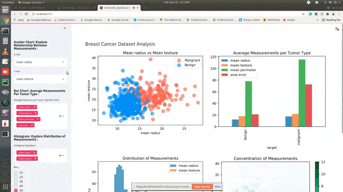
Dashboard
This ends our small tutorial explaining how we can create a basic dashboard using streamlit and matplotlib. Please feel free to let us know your views in the comments section.
References
- How to Create Basic Dashboard using Streamlit & Cufflinks (Plotly)?
- Turn Python Scripts into Beautiful ML Tools
- How to build dashboard using Python (Dash & Plotly) and deploy online (pythonanywhere.com)?
- How to create interactive dashboard using Python(Matplotlib and Panel)?
- How to Create Simple Dashboard with Widgets in Python [Bokeh]?
- How to Create Basic Dashboard in Python with Widgets [plotly & Dash]?
- Mastering Markdown
 Sunny Solanki
Sunny Solanki
Intro: Software Developer | Youtuber | Bonsai Enthusiast
About: Sunny Solanki holds a bachelor's degree in Information Technology (2006-2010) from L.D. College of Engineering. Post completion of his graduation, he has 8.5+ years of experience (2011-2019) in the IT Industry (TCS). His IT experience involves working on Python & Java Projects with US/Canada banking clients. Since 2020, he’s primarily concentrating on growing CoderzColumn.
His main areas of interest are AI, Machine Learning, Data Visualization, and Concurrent Programming. He has good hands-on with Python and its ecosystem libraries.
Apart from his tech life, he prefers reading biographies and autobiographies. And yes, he spends his leisure time taking care of his plants and a few pre-Bonsai trees.
Contact: sunny.2309@yahoo.in


![YouTube Subscribe]() Comfortable Learning through Video Tutorials?
Comfortable Learning through Video Tutorials?
If you are more comfortable learning through video tutorials then we would recommend that you subscribe to our YouTube channel.
![Need Help]() Stuck Somewhere? Need Help with Coding? Have Doubts About the Topic/Code?
Stuck Somewhere? Need Help with Coding? Have Doubts About the Topic/Code?
 Stuck Somewhere? Need Help with Coding? Have Doubts About the Topic/Code?
When going through coding examples, it's quite common to have doubts and errors.
If you have doubts about some code examples or are stuck somewhere when trying our code, send us an email at coderzcolumn07@gmail.com. We'll help you or point you in the direction where you can find a solution to your problem.
You can even send us a mail if you are trying something new and need guidance regarding coding. We'll try to respond as soon as possible.
![Share Views]() Want to Share Your Views? Have Any Suggestions?
Want to Share Your Views? Have Any Suggestions?
 Want to Share Your Views? Have Any Suggestions?
If you want to
- provide some suggestions on topic
- share your views
- include some details in tutorial
- suggest some new topics on which we should create tutorials/blogs
 dashboard, streamlit, matplotlib