CoderzColumn : Tutorials Home (Page: 1)

CoderzColumn Tutorials


Learning is a lifelong process. But you must know what, where, and how to learn? What skills to develop? What skills will help you boost your career? If not, you are at the right place! Our tutorial section at CoderzColumn is dedicated to providing you with all the practical lessons. It will give you the experience to learn Python for different purposes and code on your own. Our tutorials cover:

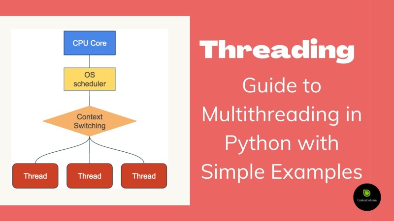
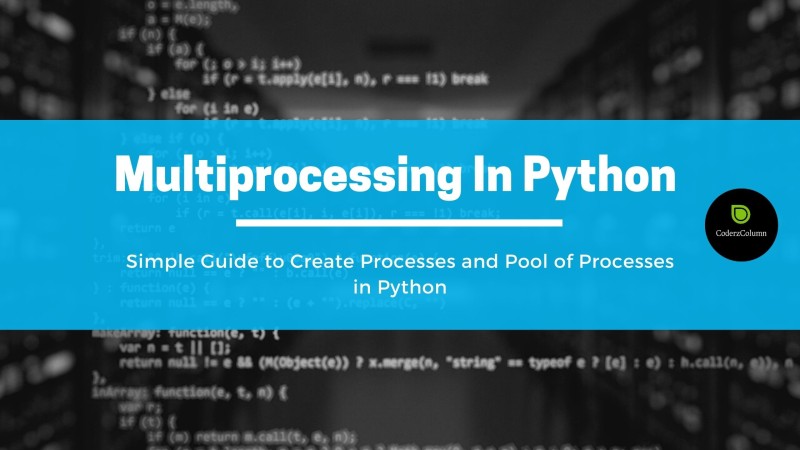
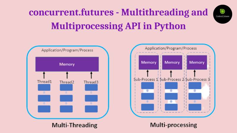
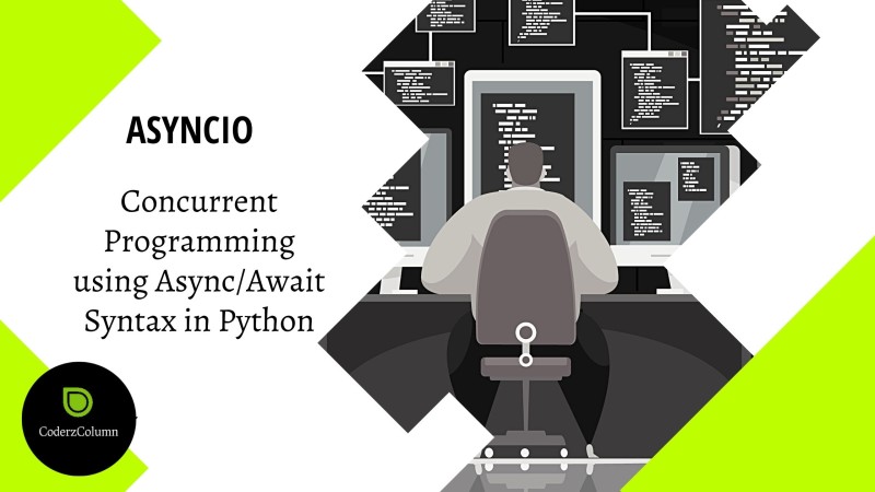
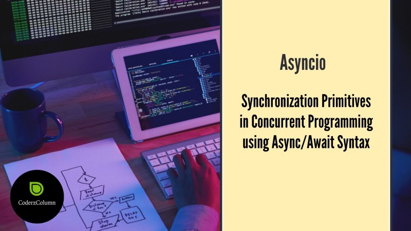
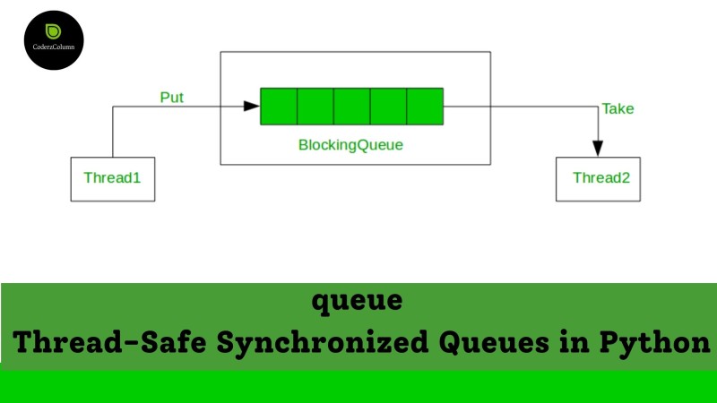
  • Python Programming - threading, multiprocessing, concurrent.futures, asyncio, queue, imaplib, smtplib, email, mimetypes, cprofile, profile, tracemalloc, logging, ipywidgets, beautifulsoup, filecmp, glob, shutil, tarfile, zipfile, argparse, datetime, traceback, abc, contextlib, warnings, dataclasses, re, difflib, textwrap, collections, heapq, bisect, weakref, configparser, signa, ipaddress, xarray, pandas, subprocess, sched, etc.
  • Artificial Intelligence - PyTorch, Keras, Tensorflow, JAX, MXNet, Torchvision, Torchtext, GluonCV, GluonNLP, etc
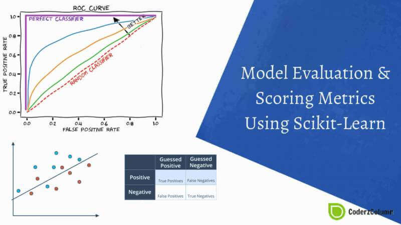
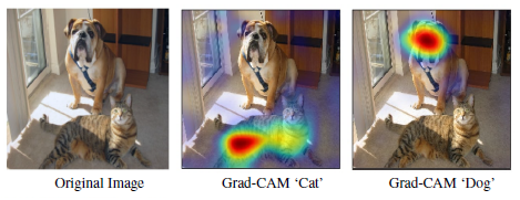
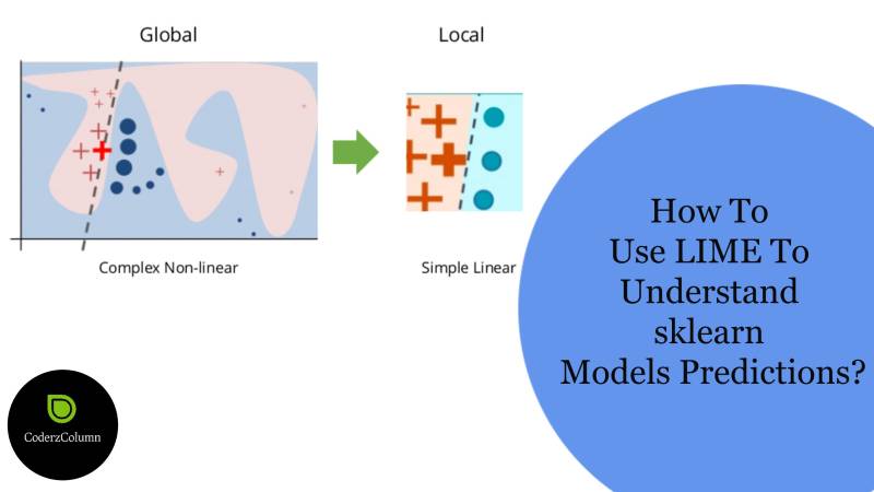
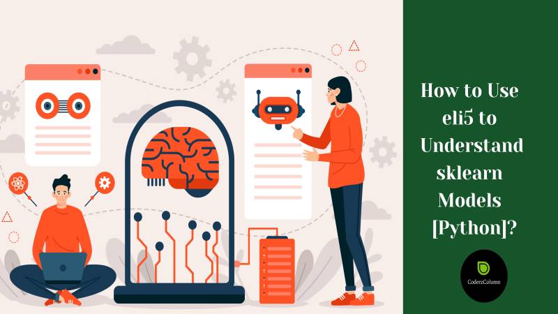
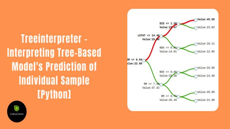
  • Machine Learning - Scikit-Learn, Statsmodels, XGBoost, CatBoost, LightGBM, optuna, scikit-optimize, hyperopt, bayes_opt, scikit-plot, lime, shap, eli5, etc.
  • Data Science - missingno, seaborn, pandas, sweetviz, numpy, networkx, xarray, awkward-array, etc.
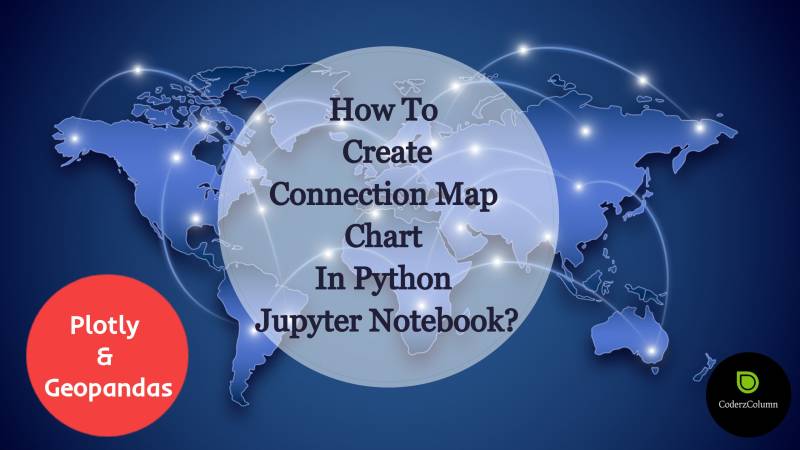
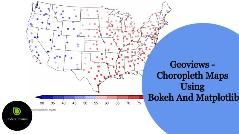
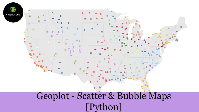
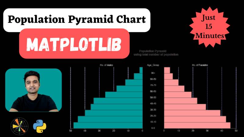
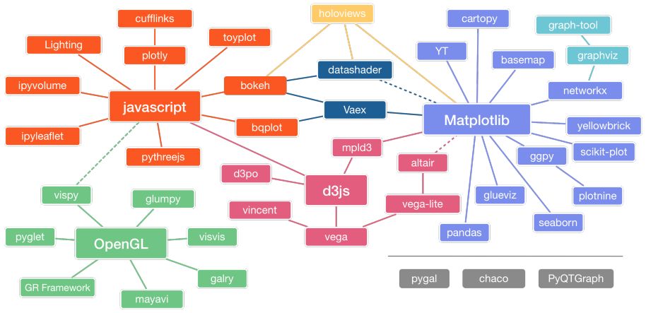
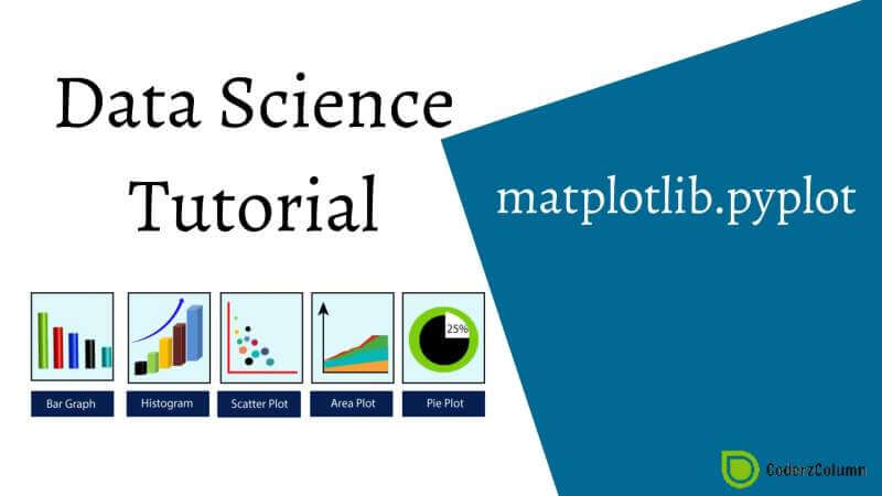
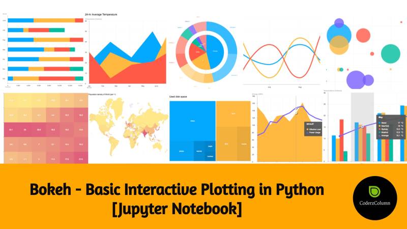
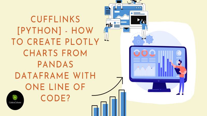
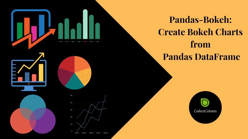
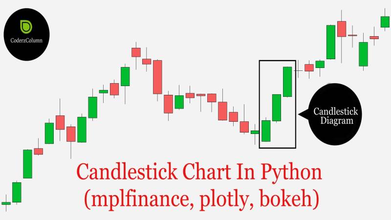
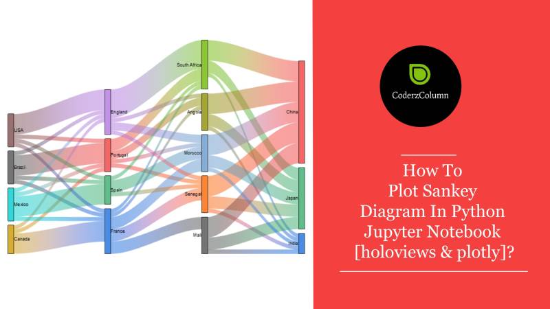
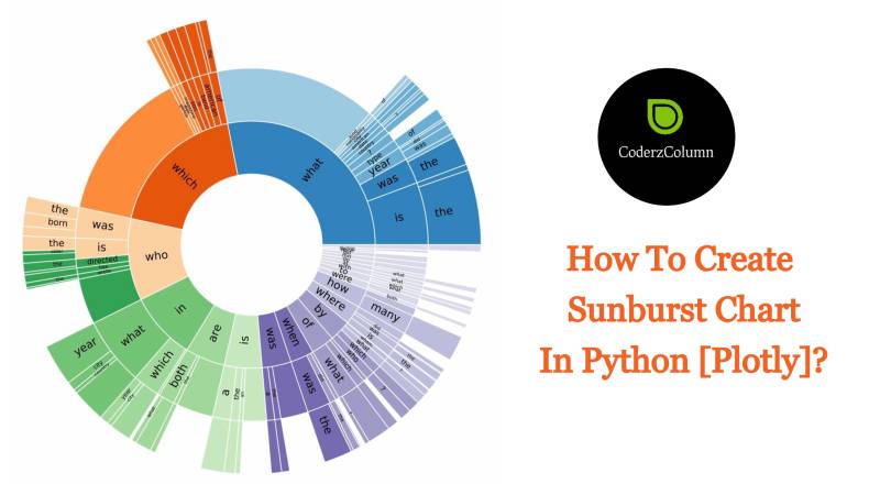
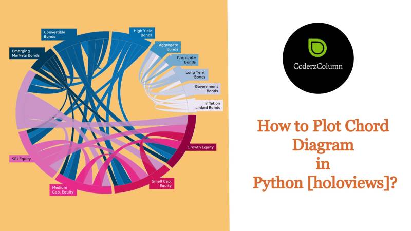
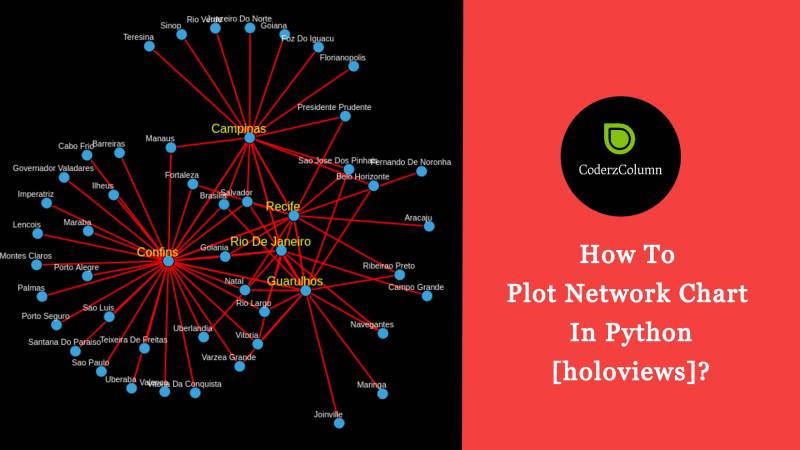
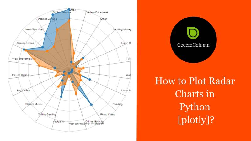
  • Data Visualization - Matplotlib, Bokeh, Bqplot, Plotnine, Altair, Plotly, Cufflinks, Holoviews, dash, streamlit, panel, voila, bokeh, geopandas, geoviews, folium, ipyleaflet, geoplot, cartopy, etc.
  • Digital Marketing - SEO tactics, marketing strategies, Social Media marketing, and more.

For an in-depth understanding of the above concepts, check out the sections below.

Recent Tutorials


Tags gantt-charts, matplotlib
Gantt Charts using Matplotlib | Project Roadmap
Data Science

Gantt Charts using Matplotlib | Project Roadmap

Need to create a project roadmap or timeline? This article will show you how to use Matplotlib to create Gantt charts in Python. Whether you're a project manager or a data scientist, you'll learn how to visualize project schedules and track progress using this powerful tool. Follow our step-by-step guide and create professional-looking Gantt charts for your next project. Don't miss out on this comprehensive tutorial!

Sunny Solanki  Sunny Solanki
Tags style-charts, modify-theme, add-theme
Style Matplotlib Charts | Change Theme of Matplotlib Charts
Data Science

Style Matplotlib Charts | Change Theme of Matplotlib Charts

Looking to give your Matplotlib charts a unique look? In this article, we'll show you how to style your charts using Matplotlib's built-in themes or by creating your own custom themes. Whether you're a beginner or an experienced data scientist, you'll learn how to create visually appealing charts that stand out. Don't miss out on this guide to changing the theme of your Matplotlib charts!

Sunny Solanki  Sunny Solanki
Tags evet-plots, matplotlib
Event Plot using Matplotlib
Data Science

Event Plot using Matplotlib

In this tutorial, we have focused on how to create event plots using "Matplotlib". We have covered the "eventplot()" function available for creating event plots, and how to customize their properties, such as markers, colors, and labels. We have also demonstrated how to create stacked event plots, which can show multiple events happening at the same time.

Sunny Solanki  Sunny Solanki
Tags bullet-chart, matplotlib
Bullet Charts using Matplotlib
Data Science

Bullet Charts using Matplotlib

As a part of this tutorial, we will explore how to create bullet charts using Python data viz library "Matplotlib" and see some examples of how they can be used to represent different types of data. First, we have created a simple bullet chart and then added a theme to improve its look further.

Sunny Solanki  Sunny Solanki
Tags matplotlib, secondary-y-axis, secondary-x-axis
Matplotlib - Secondary X and Y Axis
Data Science

Matplotlib - Secondary X and Y Axis

In this tutorial, we have explained how to create secondary axes (Secondary X axis and Secondary Y axis) in "Matplotlib" and demonstrated how they can be used to enhance your visualizations. Additionally, we have discussed some common use cases where secondary axes can be useful and demonstrate how to implement them in Python.

Sunny Solanki  Sunny Solanki
Tags waterfall-charts, matplotlib
Waterfall Chart using Matplotlib | Python
Data Science

Waterfall Chart using Matplotlib | Python

A simple guide on how to create a waterfall chart using Python Data Viz library matplotlib.Tutorial covers a guide on how to improve look & feel of waterfall chart as well. It even covers different ways to lay out bars of waterfall chart.

Sunny Solanki  Sunny Solanki
Tags hvplot, pandas
hvplot - Create Interactive Charts from Pandas DataFrame with One Line Of Code
Data Science

hvplot - Create Interactive Charts from Pandas DataFrame with One Line Of Code

A detailed guide on how to create interactive charts from pandas dataframe using Python library hvplot. Tutorial explains various chart types like scatter charts, bar charts, line charts, histograms, etc. Tutorial also covers how to modify chart properties (labels, title, etc) to improve look and feel of it.

Sunny Solanki  Sunny Solanki
Tags matplotlib, animations
Animations using Matplotlib | Python
Data Science

Animations using Matplotlib | Python

A simple guide on how to create animation using Python library matplotlib. Tutorial creates simple examples demonstrating animations like line chart animation, bar chart animation, bubbe chart animations, etc. Tutorial is a good starting point for someone who is new to creating animation using matplotlib.

Sunny Solanki  Sunny Solanki
Tags plotnine, grammer-of-graphics, charts
Plotnine: Simple Guide to Create Charts using Grammar of Graphics [Python]
Data Science

Plotnine: Simple Guide to Create Charts using Grammar of Graphics [Python]

A detailed guide to create charts using Python library Plotnine. Plotnine has same API as that of R programming data viz package ggplot2. It is commonly referred to as ggplot of Python. Plotnine is based on concept of grammar of graphics. Tutorial covers many different chart types like scatter charts, bar charts, line charts, heatmaps, etc.

Sunny Solanki  Sunny Solanki
Tags datascience, datavisulisation, matplotlib
Matplotlib.Pyplot - Complete Guide to Create Charts in Python
Data Science

Matplotlib.Pyplot - Complete Guide to Create Charts in Python

A detailed guide on how to create data visualizations using Python library matplotlib. Tutorial covers chart creation using pyplot API of matplotlib. Tutorial explains many different chart types like scatter charts, bar charts, line charts, heatmaps, box plots, etc. Tutorial also covers how to change themes to improve look and feel of matplotlib charts.

Sunny Solanki  Sunny Solanki
Parallel Computing using Python

Parallel Computing using Python


Parallel Computing is a type of computation where tasks are assigned to individual processes for completion. These processes can be running on a single computer or cluster of computers. Parallel Computing makes multi-tasking super fast.

Python provides different libraries (joblib, dask, ipyparallel, etc) for performing parallel computing.

Concurrent Programming in Python

Concurrent Programming in Python


Concurrent computing is a type of computing where multiple tasks are executed concurrently. Concurrent programming is a type of programming where we divide a big task into small tasks and execute these tasks in parallel. These tasks can be executed in parallel using threads or processes.

Python provides various libraries (threading, multiprocessing, concurrent.futures, asyncio, etc) to create concurrent code.

Visualize Machine Learning Metrics

Visualize Machine Learning Metrics


Once our Machine Learning model is trained, we need some way to evaluate its performance. We need to know whether our model has generalized or not.

For this, various metrics (confusion matrix, ROC AUC curve, precision-recall curve, silhouette Analysis, elbow method, etc) are designed over time. These metrics help us understand the performance of our models trained on various tasks like classification, regression, clustering, etc.

Python has various libraries (scikit-learn, scikit-plot, yellowbrick, interpret-ml, interpret-text, etc) to calculate and visualize these metrics.

Interpret Predictions Of ML Models

Interpret Predictions Of ML Models


After training ML Model, we generally evaluate the performance of model by calculating and visualizing various ML Metrics (confusion matrix, ROC AUC curve, precision-recall curve, silhouette Analysis, elbow method, etc).

These metrics are normally a good starting point. But in many situations, they don’t give a 100% picture of model performance. E.g., A simple cat vs dog image classifier can be using background pixels to classify images instead of actual object (cat or dog) pixels.

In these situations, our ML metrics will give good results. But we should always be a little skeptical of model performance.

We can dive further deep and try to understand how our model is performing on an individual example by interpreting results. Various algorithms have been developed over time to interpret predictions of ML models and many Python libraries (lime, eli5, treeinterpreter, shap, etc) provide their implementation.

Python Data Visualization Libraries

Python Data Visualization Libraries


Data Visualization is a field of graphical representation of information / data. It is one of the most efficient ways of communicating information with users as humans are quite good at capturing patterns in data.

Python has a bunch of libraries that can help us create data visualizations. Some of these libraries (matplotlib, seaborn, plotnine, etc) generate static charts whereas others (bokeh, plotly, bqplot, altair, holoviews, cufflinks, hvplot, etc) generate interactive charts. Majority of basic visualizations like bar charts, line charts, scatter plots, histograms, box plots, pie charts, etc are supported by all libraries. Many libraries also support advanced visualization, widgets, and dashboards.

Advanced Data Visualizations using Python

Advanced Data Visualizations using Python


Basic Data Visualizations like bar charts, line charts, scatter plots, histograms, box plots, pie charts, etc are quite good at representing information and exploring relationships between data variables.

But sometimes these visualizations are not enough and we need to analyze data from different perspectives. For this purpose, many advanced visualizations are developed over time like Sankey diagrams, candlestick charts, network charts, chord diagrams, sunburst charts, radar charts, parallel coordinates charts, etc. Python has many data visualization libraries that let us create such advanced data visualizations.

Python Deep Learning Libraries

Python Deep Learning Libraries


Deep learning is a field in Machine Learning that uses deep neural networks to solve tasks. The neural networks with generally more than one hidden layer are referred to as deep neural networks.

Many real-world tasks like object detection, image classification, image segmentation, etc can not be solved with simple machine learning models (decision trees, random forest, logistic regression, etc). Research has shown that neural networks with many layers are quite good at solving these kinds of tasks involving unstructured data (Image, text, audio, video, etc). Deep neural networks nowadays can have different kinds of layers like convolution, recurrent, etc apart from dense layers.

Python has many famous deep learning libraries (PyTorch, Keras, JAX, Flax, MXNet, Tensorflow, Sonnet, Haiku, PyTorch Lightning, Scikeras, Skorch, etc) that let us create deep neural networks to solve complicated tasks.

Image Classification

Image Classification


Image classification is a sub-field under computer vision and image processing that identifies an object present in an image and assigns a label to an image based on it. Image classification generally works on an image with a single object present in it.

Over the years, many deep neural networks (VGG, ResNet, AlexNet, MobileNet, etc) were developed that solved image classification task with quite a high accuracy. Due to the high accuracy of these algorithms, many Python deep learning libraries started providing these neural networks. We can simply load these networks with weights and make predictions using them.

Python libraries PyTorch and MXNet have helper modules named 'torchvision' and 'gluoncv’ respectively that provide an implementation of image classification networks.