How to build a dashboard using Python (Dash & Plotly) and deploy online (Pythonanywhere.com)
Table of Contents
Introduction 
Organizations around the world nowadays are collecting data. Analyzing collected data and presenting it visually is very common nowadays. One can use python libraries like matplotlib, seaborn in jupyter notebook and share it with their colleagues. But it has few limitations like plots are static and a person viewing results needs to start a jupyter server in order to run notebook.
Now, what if a person who is from management and needs interactive graphs and need to share it further with people without technical background who can't run a jupyter notebook?
One can design interactive visualization dashboards using javascript libraries like d3.js, chartjs, threejs, reactjs, leaflet etc.
But what if a person is a python developer and does not want to involve in web development technologies like javascript, CSS, etc.
We have designed this tutorial for such people who want to create a dashboard using their knowledge of Python and want to share it with others.
This tutorial will be explaining how to use python libraries plotly(for creating interactive visualization) and dash (Assembling visualization to create dashboard) to create interactive dashboard working on local and then deploy it for free on pythonanywhere.com so that it can be shared with anyone by just giving a link. A person can visit the link and analyze the dashboard.
1. Creating Dashboard On Local 
We'll first make dashboard working on local and then deploy it to pythonanywhere.com.We'll start by installing the latest version of plotly and dash libraries on local.
!pip install --upgrade dash plotly sklearn
Loading IRIS Dataset
As a part of this tutorial, we'll be using a simple IRIS flower dataset available in scikit-learn for analysis purposes. IRIS dataset has size information about 150 samples of 3 different flower types (iris-setosa, iris-virginica, iris-versicolor). Let's load the IRIS dataset.
import pandas as pd
import numpy as np
from sklearn.datasets import load_iris
iris = load_iris() ## It returns simple dictionary like object with all data.
print("IRIS Dataset Size : ",iris.data.shape, iris.target.shape)
print("IRIS Flower Names : ", iris.target_names)
print("IRIS Flower Feature Names : ", iris.feature_names)

## Creating dataframe of total data
iris_df = pd.DataFrame(data=np.concatenate((iris.data,iris.target.reshape(-1,1)), axis=1), columns=(iris.feature_names+['Flower Type']))
iris_df["Flower Name"] = [iris.target_names[int(i)] for i in iris_df["Flower Type"]]
iris_df.head()
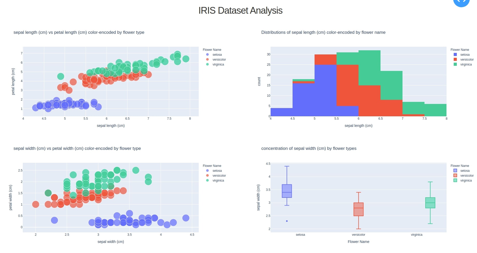
We'll be including four simple graphs in our dashboard which will be interactive.
Scatter Plotdepicting a relationship between sepal length and petal length features of flower color-encoded by flower nameScatter Plotdepicting a relationship between sepal width and petal width features of flower color-encoded by flower nameHistogramshowing distributions of sepal length (cm) color-encoded by flower nameBox Plotshowing a concentration of sepal width (cm) by flower types in a dataset.
1.1 Plotting Interactive Graphs Independently 
We'll first plot all graphs independently and then incorporate them into a dashboard.
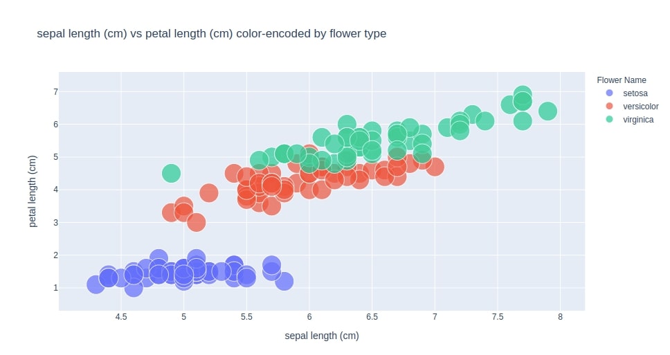
Scatter Plot depicting the relationship between sepal length and petal length features of flower color-encoded by flower name
import plotly.express as px
chart1 = px.scatter(data_frame=iris_df,
           x="sepal length (cm)",
           y="petal length (cm)",
           color="Flower Name",
           size=[1.0]*150,
           title="sepal length (cm) vs petal length (cm) color-encoded by flower type")
chart1
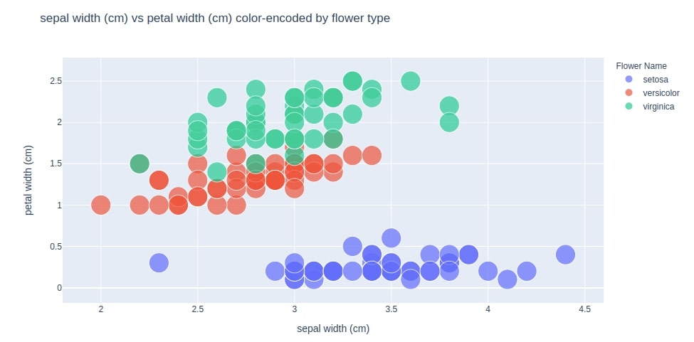
Scatter Plot depicting the relationship between sepal width and petal width features of flower color-encoded by flower name
chart2 = px.scatter(data_frame=iris_df,
           x="sepal width (cm)",
           y="petal width (cm)",
           color="Flower Name",
           size=[1.0]*150,
           title="sepal width (cm) vs petal width (cm) color-encoded by flower type")
chart2
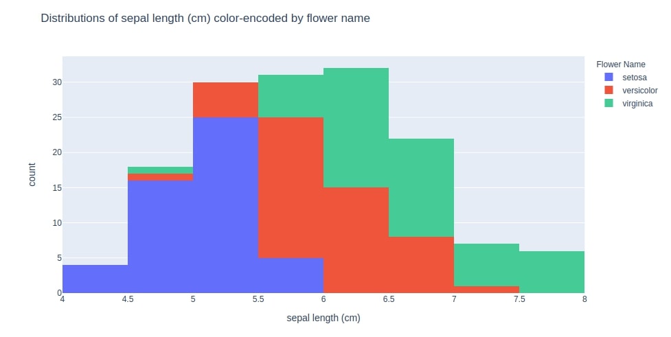
Histogram showing distributions of sepal length (cm) color-encoded by flower name
chart3 = px.histogram(data_frame=iris_df,
             x="sepal length (cm)",
             color="Flower Name",
             title="Distributions of sepal length (cm) color-encoded by flower name")
chart3
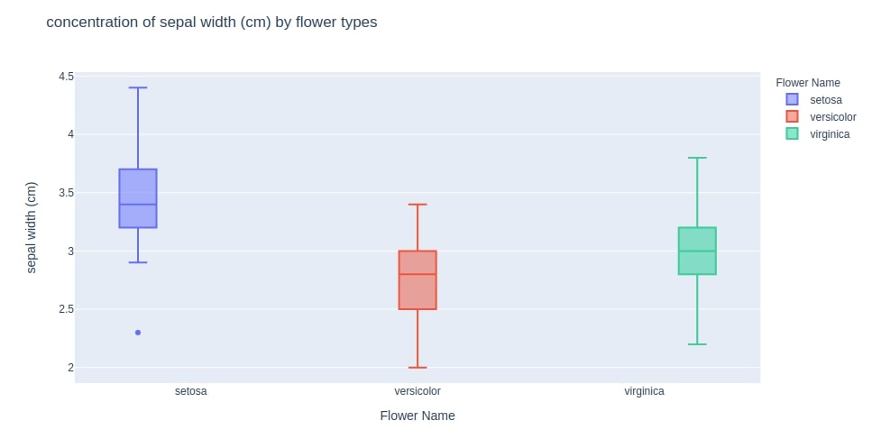
Box Plot showing concentration of sepal width (cm) by flower types in dataset.
chart4 = px.box(data_frame=iris_df,
           x="Flower Name",
           y="sepal width (cm)",
           color="Flower Name",
           title="concentration of sepal width (cm) by flower types")
chart4
1.2 Integrating Charts Into Dashboard 
We'll now use the dash library to create a dashboard consisting of these 4 charts put as four boxes into a dashboard.
Import dash components & Initialize Dashboard App
We first need to import the necessary dash core and HTML modules. We then need to initialize the dashboard by creating an app of it.
NOTE: Please make a note that we are using external CSS which will be responsible for the look of the dashboard. Experience web developers can replace it with their style sheets and modify the look and feel of a dashboard as needed.
import dash
import dash_core_components as dcc
import dash_html_components as html

external_stylesheets = ['https://codepen.io/chriddyp/pen/bWLwgP.css']

app = dash.Dash(__name__, external_stylesheets=external_stylesheets)
Embed Each Graphs Into Dash Components
We first need to wrap each graph into core dash components so that they can be easily integrated with other dash html components. We'll wrap each graph into Graph core components of the dashboard. Here, className="six columns" is little CSS part of stylesheet used above for look-feel of dashboard. It'll take up half screen space for keeping the graph.
graph1 = dcc.Graph(
        id='graph1',
        figure=chart1,
        className="six columns"
    )

graph2 = dcc.Graph(
        id='graph2',
        figure=chart2,
        className="six columns"
    )

graph3 = dcc.Graph(
        id='graph3',
        figure=chart3,
        className="six columns"
    )

graph4 = dcc.Graph(
        id='graph4',
        figure=chart4,
        className="six columns"
    )
Create HTML Layout of Dashboard
We'll now create 2 rows of html.Div components. Both rows will have 2 graphs as their children along with the dashboard header. Please make a note that we have also created html.H2 heading component which will be used to show heading of dashboard. We also have used simple CSS with the style attribute of last html.Div. One can modify the look and feel of a dashboard by providing style details with there parameters in each dash html components.
header = html.H2(children="IRIS Dataset Analysis")

row1 = html.Div(children=[graph1, graph3],)

row2 = html.Div(children=[graph2, graph4])

layout = html.Div(children=[header, row1, row2], style={"text-align": "center"})
Setting Layout of Dashboard
We now just need to set layout as the layout of the dashboard app initialized at the beginning.
app.layout = layout
1.3 Putting All Together and Bringing Dashboard Up on Local 
We'll now put all the contents described above in a simple file called iris_analysis.py and run it. It'll bring up a dashboard on the localhost at port 8050.
iris_analysis.py
import numpy as np
import pandas as pd
from sklearn.datasets import load_iris

import plotly.express as px


import dash
import dash_core_components as dcc
import dash_html_components as html

iris = load_iris() ## It returns simple dictionary like object with all data.

## Creating dataframe of total data
iris_df = pd.DataFrame(data=np.concatenate((iris.data,iris.target.reshape(-1,1)), axis=1), columns=(iris.feature_names+['Flower Type']))
iris_df["Flower Name"] = [iris.target_names[int(i)] for i in iris_df["Flower Type"]]

external_stylesheets = ['https://codepen.io/chriddyp/pen/bWLwgP.css']

app = dash.Dash(__name__, external_stylesheets=external_stylesheets)


header = html.H2(children="IRIS Dataset Analysis")

chart1 = px.scatter(data_frame=iris_df,
           x="sepal length (cm)",
           y="petal length (cm)",
           color="Flower Name",
           size=[1.0]*150,
           title="sepal length (cm) vs petal length (cm) color-encoded by flower type")


graph1 = dcc.Graph(
        id='graph1',
        figure=chart1,
        className="six columns"
    )

chart2 = px.scatter(data_frame=iris_df,
           x="sepal width (cm)",
           y="petal width (cm)",
           color="Flower Name",
           size=[1.0]*150,
           title="sepal width (cm) vs petal width (cm) color-encoded by flower type")


graph2 = dcc.Graph(
        id='graph2',
        figure=chart2,
        className="six columns"
    )

chart3 = px.histogram(data_frame=iris_df,
             x="sepal length (cm)",
             color="Flower Name",
             title="Distributions of sepal length (cm) color-encoded by flower name")

graph3 = dcc.Graph(
        id='graph3',
        figure=chart3,
        className="six columns"
    )

chart4 = px.box(data_frame=iris_df,
           x="Flower Name",
           y="sepal width (cm)",
           color="Flower Name",
           title="concentration of sepal width (cm) by flower types")


graph4 = dcc.Graph(
        id='graph4',
        figure=chart4,
        className="six columns"
    )


row1 = html.Div(children=[graph1, graph3],)

row2 = html.Div(children=[graph2, graph4])

layout = html.Div(children=[header, row1, row2], style={"text-align": "center"})

app.layout = layout

if __name__ == "__main__":
    app.run_server(debug=True)
We'll now run it local.
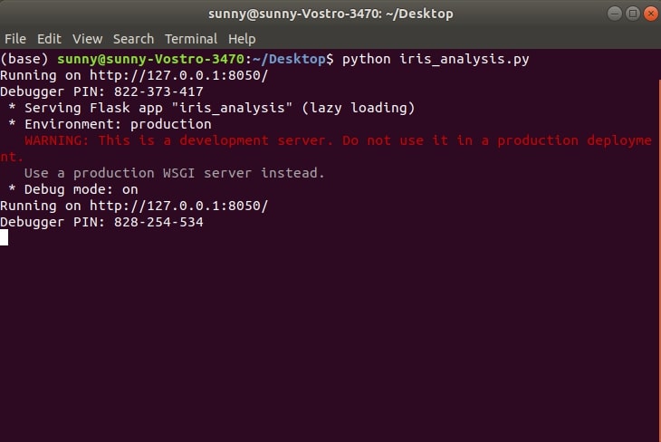
Below how our server will look when tried to access from 127.0.0.1:8050 in a browser.
2. Deploying Dashboard on pythonanywhere.com 
We'll now provide step by step guide on deploying above server to pythonanywhere.com. Please create a free beginner account with pythonanywhere.com to follow along.
- Login to pythonanywhere.com
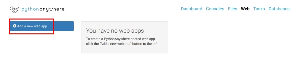
Go to Web tab from top and click on
Add a new web appbutton to create new web app.![WebApp Creation Tab]()
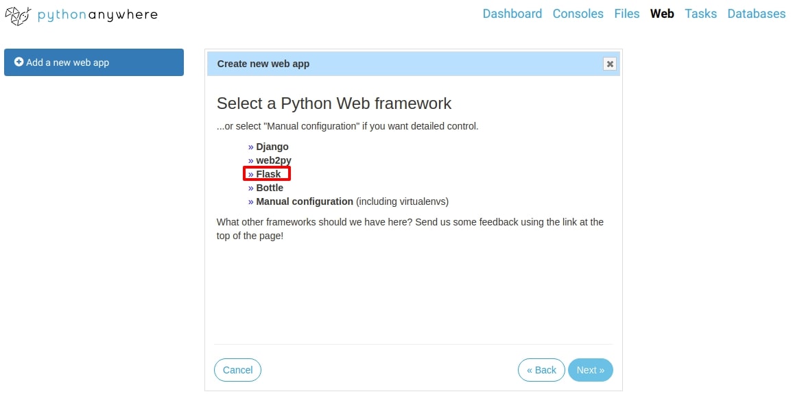
Select
Flaskas framework for keeping dashboard.![Flask]()
Select
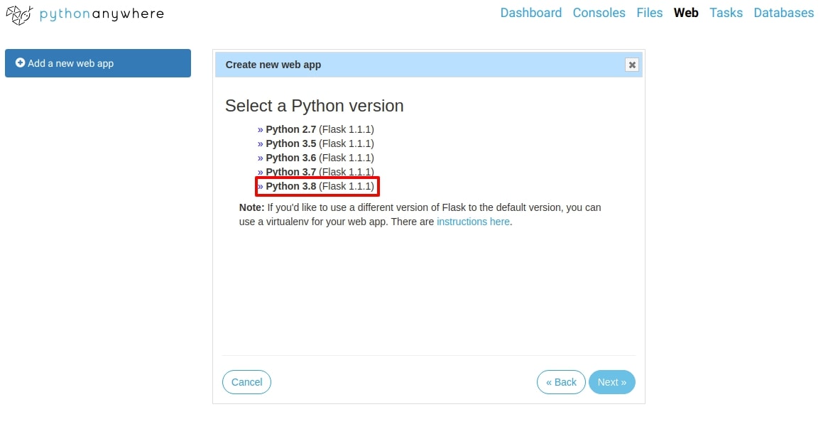
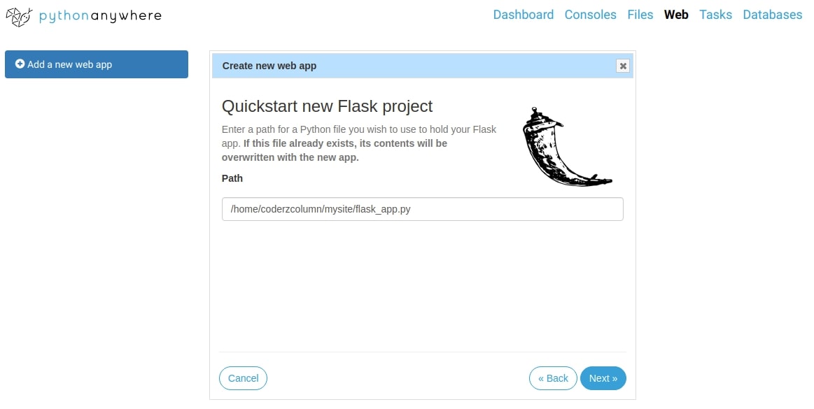
Python 3.8from next screen and click on next. It'll create flask project namedmysiteand keep flask server file(flask_app.py) in that folder file. Clicking next on that screen will create our flask app which will be used for deploying our dashboard and handling requests.![Python38]()
![Flask App File]()
Go to
Dashboardof pythonanywhere.com by clicking on the link at the top.- Click on the
bashbutton below New Console. It'll start a new bash shell for us. - Install dash, plotly, and sklearn using this bash shell. Please execute below command in shell.
pip3.8 install --upgrade --user plotly dash sklearn- Please make a note that you need to use pip version according to your python version else you'll face an error saying no dash module found.
- Go to
Dashboardof pythonanywhere.com click onBrowse files - Go to
mysitefolder and uploadiris_analysis.pyfile there. Please deleteflask_app.pyfile. - Click on
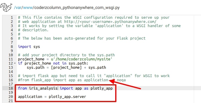
Weblink at the top again to go to settings of a web app. Scroll below and an open file namedWSGI Configuration file. Make below-mentioned changes to file whose name ends with
_wsgi.py.- Comment line which imports
flask_app - Import
appfromiris_analysisasplotly_app - Set value of
applicationvariable asplotly_app.serverand save changes.![WSGI File Changes]()
- Comment line which imports
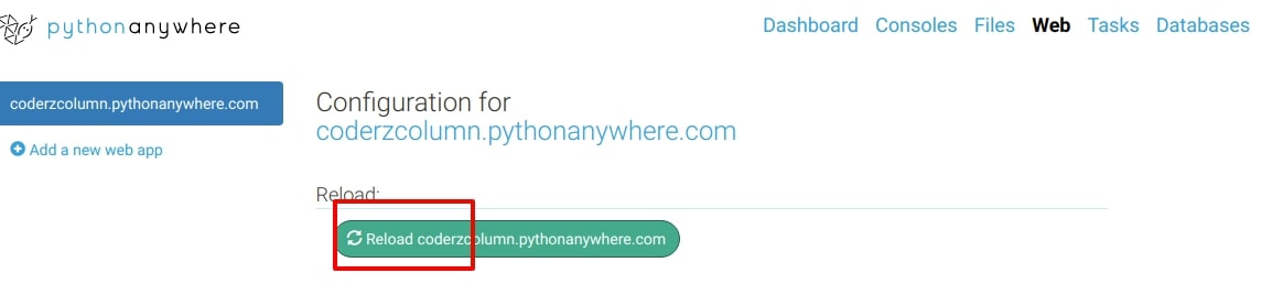
Go to Web app setting tab by clicking on
Webfrom the dashboard ofpythonanywhere.com. Click on the reload button to bring up a server with the above-mentioned changes to the WSGI Configuration file.![Reloading Server With Changes]()
- Access Dashboard from URL https://coderzcolumn.pythonanywhere.com/
NOTE You can force https usage from the web settings page.
DASHBOARD URL: https://coderzcolumn.pythonanywhere.com/
Please feel free to check our URL for the live dashboard and let us know your views.
References 
 Sunny Solanki
Sunny Solanki
Intro: Software Developer | Youtuber | Bonsai Enthusiast
About: Sunny Solanki holds a bachelor's degree in Information Technology (2006-2010) from L.D. College of Engineering. Post completion of his graduation, he has 8.5+ years of experience (2011-2019) in the IT Industry (TCS). His IT experience involves working on Python & Java Projects with US/Canada banking clients. Since 2020, he’s primarily concentrating on growing CoderzColumn.
His main areas of interest are AI, Machine Learning, Data Visualization, and Concurrent Programming. He has good hands-on with Python and its ecosystem libraries.
Apart from his tech life, he prefers reading biographies and autobiographies. And yes, he spends his leisure time taking care of his plants and a few pre-Bonsai trees.
Contact: sunny.2309@yahoo.in


![YouTube Subscribe]() Comfortable Learning through Video Tutorials?
Comfortable Learning through Video Tutorials?
If you are more comfortable learning through video tutorials then we would recommend that you subscribe to our YouTube channel.
![Need Help]() Stuck Somewhere? Need Help with Coding? Have Doubts About the Topic/Code?
Stuck Somewhere? Need Help with Coding? Have Doubts About the Topic/Code?
 Stuck Somewhere? Need Help with Coding? Have Doubts About the Topic/Code?
When going through coding examples, it's quite common to have doubts and errors.
If you have doubts about some code examples or are stuck somewhere when trying our code, send us an email at coderzcolumn07@gmail.com. We'll help you or point you in the direction where you can find a solution to your problem.
You can even send us a mail if you are trying something new and need guidance regarding coding. We'll try to respond as soon as possible.
![Share Views]() Want to Share Your Views? Have Any Suggestions?
Want to Share Your Views? Have Any Suggestions?
 Want to Share Your Views? Have Any Suggestions?
If you want to
- provide some suggestions on topic
- share your views
- include some details in tutorial
- suggest some new topics on which we should create tutorials/blogs
 dashboard, plotly, dash, pythonanywhere