Gantt Charts using Matplotlib | Python | Project Roadmap
In today's fast-paced and dynamic business environment, project management has become a critical aspect of organizational success. As companies undertake increasingly complex projects, effective project management techniques have become essential to ensure that projects are delivered on time, within budget, and to the desired quality.
One of the most effective tools for project management is the Gantt chart. A Gantt chart is a visual representation of a project schedule that shows the start and end dates of each task, as well as their duration and dependencies. The chart is named after Henry Gantt, an American engineer who developed the chart in the early 20th century.
The Gantt chart is a powerful tool that helps project managers to plan and track project progress. By breaking down a project into smaller tasks and visualizing them in a chart, project managers can identify potential roadblocks, allocate resources effectively, and adjust timelines as needed. Gantt charts are also useful for communicating project progress to stakeholders and team members, as they provide a clear overview of the project's status and can help identify potential risks and issues.
What Can You Learn From This Article?
In this article, we will explore how to create Gantt charts using Matplotlib, a popular data visualization library in Python. We will walk through the process of creating a Gantt chart step by step and demonstrate how to customize the chart to fit the specific needs of a project roadmap. Whether you are a project manager or a data scientist interested in data visualization, this tutorial will provide you with the knowledge to create effective Gantt charts using Matplotlib.
Video Tutorial
Please feel free to check below video tutorial if feel comfortable learning through videos.
First, we have imported matplotlib and printed the version that we have used in our tutorial.
import matplotlib

print("Maplotlib Version : {}".format(matplotlib.__version__))
Load Dataset
Below, we have created a sample dataset that we'll be using for our Gantt chart creation.
First, the code defines three lists: task, start_date, and end_date. These lists represent the tasks to be performed in the project, the start date of each task, and the end date of each task, respectively.
Next, the code creates a pandas DataFrame object, "df," using the data from the three lists. The DataFrame has three columns: "Task," "Start," and "End," which correspond to the task names, start dates, and end dates, respectively.
The next two lines of code convert the "Start" and "End" columns to datetime objects using the pd.to_datetime() method. This is necessary for the Gantt chart to be plotted correctly.
The next line of code calculates the duration of each task by subtracting the "Start" date from the "End" date and assigns it to a new column called "Days". This duration is used to determine the length of each horizontal bar in the Gantt chart.
Finally, the last line of code creates a new column called "Color" that uses the plt.cm.Set1 colormap from Matplotlib to assign a unique color to each task. This is done so that each task is easily distinguishable in the Gantt chart.
import pandas as pd
import matplotlib.pyplot as plt

task = ["Planning", "Research", "Design", "Implementation", "Testing", "QA", "UAT", "Followup"]
start_date =["2023-1-15", "2023-2-15", "2023-3-1", "2023-4-1", "2023-6-15", "2023-7-1", "2023-7-1", "2023-6-15"]
end_date = ["2023-3-15", "2023-3-15", "2023-4-15", "2023-7-1", "2023-7-15", "2023-7-15", "2023-7-15", "2023-7-25"]

df = pd.DataFrame(data={"Task": task, "Start": start_date, "End": end_date})

df["Start"] = pd.to_datetime(df.Start)
df["End"] = pd.to_datetime(df.End)

df["Days"] = df["End"] - df["Start"]
df["Color"] = plt.cm.Set1.colors[:len(df)]

df
Chart 1
Below, we have created our first Gantt chart using the dataset we loaded in our previous cell.
The first line of the script imports the required Matplotlib and datetime libraries.
The second line of the script sets the "ggplot" style for the plot using the plt.style.use() method. This makes the plot appear with a gray background and white gridlines, similar to the ggplot2 style used in R.
The third line creates a new figure with a size of 12 inches by 8 inches using the plt.figure() method.
The fourth line plots the horizontal bars using the plt.barh() method. The y parameter specifies the vertical position of the bars, which is set to the "Task" column of the DataFrame. The left parameter specifies the starting date of the bars, which is set to the "Start" column of the DataFrame. The width parameter specifies the length of the bars, which is set to the "Days" column of the DataFrame. The color parameter specifies the color of each bar, which is set to the "Color" column of the DataFrame.
The fifth and sixth lines of the script plot a vertical line and a text label indicating the current date. The plt.vlines() method plots a vertical line at the x-coordinate specified by the date(2023,2,20). The ymin and ymax parameters specify the y-coordinates of the bottom and top of the line, respectively. The plt.text() method adds a text label at the x-coordinate specified by the date(2023,2,25) and the y-coordinate of 7.1. The s parameter specifies the text to be displayed, which is set to "Today". The fontsize, fontweight, and color parameters specify the size, weight, and color of the text, respectively.
The seventh and eighth lines of the script set the x-axis and y-axis limits, respectively. The x-axis limits are set to January 1, 2023, and July 30, 2023, using the plt.xlim() method. The y-axis limits are set to -0.5 and 7.5 using the plt.ylim() method.
The ninth and tenth lines of the script set the tick marks for the x-axis and y-axis, respectively. The pd.date_range() method generates a range of dates from January 1, 2023, to August 30, 2023, with a frequency of "MS", which stands for month start. The plt.xticks() method sets the tick marks on the x-axis to the dates in the dt_rng range, and the tick labels are set to the month names using a list comprehension. The fontsize parameter specifies the size of the tick labels. The plt.yticks() method sets the tick marks on the y-axis to the "Task" column of the DataFrame, and the fontsize parameter specifies the size of the tick labels.
The eleventh, twelfth, and thirteenth lines of the script set the x-axis label, y-axis label, and title of the plot, respectively. The xlabel() method sets the x-axis label to "Date", with a fontsize and fontweight of 20 and "bold", respectively. The ylabel() method sets the y-axis label to "Task", with a fontsize and fontweight of 20 and "bold", respectively. The title() method sets the title of the plot to "Project Roadmap", with a loc parameter set to "left" to align the title to the left side of the plot, a padding parameter of 20 to add some padding between the title and the plot, and a fontsize and fontweight of 30 and "bold", respectively.
import matplotlib.pyplot as plt
from datetime import date

plt.style.use("ggplot");

fig = plt.figure(figsize=(12,8))

plt.barh(y=df["Task"], left=df["Start"], width=df["Days"], color=df["Color"]);

plt.vlines(x=date(2023,2,20), ymin=-1, ymax=8, color="dodgerblue", linewidth=5.0, linestyle="dashed");
plt.text(x=date(2023,2,25), y=7.1, s="Today", fontsize=20, fontweight="bold", color="black");

plt.xlim(date(2023,1,1), date(2023, 7,30));
plt.ylim(-0.5, 7.5);

dt_rng = pd.date_range(start="2023-1-1", end="2023-8-30", freq="MS")
plt.xticks(dt_rng, [dt.month_name() for dt in dt_rng], fontsize=15);
plt.yticks(fontsize=15);

plt.xlabel("Date", fontsize=20, fontweight="bold");
plt.ylabel("Task", fontsize=20, fontweight="bold");
plt.title("Project Roadmap", loc="left", pad=20, fontsize=30, fontweight="bold");
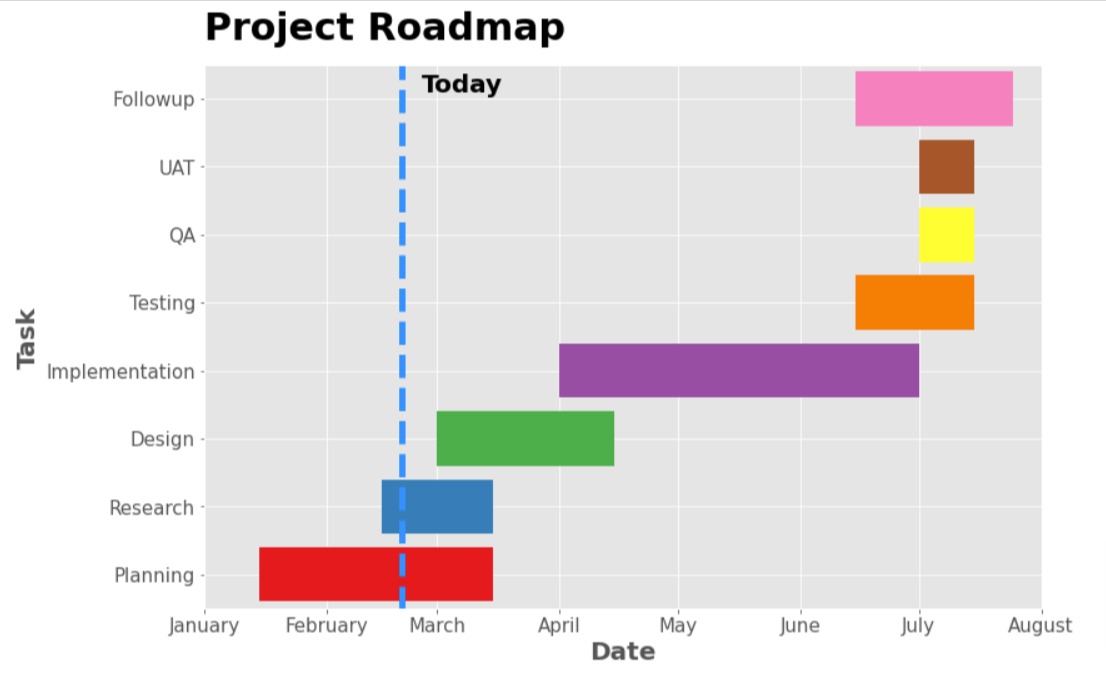
Chart 2
Below, we have created another Gantt chart that starts the phases of the project in reverse order so that the first stage is at the top. The majority of the code is the same as the previous example with the only major change being that some of the lists are reversed to reverse phases of the chart.
import matplotlib.pyplot as plt
from datetime import date

plt.style.use("ggplot");

fig = plt.figure(figsize=(12,8))

plt.barh(y=df["Task"][::-1], left=df["Start"][::-1], width=df["Days"][::-1], color=df["Color"][::-1]);

plt.vlines(x=date(2023,2,20), ymin=-1, ymax=8, color="dodgerblue", linewidth=5.0, linestyle="dashed");
plt.text(x=date(2023,2,25), y=1.1, s="Today", fontsize=20, fontweight="bold", color="black");

plt.xlim(date(2023,1,1), date(2023, 7,30));
plt.ylim(-0.5, 7.5);

dt_rng = pd.date_range(start="2023-1-1", end="2023-8-30", freq="MS")
plt.xticks(dt_rng, [dt.month_name() for dt in dt_rng], fontsize=15);
plt.yticks(fontsize=15);

plt.xlabel("Date", fontsize=20, fontweight="bold");
plt.ylabel("Task", fontsize=20, fontweight="bold");
plt.title("Project Roadmap", loc="left", pad=20, fontsize=30, fontweight="bold");
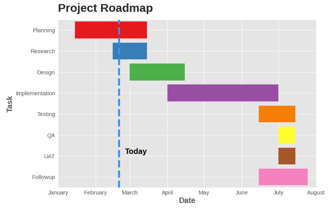
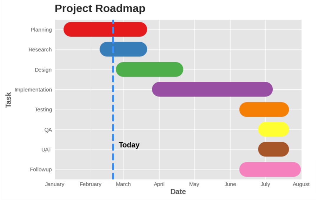
Chart 3
In this section, we have explained another way of creating a Gantt chart using matplotlib. This time, we have used plt.hlines() method to create horizontal bars with curved edges instead of plt.barh(). In order to create curved bars, linewidth is set to 40 and capstyle parameter to 'round'.
The choice between using plt.barh() and plt.hlines() depends on personal preference and the specific requirements of the project.
import matplotlib.pyplot as plt
from datetime import date

plt.style.use("ggplot");

fig = plt.figure(figsize=(12,8))

plt.hlines(y=range(8), xmin=df["Start"][::-1], xmax=df["End"][::-1], color=df["Color"][::-1],
           linewidth=40, capstyle="round");

plt.vlines(x=date(2023,2,20), ymin=-1, ymax=8, color="dodgerblue", linewidth=5.0, linestyle="dashed");
plt.text(x=date(2023,2,25), y=1.1, s="Today", fontsize=20, fontweight="bold", color="black");

plt.xlim(date(2023,1,1), date(2023, 7,30));
plt.ylim(-0.5, 7.5);

dt_rng = pd.date_range(start="2023-1-1", end="2023-8-30", freq="MS")
plt.xticks(dt_rng, [dt.month_name() for dt in dt_rng], fontsize=15);
plt.yticks(range(8),df["Task"][::-1 ],fontsize=15);

plt.xlabel("Date", fontsize=20, fontweight="bold");
plt.ylabel("Task", fontsize=20, fontweight="bold");
plt.title("Project Roadmap", loc="left", pad=20, fontsize=30, fontweight="bold");
 Sunny Solanki
Sunny Solanki
Intro: Software Developer | Youtuber | Bonsai Enthusiast
About: Sunny Solanki holds a bachelor's degree in Information Technology (2006-2010) from L.D. College of Engineering. Post completion of his graduation, he has 8.5+ years of experience (2011-2019) in the IT Industry (TCS). His IT experience involves working on Python & Java Projects with US/Canada banking clients. Since 2020, he’s primarily concentrating on growing CoderzColumn.
His main areas of interest are AI, Machine Learning, Data Visualization, and Concurrent Programming. He has good hands-on with Python and its ecosystem libraries.
Apart from his tech life, he prefers reading biographies and autobiographies. And yes, he spends his leisure time taking care of his plants and a few pre-Bonsai trees.
Contact: sunny.2309@yahoo.in


![YouTube Subscribe]() Comfortable Learning through Video Tutorials?
Comfortable Learning through Video Tutorials?
If you are more comfortable learning through video tutorials then we would recommend that you subscribe to our YouTube channel.
![Need Help]() Stuck Somewhere? Need Help with Coding? Have Doubts About the Topic/Code?
Stuck Somewhere? Need Help with Coding? Have Doubts About the Topic/Code?
 Stuck Somewhere? Need Help with Coding? Have Doubts About the Topic/Code?
When going through coding examples, it's quite common to have doubts and errors.
If you have doubts about some code examples or are stuck somewhere when trying our code, send us an email at coderzcolumn07@gmail.com. We'll help you or point you in the direction where you can find a solution to your problem.
You can even send us a mail if you are trying something new and need guidance regarding coding. We'll try to respond as soon as possible.
![Share Views]() Want to Share Your Views? Have Any Suggestions?
Want to Share Your Views? Have Any Suggestions?
 Want to Share Your Views? Have Any Suggestions?
If you want to
- provide some suggestions on topic
- share your views
- include some details in tutorial
- suggest some new topics on which we should create tutorials/blogs
 gantt-charts, matplotlib