Geoplot - Choropleth Maps [Python]
Geospatial data is generally available in datasets nowadays. The geospatial data can be names of locations (cities, states, countries, etc.) or it can be exact geolocations (longitude and latitude) as well. Visualizing geospatial data can give meaningful insights during data analysis.
The Choropleth map is one such representation of geospatial data. It can be used to analyze the distribution of data in geographical regions (e.g. population density, GDP per capita of countries, etc). Python has a list of libraries (geopandas, bokeh, cartopy, folium, ipyleaflet, etc.) that let us create choropleth maps. As a part of this tutorial, we'll introduce one new library named geoplot which is built on top of geopandas and cartopy. It let us create a choropleth map with just one line of code. We'll be using datasets from geopandas as well in our tutorial. As geoplot is built on top of geopandas and cartopy which itself are built on top of matplotlib, we can add details to charts using matplotlib as well.
If you don't have a background in geopandas and cartopy then please feel free to check our tutorials on them.
- Plotting Static Maps using geopandas (Working with Geospatial data)
- Cartopy - Basic Maps (Scatter Map, Bubble Map and Connection Map)
If you want to create scatter and bubble maps using geoplot then please check our other tutorial where we cover them.
We'll be creating choropleth maps using geoplot as a part of this tutorial. We'll try to explain the usage of geoplot API with simple examples.
We'll start by importing the necessary libraries. We have also printed the versions of the libraries that we are using.
import geoplot

print("Geoplot Version : {}".format(geoplot.__version__))

import matplotlib.pyplot as plt
Below we have imported geopandas library which we'll be using for loading geospatial datasets. We have printed the version of the library and the list of datasets available through it.
import geopandas as gpd

print("Geopandas Version : {}".format(gpd.__version__))

print("Available Datasets : {}".format(gpd.datasets.available))
Below we have loaded the dataset with geospatial data about countries of the world. We can notice that geopandas dataframe has a column named geometry which holds information about the plotting shape of countries. We can merge this dataframe with other data frames and display other details for countries as well which we'll explain in our examples.
world = gpd.read_file(gpd.datasets.get_path("naturalearth_lowres"))

world.head()
Below we have loaded the world happiness dataframe. It has information like the happiness score of countries, GDP per capita, social support, life expectancy, generosity, freedom, and perception of corruption. We'll be merging this dataframe with geo dataframe from geopandas which we loaded earlier so that we can plot information from this dataset on the world map.
The happiness dataset can be downloaded from the below link.
import pandas as pd

happiness = pd.read_csv("datasets/world_happiness_2019.csv")

happiness.head()
Below we have merged the geo dataframe which we loaded earlier with a happiness dataset based on the name of the countries. The final merged dataset will have columns from both datasets. We'll be using this dataset to create choropleth maps.
world_happiness = world.merge(happiness, left_on="name", right_on="Country or region")

world_happiness.head()
Simple World Map
If we want to create simple maps without any information presented through them then we can use polyplot() method available from geoplot.
- polyplot(df,projection=None,extent=None,figsize=(8,6),ax=None,**kwargs) - This method takes as input GeoDataFrame and creates map from it. The GeoDataFrame is an data frame from geopandas which has column named geomtry holding information about geometries (polygons, multi-polygons, points, etc.).
- The projection parameter takes as input instance of any projection available from geoplot.crs module. It can be used to change the projection of the map.
- The extent parameter takes as input tuple of 4 values (min_longitude, min_latitude, max_longitude, max_latitude) specifying bounding box of map.
- The figsize parameter accepts tuple specifying figure size.
- The ax parameter accepts matplotlix Axes object.
- All other extra parameters provided will be passed to polygons or multi-polygon objects which are present in geometry column. These parameters can be fill the color of polygons, edge color, edge width, etc.
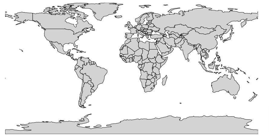
Below we have created a world map by giving world GeoDataFrame which we loaded earlier using geopandas. We have asked the chart to fill the color of each country with lightgrey color.
geoplot.polyplot(world, facecolor="lightgrey", figsize=(15, 8));
Simple US Map
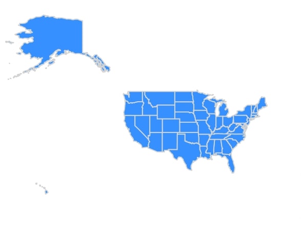
In this example, we have created a map of the US using polyplot() method. We have the first loaded dataset which has geospatial data of the US. We have loaded GeoJSON file as GeoDataFrame using geopandas. The link to the dataset is below.
We have then created the US map using GeoDataFrame. We have asked the method to fill polygons with dodgerblue color and the border color of the method is lightgrey. We have also used extent parameter specifying the bounding box of longitudes and latitudes for the US Map.
us_states_geo = gpd.read_file("datasets/us-states.json")

us_states_geo.head()
geoplot.polyplot(us_states_geo,
                 facecolor="dodgerblue", edgecolor="lightgrey",
                 linewidth=2.,
                 extent=(-172,0, 10,75), figsize=(15, 8));
Choropleth Maps
In this section, we'll introduce a method named choropleth() from geoplot which will let us create choropleth maps.
choropleth(df,projection=None,hue=None,cmap=None,norm=None,scheme=None,legend=None,legend_kwargs=None,legend_labels=None,legend_values=None,extent=None,figsize=(8,6),ax=None,kwargs) - This method takes as input GeoDataFrame as input and creates choropleth from it based on the value of parameter hue whose value will be used to color polygons of map.
- The hue parameter takes as input string column name from GeoDataFrame or geo series, iterable specifying values to be used to color polygons of the map. We can give a column name from GeoDataFrame which has continuous data or categorical data. It'll create a color bar for a continuous column and a categorical legend for a categorical column.
- The cmap parameter accepts matplotlib colormap name.
- The scheme parameter accepts instances of mapclassify specifying scheme to group geo data. We can also give the string to this parameter specifying the name of any class from mapclassify. It'll create an instance of that class with default parameters. Below are some of the classification schemes for choropleth maps.
- 'BoxPlot', 'EqualInterval', 'FisherJenks', 'FisherJenksSampled', 'HeadTailBreaks', 'JenksCaspall', 'JenksCaspallForced', 'JenksCaspallSampled', 'MaxP', 'MaximumBreaks', 'NaturalBreaks', 'Quantiles', 'Percentiles', 'StdMean'
- The legend parameter accepts boolean value specifying whether to include a legend or not.
- The legend_kwargs parameter accepts dictionary specifying options to modify the legend of the map.
- The legend_labels accepts list of string values for categorical legends. We can group map values using scheme parameter into groups and using this parameter we can give labels for each group that will be included in the map.
- The legend_values parameter accepts a list of values to be used for categorical legends.
- The extent, ax, projection and \*\*kwargs parameters works like polyplot() method we explained above.
Continent Choropleth Map
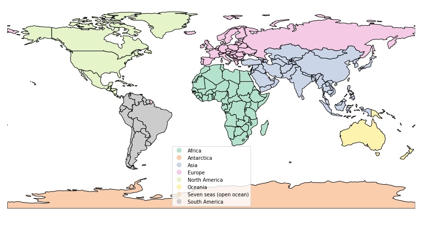
Below we have created our first choropleth map which highlights each continent using a different color. We have used world GeoDataFrame which we have loaded earlier to create a map. We have give hue parameter with column named continent from GeoDataFrame which is categorical column. We have instructed the method to use Pastel2 colormap for our purpose.
geoplot.choropleth(world, hue="continent", cmap="Pastel2", figsize=(15, 8), legend=True);
World Happiness Choropleth Map
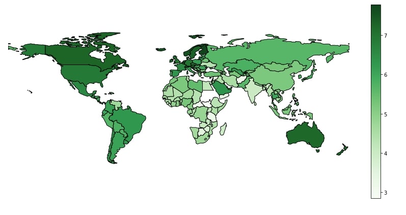
In this example, we have created a choropleth map using a continuous column of data. We have created a choropleth map showing the happiness scores of countries. We have used world happiness GeoDataFrame which we had created earlier by merging world GeoDataFrame with happiness pandas dataframe. We have instructed the method to use Score column of the dataframe to color polygons of the map. As Score is a continuous column, the map has created a color bar instead of showing categorical legend like the previous chart.
geoplot.choropleth(world_happiness, hue="Score", cmap="Greens", figsize=(15,7), legend=True);
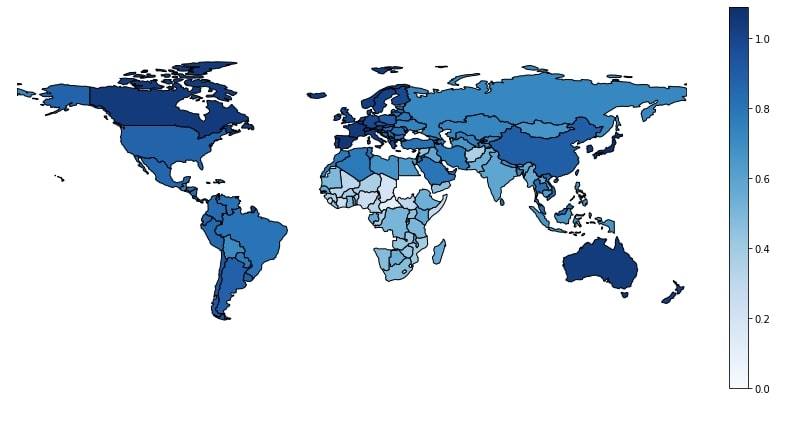
World Healthy Life Expectancy Choropleth Map
In this example, we have created another choropleth map showing healthy life expectancy across world countries.
geoplot.choropleth(world_happiness, hue="Healthy life expectancy", cmap="Blues", figsize=(15,7), legend=True);
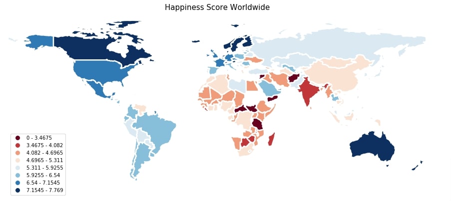
World Happiness Choropleth Map Categorical
In this example, we have explained how we can categorize the continuous column of GeoDataFrame. We have again created a choropleth map of the happiness score of countries but we have treated the happiness score column as categorical by using scheme parameter of choropleth() method. We have given it an instance of EqualInterval() with parameter k set to 8 which will divided values of happiness score columns into 8 equal clusters. We can notice in map legend the range of values covered in each cluster. This can be useful in a situation where we want to give a name to values that fall in particular ranges.
import mapclassify

geoplot.choropleth(world_happiness,
                   hue="Score",
                   scheme=mapclassify.EqualInterval(world_happiness["Score"], k=8),
                   cmap="RdBu", edgecolor="white", linewidth=2.5,
                   figsize=(15,7), legend=True);

plt.title("Happiness Score Worldwide", fontdict={"fontsize": 15}, pad=5);
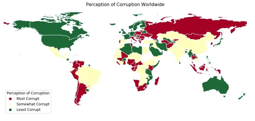
Perception of Corruption Choropleth Map
In this section, we have created another choropleth map explaining how we can categorize continuous columns of data. This time we have created a choropleth map using the perception of corruption column of data. We have using Quantiles scheme to cluster values of perception of corruption columns into three clusters. We have given legend labels to three clusters as most corrupt, somewhat corrupt, and least corrupt. We have also given a dictionary to legend_kwargs parameter specifying how to modify the look of legend.
import mapclassify


geoplot.choropleth(world_happiness,
                   hue="Perceptions of corruption",
                   scheme=mapclassify.Quantiles(world_happiness["Perceptions of corruption"], k=3),
                   cmap="RdYlGn", edgecolor="white",
                   legend_labels=["Most Corrupt", "Somewhat Corrupt", "Least Corrupt"],
                   legend_kwargs={"loc":"best",
                                  "fontsize": "large",
                                  "title":"Perception of Corruption",
                                  "title_fontsize":"large"},
                   figsize=(15,7), legend=True,
                  );

plt.title("Perception of Corruption Worldwide", fontdict={"fontsize": 15}, pad=5);
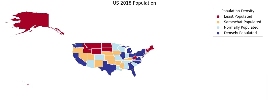
US 2018 Population Choropleth Map
In this example, we'll be creating another choropleth map showing the US population in 2018 per us states. We have loaded the dataset which has information about states from the below link.
We have then merged us states GeoDataFrame with us population pandas dataframe to create merged dataframe which we'll use to create choropleth map.
us_state_pop = pd.read_csv("datasets/State Populations.csv")

us_state_pop.head()
us_states_pop = us_states_geo.merge(us_state_pop, left_on="name", right_on="State")

us_states_pop.head()
Below we have created a choropleth map of the US state’s population. The population column has continuous data and we have categorized it using Quantiles scheme into 4 clusters. The clusters represents population as least populated, somewhat populated, normally populated and densely populated. These let us analyze which states are most populated and which are least.
import mapclassify

geoplot.choropleth(us_states_pop,
                   hue="2018 Population",
                   scheme=mapclassify.Quantiles(us_states_pop["2018 Population"], k=4),
                   cmap="RdYlBu", edgecolor="white",
                   extent=(-172,10, 10,75),
                   legend_labels=["Least Populated", "Somewhat Populated", "Normally Populated","Densely Populated"],
                   legend_kwargs={"loc":"best",
                                  "fontsize": "large",
                                  "title":"Population Density",
                                  "title_fontsize":"large"},
                   figsize=(16,8), legend=True);

plt.title("US 2018 Population", fontdict={"fontsize": 15}, pad=5);
This ends our small tutorial explaining how we can create choropleth maps using geoplot. Please feel free to let us know your views in the comments section. We have included links to tutorials on few more python libraries which also let us create choropleth maps. Please feel free to check them as well if you find them interesting.
References
- Maps using Plotnine (Choropleth, Scatter, and Bubble Maps)
- Choropleth Maps using ipyleaflet [Python]
- Choropleth Maps & Scatter Maps using cufflinks [Python]
- Interactive Choropleth Maps using bqplot [Python]
- Cartopy - Basic Maps [Scatter Map, Bubble Map and Connection Map]
- Plotting Maps using Bokeh [Python]
- ipyleaflet [Python] - Interactive Maps in Python based on leafletjs
- Folium - Interactive Maps [Python]
- How to Create Connection Map Chart in Python Jupyter Notebook [Plotly & Geopandas]?
- hvplot - How to Convert Static Python Maps (Geopandas) to Interactive Maps?
 Sunny Solanki
Sunny Solanki
Intro: Software Developer | Youtuber | Bonsai Enthusiast
About: Sunny Solanki holds a bachelor's degree in Information Technology (2006-2010) from L.D. College of Engineering. Post completion of his graduation, he has 8.5+ years of experience (2011-2019) in the IT Industry (TCS). His IT experience involves working on Python & Java Projects with US/Canada banking clients. Since 2020, he’s primarily concentrating on growing CoderzColumn.
His main areas of interest are AI, Machine Learning, Data Visualization, and Concurrent Programming. He has good hands-on with Python and its ecosystem libraries.
Apart from his tech life, he prefers reading biographies and autobiographies. And yes, he spends his leisure time taking care of his plants and a few pre-Bonsai trees.
Contact: sunny.2309@yahoo.in


![YouTube Subscribe]() Comfortable Learning through Video Tutorials?
Comfortable Learning through Video Tutorials?
If you are more comfortable learning through video tutorials then we would recommend that you subscribe to our YouTube channel.
![Need Help]() Stuck Somewhere? Need Help with Coding? Have Doubts About the Topic/Code?
Stuck Somewhere? Need Help with Coding? Have Doubts About the Topic/Code?
 Stuck Somewhere? Need Help with Coding? Have Doubts About the Topic/Code?
When going through coding examples, it's quite common to have doubts and errors.
If you have doubts about some code examples or are stuck somewhere when trying our code, send us an email at coderzcolumn07@gmail.com. We'll help you or point you in the direction where you can find a solution to your problem.
You can even send us a mail if you are trying something new and need guidance regarding coding. We'll try to respond as soon as possible.
![Share Views]() Want to Share Your Views? Have Any Suggestions?
Want to Share Your Views? Have Any Suggestions?
 Want to Share Your Views? Have Any Suggestions?
If you want to
- provide some suggestions on topic
- share your views
- include some details in tutorial
- suggest some new topics on which we should create tutorials/blogs
 geoplot, choropleth-maps