How to create a dashboard using Python(Matplotlib and Panel)
Table of Contents
- Introduction
- 1. Creating Individual Plot
- 2. Merging Plots into Single Figure
- 3. Creating First Dashboard
- 4. Organizing Components of Dashboard
- 5. Recreating Dashboard with Individual Components
- 6. How to keep a server running indefinitely?
- References
Introduction 
Dashboards are quite common nowadays as many people are sharing interactive dashboards to share information. There are lots of options to create dashboards like Tableau, Power BI, d3.js, react.js which are tools or based on javascript which will require an additional learning curve.
But what if you are a python developer and already experienced with python plotting libraries like matplotlib, bokeh, seaborn, plotly, etc who want to create dashboard using only python without learning javascript or new tools?.
We'll help you with that. We have designed this tutorial to get you started with developing a dashboard using matplotlib and a very interesting dashboard creation library Panel. We'll be providing step by step guide about creating a dashboard using only python which will have plots along with widgets to interact. Our tutorials will make use of a scikit-learn breast cancer dataset for plotting graphs. So let's get started without wasting time further.
We'll start with loading libraries like scikit-learn, pandas, numpy.
import sklearn
import numpy as np
import pandas as pd
from sklearn.datasets import load_breast_cancer

import matplotlib.pyplot as plt

pd.set_option("display.max_columns", 32)
Loading Breast Cancer Dataset
We'll start loading breast cancer datasets available from scikit-learn. We suggest that you read about the dataset further over here) to get an idea about data. The dataset contains 30 features and a target variable telling whether a tumor is malignant(Class-0) or benign(Class-1). We'll be keeping breast cancer data as a pandas dataframe so that it becomes easily available as well as easy to manipulate.
breast_cancer = load_breast_cancer()

print("Feature Names", breast_cancer.feature_names)
print("Target : ", breast_cancer.target_names)
print("Dataset Size : ", breast_cancer.data.shape)

breast_cancer_df = pd.DataFrame(breast_cancer.data, columns=breast_cancer.feature_names)
breast_cancer_df["Target"] = breast_cancer.target
breast_cancer_df["Target"] = ['Malignant' if typ==0 else 'Benign' for typ in breast_cancer_df["Target"]]
breast_cancer_df.head()
1. Creating Individual Plot 
We'll be creating the first various types of individual plots first before merging them to create a dashboard.
- Scatter Plot showing a relationship between 2 features color-encoded by target(malignant/benign).
- Bar chart showing average feature value by target(malignant/benign).
- Histogram showing the distribution of a single feature.
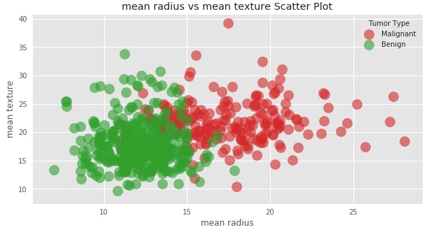
1.1 Scatter Plot showing relationship between 2 features color-encoded by target(malignant/benign). 
Our first plot consists of a simple scatter plot that shows a relationship between 2 variables. We'll be drawing a scatter plot of mean radius versus mean texture. We have even color-encoded each point according to tumor type(Malignant/Benign).
with plt.style.context(("seaborn","ggplot")):
    color = {"Malignant" : "tab:red", "Benign":"tab:green"}
    plt.figure(figsize=(10,5))
    for tumor_typ in breast_cancer_df["Target"].unique():
        plt.scatter(breast_cancer_df[breast_cancer_df["Target"]==tumor_typ]["mean radius"],
                    breast_cancer_df[breast_cancer_df["Target"]==tumor_typ]["mean texture"],
                    c=color[tumor_typ],
                    s=200,
                    alpha=0.6,
                    label=tumor_typ)
    plt.xlabel("mean radius")
    plt.ylabel("mean texture")
    plt.title("mean radius vs mean texture Scatter Plot")
    plt.legend(title="Tumor Type",loc="best")
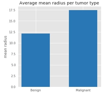
1.2. Bar chart showing average feature value by target(malignant/benign). 
Our second plot is easy bar chart. Here we are taking average of mean radius for both tumor types(Malignant & Benign). This will let us know average radius for malignant tumor as well as benign tumor.
with plt.style.context(("seaborn","ggplot")):
    avg_radius_per_tumor_typ = breast_cancer_df.groupby(by="Target").mean()[["mean radius"]]

    plt.figure(figsize=(5,5))
    plt.bar(avg_radius_per_tumor_typ.index,
            avg_radius_per_tumor_typ["mean radius"],
            color="tab:blue",
            width=0.6)
    plt.ylabel("mean radius")
    plt.title("Average mean radius per tumor type")
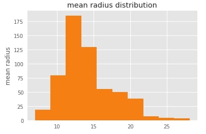
1.3. Histogram showing distribution of a single feature. 
Our 3rd plot is simple histogram of mean radius which shows distribution of mean radius values.
with plt.style.context(("seaborn","ggplot")):
    plt.figure(figsize=(6,4))
    plt.hist(breast_cancer_df["mean radius"], color="tab:orange", )
    plt.ylabel("mean radius")
    plt.title("mean radius distribution")
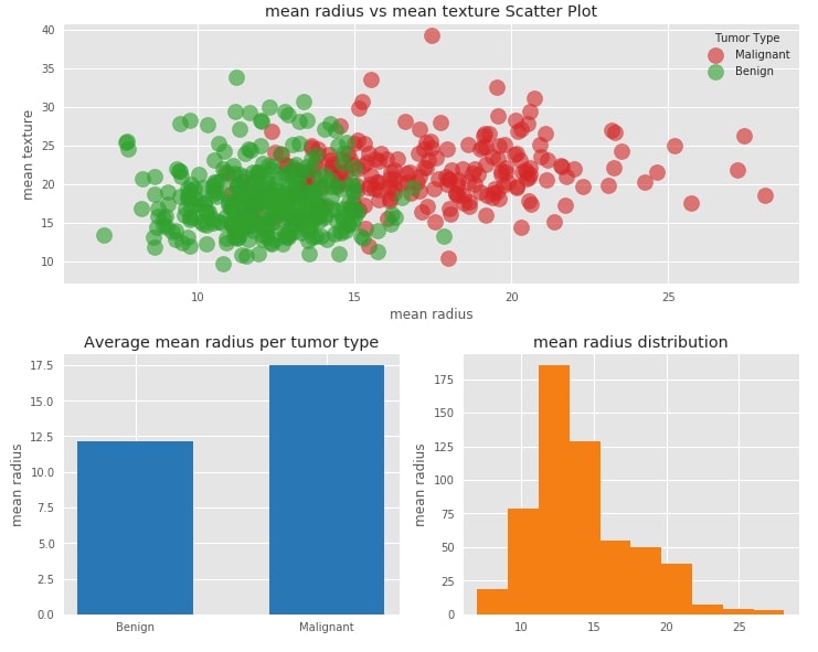
2. Merging Plots into Single Figure 
We'll now merge all of individual graph plotted above to create combined figure with all graphs. It's how our dashboard will look in future. Currently it's static but when we'll convert it to dashboard, we'll have widgets which will let us modify graphs.
We are using matplotlib.gridspec to create layout of our figure.
import matplotlib.gridspec as gridspec

def create_figure(plot1_f1,plot1_f2, plot2_f,plot3_f):
    with plt.style.context(("seaborn","ggplot")):
        fig = plt.figure(constrained_layout=True, figsize=(10,8))
        specs = gridspec.GridSpec(ncols=2, nrows=2, figure=fig) ## Declaring 2x2 figure.

        ax1 = fig.add_subplot(specs[0, :]) ## First Row
        ax2 = fig.add_subplot(specs[1, 0]) ## Second Row First Column
        ax3 = fig.add_subplot(specs[1, 1]) ## Second Row Second Colums

        ## First Graph -  Scatter Plot
        color = {"Malignant" : "tab:red", "Benign":"tab:green"}
        for tumor_typ in breast_cancer_df["Target"].unique():
            ax1.scatter(breast_cancer_df[breast_cancer_df["Target"]==tumor_typ][plot1_f1],
                        breast_cancer_df[breast_cancer_df["Target"]==tumor_typ][plot1_f2],
                        c=color[tumor_typ],
                        s=200,
                        alpha=0.6,
                        label=tumor_typ)
        ax1.set_xlabel(plot1_f1)
        ax1.set_ylabel(plot1_f2)
        ax1.set_title("%s vs %s Scatter Plot"%(plot1_f1, plot1_f2))
        ax1.legend(title="Tumor Type",loc="best")

        ## Second Graph - Bar Chart
        avg_radius_per_tumor_typ = breast_cancer_df.groupby(by="Target").mean()[[plot2_f]]
        ax2.bar(avg_radius_per_tumor_typ.index,
                avg_radius_per_tumor_typ[plot2_f],
                color="tab:blue",
                width=0.6)
        ax2.set_ylabel(plot2_f)
        ax2.set_title("Average %s per tumor type"%(plot2_f))

        ## Third Graph - Histogram
        ax3.hist(breast_cancer_df[plot3_f], color="tab:orange", )
        ax3.set_ylabel(plot3_f)
        ax3.set_title("%s distribution"%(plot3_f))

        plt.close(fig)
        return fig
create_figure("mean radius", "mean texture", "mean radius", "mean radius")
3. Creating First Dashboard 
After going through above figure, we can clearly see the limits if we want to do further analysis. It's static figure. It does not let us analyze relationship between various features or see distribution of various features. We'll have to make code changes everytime if we want to analyze different attributes.
But what if we can create dashboard which can let us select attributes and based on that selection display updated graphs?
Thankfully, we have library called panel which makes our work quite easy to create dashboard. We'll start loading panel by importing it and then calling it's extension() method to load it. We'll then create dictionary which will have list of possible values for all parameters of create_figure() method. We can then convert our simple create_figure() function into dashboard by just calling pn.interact() method on it passing dictionary of all possible parameter values.
import panel as pn
pn.extension()

kw = dict(plot1_f1=breast_cancer.feature_names,
          plot1_f2=breast_cancer.feature_names,
          plot2_f=breast_cancer.feature_names,
          plot3_f=breast_cancer.feature_names)

dash1 = pn.interact(create_figure, **kw)
dash1
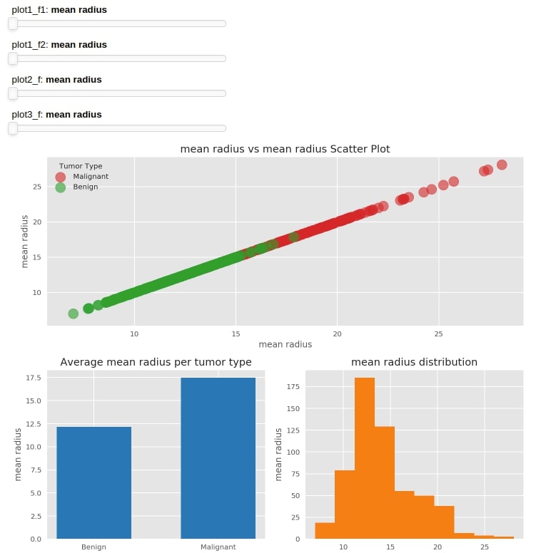
We can see above that the pn.interact() method is creating slider for all list of parameter values passed to it and keeping all of them first before graphs. One now change values by sliding sliders and see that graphs are updated as well.
NOTE
Please make a note that dashboard will be static here. It'll be interactive when you run it on your machine.It requires back-end running to retrieve results according to changes in widget value.
NOTE: Please make a not that interact() method layouts widgets/figures according to it's choice which we can modify according to our needs.
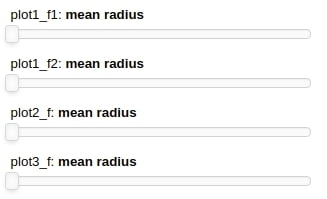
4. Organizing Components of Dashboard 
As we are done with the creation of our first dashboard, we would like to dig deep further and look into a dashboard object to understand it further. We'll print dash1 to see what it consist of.
print(dash1)
We can clearly see that it consist of a Column component which consists of 2 components(Column & Row). We can see that all widgets which are sliders in our case by default are part of the inner Column and Figure is part of the inner Row object. We can print individual components as well.
dash1[0]
dash1[1]
Now that we are well aware of individual components of the dashboard, we'll now try to organize it properly which can improve the look of the dashboard. We'll create a Column object with 3 components (Row, Row & Matplotlib Plot). First Row will hold two parameters responsible for the scatter plot. Second Row will hold parameters for bar chart and histogram.
dash2 = pn.Column(
                    pn.Row(dash1[0][0],dash1[0][1], align="center"),
                    pn.Row(dash1[0][2],dash1[0][3], align="center"),
                    dash1[1]
                 )
dash2
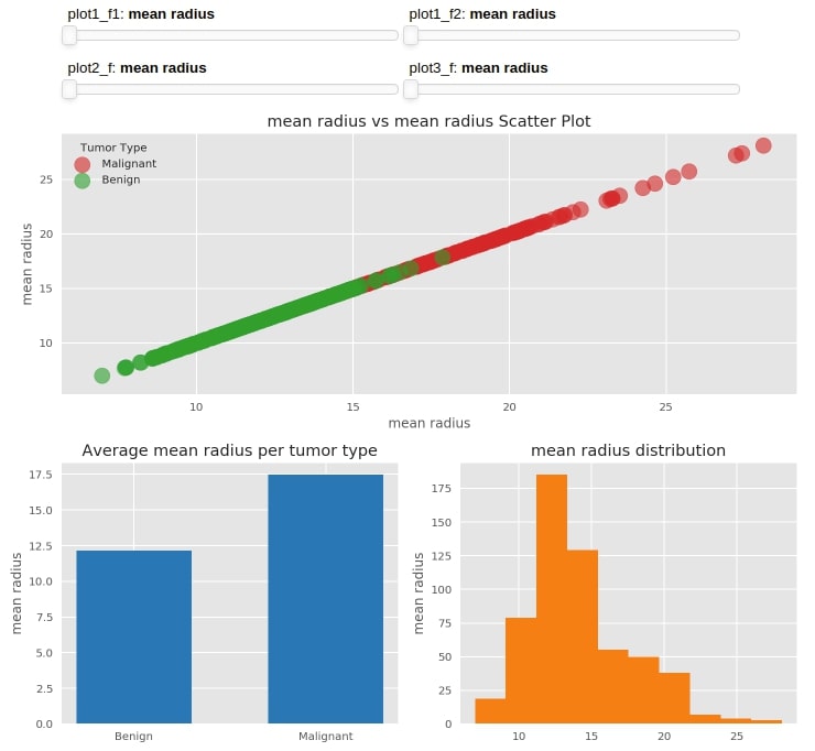
5. Recreating Dashboard with Individual Components 
We can clearly see from the above dashboard that slider widgets are not an ideal choice for a list of string values. interact() function by default is creating sliders for our list of features.
What if we want to modify this and want Dropdown instead of sliders as it would be a better choice for selection?
We can do that using the widgets module of panel. panel provides us with a list of widgets like sliders, radio boxes, checkboxes, integer slider, float slider, etc. We can create widgets according to our choice and link it to the parameter of our method.
import panel.widgets as pnw
We'll start by creating 4 dropdowns each of which will have all features as options. We also have given names to each dropdown about which parameter it belongs to.
f1 = pnw.Select(options=list(breast_cancer.feature_names), name="Scatter Plot Feature 1")
f2 = pnw.Select(options=list(breast_cancer.feature_names), name="Scatter Plot Feature 2")
f3 = pnw.Select(options=list(breast_cancer.feature_names), name="Bar Chart Feature")
f4 = pnw.Select(options=list(breast_cancer.feature_names), name="Histogram Feature")
We can link the above-mentioned widgets to a parameter of our method by creating wrapper function around it and giving it decorator(@pn.depends) as mentioned below. It'll link the value of these widgets with a value of a function.
@pn.depends(f1.param.value,f2.param.value,f3.param.value,f4.param.value)
def create_dash(f1,f2,f3,f4):
    return create_figure(f1,f2,f3,f4)
heading = "<h3>Breast Cancer Data Analysis Dashboard</h3>\nPlease feel free to try various combinations of parameters to analyze results from different angles"
text = pnw.StaticText(value=heading, align="center")

dash3 = pn.Column(
                    text,
                    pn.Row(f1,f2, align="center"),
                    pn.Row(f3,f4, align="center"),
                    pn.Row(create_dash)
                )
dash3
print(dash3)
We can start the dashboard by calling method show() on dashboard object and it'll start dashboard in a new window on localhost. It accepts arguments like port(integer) and websocket_origin(str of list str which tells us which hosts can connect to the WebSocket).
dash3.show()
6. How to keep a server running indefinitely? 
We can declare the dashboard object as servable by calling the servable() method on it which will mark it to serve. We can then go to a command line and run a notebook using the panel command which will keep running it indefinitely.
panel serve --show dash.ipynb
dash3.servable()
We can even save the dashboard as html or png files by calling save() method and passing the filename to it.
dash3.save("dash.html")
dash3.save("dash.png")
This concludes our tutorial on creating a dashboard using matplotlib. Our main aim of creating this tutorial was to give people intro on how to create a basic interactive dashboard using matplotlib and panel. This kind of dashboard can be easily deployed using a flask server and made available to everyone on the internet to explore analysis.
NOTE
Please make a note that panel supports a majority of python plotting libraries like matplotlib, seaborn, plotly, holeviews, bokeh, etc. We have covered dashboard creation with matplotlib in this tutorial. We'll in future create tutorials about other libraries as well.
References 
 Sunny Solanki
Sunny Solanki
Intro: Software Developer | Youtuber | Bonsai Enthusiast
About: Sunny Solanki holds a bachelor's degree in Information Technology (2006-2010) from L.D. College of Engineering. Post completion of his graduation, he has 8.5+ years of experience (2011-2019) in the IT Industry (TCS). His IT experience involves working on Python & Java Projects with US/Canada banking clients. Since 2020, he’s primarily concentrating on growing CoderzColumn.
His main areas of interest are AI, Machine Learning, Data Visualization, and Concurrent Programming. He has good hands-on with Python and its ecosystem libraries.
Apart from his tech life, he prefers reading biographies and autobiographies. And yes, he spends his leisure time taking care of his plants and a few pre-Bonsai trees.
Contact: sunny.2309@yahoo.in


![YouTube Subscribe]() Comfortable Learning through Video Tutorials?
Comfortable Learning through Video Tutorials?
If you are more comfortable learning through video tutorials then we would recommend that you subscribe to our YouTube channel.
![Need Help]() Stuck Somewhere? Need Help with Coding? Have Doubts About the Topic/Code?
Stuck Somewhere? Need Help with Coding? Have Doubts About the Topic/Code?
 Stuck Somewhere? Need Help with Coding? Have Doubts About the Topic/Code?
When going through coding examples, it's quite common to have doubts and errors.
If you have doubts about some code examples or are stuck somewhere when trying our code, send us an email at coderzcolumn07@gmail.com. We'll help you or point you in the direction where you can find a solution to your problem.
You can even send us a mail if you are trying something new and need guidance regarding coding. We'll try to respond as soon as possible.
![Share Views]() Want to Share Your Views? Have Any Suggestions?
Want to Share Your Views? Have Any Suggestions?
 Want to Share Your Views? Have Any Suggestions?
If you want to
- provide some suggestions on topic
- share your views
- include some details in tutorial
- suggest some new topics on which we should create tutorials/blogs
 panel, matplotlib