Simple Guide to use Bokeh Widgets (Interactive GUI / Apps)
Python has a bunch of libraries (bokeh, plotly, altair, bqplot, etc.) that let us create interactive charts.
But just having simple interactivity like a tooltip, zooming, panning, etc are not enough all time.
When analyzing data from a different perspective we can add another level of interactivity by adding widgets to our chart. With the help of widgets, we can modify existing charts to analyze data from different perspectives rather than coding new charts for different combinations.
Adding widgets to our chart let us create interactive GUIs which we can deploy online for others to analyze data. It is commonly referred to as a dashboard.
What Can You Learn From This Article?
As a part of this tutorial, we have explained how we can create interactive GUIs by linking charts and widgets available from bokeh. Tutorial explains different widgets like dropdowns, checkboxes, radio buttons, date pickers, sliders, etc with simple and easy-to-understand examples. Tutorial uses python callbacks for making changes to charts when widget state changes instead of javascript callbacks.
If you are someone who is new to creating charts using bokeh then please check below link. It covers a detailed guide to bokeh for someone who is new to the library.
Below, we have listed important sections of tutorial to give an overview of the material covered.
Important Sections Of Tutorial
- Scatter Plot With Dropdowns
- Scatter Plot with Dropdowns & Checkboxes
- Scatter Plot with Dropdowns & Radio Buttons
- Candlestick Chart with Date Pickers
- Candlestick Chart with Date Range Slider
- Line Chart with Sliders
- Scatter Chart with Multi-Select (Multi-Choice)
Below, we have imported Python library bokeh and printed the version that we have used in our tutorial.
import bokeh

print("Bokeh Version : {}".format(bokeh.__version__))
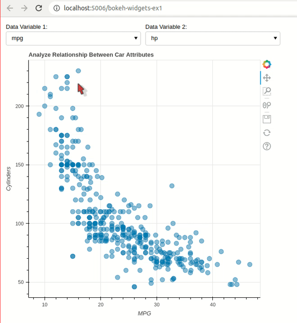
Example 1: Scatter Plot With Dropdowns 
In this example, we have explained how we can create an interactive GUI using bokeh widgets dropdown.
Our GUI consists of two dropdowns and one scatter plot. The dropdowns let us select columns from our autompg dataset and scatter chart shows relationship between them. Auto mpg dataset has information (like mpg, cylinders, horsepower, acceleration, etc.) about various car models.
In order to create GUI, we have first created a scatter chart showing a relationship between mpg and horsepower. These will be default columns.
After creating chart, we have declared two dropdowns using Select() constructor available from models sub-module of bokeh. We have given dropdown options through options parameter of constructor.
Next, we have defined call-back functions and registered them with dropdowns so that they get called each time there is change in value of dropdowns.
We need to declare callback function with three parameters.
- attr - Attribute of widget that we are monitoring. In our case, we are monitoring value attribute of dropdown. Whenever we change dropdown option, this attribute changes and it calls callback.
- old - Old value of an attribute.
- new - New value of an attribute.
Our callback functions simply replace x and y-axis values for chart. This will replace old column name with new column name and chart will be updated.
We have registered callbacks with 'value' attribute by calling on_change() method of dropdown. This will execute that callback when value attribute of dropdown changes.
After creating a chart and defining widgets, we have created a GUI using column() and row() functions of bokeh.plotting module. We have laid two dropdowns next to each other and chart below them to create GUI.
At last, we have added the whole GUI to page by calling add_root() method on curdoc() function.
## bokeh-widgets-ex1.py
import bokeh
from bokeh import models
from bokeh.plotting import figure, curdoc, column, row
from bokeh.io import show
from bokeh.sampledata.autompg import autompg_clean as autompg

## Scatter Plot
fig = figure(title="Analyze Relationship Between Car Attributes")

scatter= fig.scatter(x="mpg", y="hp",
                    size=10, alpha=0.5,
                    source=autompg)

fig.xaxis.axis_label="MPG"
fig.yaxis.axis_label="Cylinders"

## Create Widgets
cols = ["mpg", "cyl", "displ", "hp", "weight", "accel", "yr"]

drop1 = models.Select(title="Data Variable 1:", value=cols[0], options=cols)
drop2 = models.Select(title="Data Variable 2:", value=cols[3], options=cols)

## Define Callbacks
def modify_chart1(attr, old, new):
    scatter.glyph.x = new
    fig.xaxis.axis_label = new.capitalize()

def modify_chart2(attr, old, new):
    scatter.glyph.y = new
    fig.yaxis.axis_label = new.capitalize()

## Register Callbacks with Widgets
drop1.on_change("value", modify_chart1)
drop2.on_change("value", modify_chart2)

## Create GUI
GUI = column(row(drop1, drop2), fig)

curdoc().add_root(GUI)
We have saved code of our interactive GUI in bokeh-widgets-ex1.py file and executed it using below command in shell / command prompt.
bokeh serve --show bokeh-widgets-ex1.py
This will start bokeh server at URL http://localhost:5006/bokeh-widgets-ex1. We can then open this URL in a browser and it'll start our interactive bokeh app.
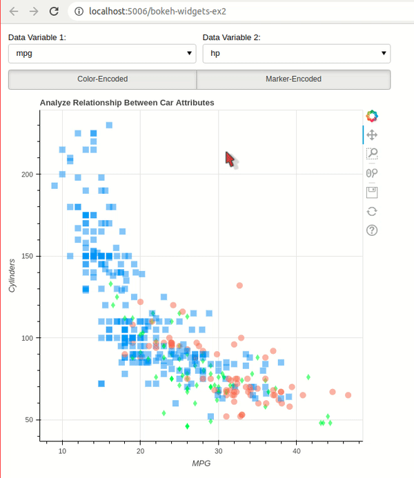
Example 2: Scatter Plot with Dropdowns & Checkboxes 
As a part of our second example, we have built on top of our previous example and added checkboxes widgets for more interactivity.
We have built a scatter chart showing relationship between two columns of autompg dataset like previous example. This time, we have color-encoded and marker-encoded points of a chart based on the origin of the car (north America, Europe, and Asia).
In order to color-encode and marker-encode scatter chart, we have added two columns to dataframe that is mapping color and marker based on origin of car model.
Then, we have created a scatter chart and declared two dropdowns like our previous examples.
After declaring dropdowns, we have created checkboxes using CheckboxButtonGroup() constructor. It'll be displayed like toggle buttons. By default, both color-encoded and marker-encoded options are checked.
Then, we have declared callbacks for all three widgets and registered them. The callback function for checkboxes checks which options are set and based on that checks / unchecks checkboxes.
This time we have laid out checkboxes below dropdown in GUI.
## bokeh-widgets-ex2.py
import bokeh
from bokeh import models
from bokeh.plotting import figure, curdoc, column, row
from bokeh.sampledata.autompg import autompg_clean as autompg

## Color & Marker Mappings
colors = ["dodgerblue", "tomato", "lime"]
color_mapping = dict(zip(autompg.origin.unique(), colors))
autompg["color"] = [color_mapping[origin] for origin in autompg.origin]

markers = ["square", "circle", "diamond"]
marker_mapping = dict(zip(autompg.origin.unique(), markers))
autompg["marker"] = [marker_mapping[origin] for origin in autompg.origin]

## Scatter Plot
fig = figure(title="Analyze Relationship Between Car Attributes")

scatter= fig.scatter(x="mpg", y="hp",
                     marker="marker", color="color",
                     line_width=0, size=10, alpha = 0.5,
                     source=autompg)

fig.xaxis.axis_label="MPG"
fig.yaxis.axis_label="Cylinders"

## Create Widgets
cols = ["mpg", "cyl", "displ", "hp", "weight", "accel", "yr"]

drop1 = models.Select(title="Data Variable 1:", value=cols[0], options=cols)
drop2 = models.Select(title="Data Variable 2:", value=cols[3], options=cols)


checkbox_button_group = models.CheckboxButtonGroup(labels=["Color-Encoded", "Marker-Encoded"], active=[0,1])


## Define Callbacks
def modify_chart1(attr, old, new):
    scatter.glyph.x = new
    fig.xaxis.axis_label = new.capitalize()

def modify_chart2(attr, old, new):
    scatter.glyph.y = new
    fig.yaxis.axis_label = new.capitalize()

def modify_chart3(attr, old, new):
    color_encoded = True if 0 in new else False
    marker_encoded = True if 1 in new else False

    if color_encoded and marker_encoded:
        scatter.glyph.fill_color = "color"
        scatter.glyph.marker = "marker"
    elif color_encoded:
        scatter.glyph.fill_color = "color"
        scatter.glyph.marker = "circle"
    elif marker_encoded:
        scatter.glyph.marker = "marker"
        scatter.glyph.fill_color = "dodgerblue"
    else:
        scatter.glyph.fill_color = "dodgerblue"
        scatter.glyph.marker = "circle"

## Register Callbacks with Widgets
drop1.on_change("value", modify_chart1)
drop2.on_change("value", modify_chart2)

checkbox_button_group.on_change("active", modify_chart3)

## Create GUI
GUI = column(column(row(drop1, drop2), checkbox_button_group), fig)

curdoc().add_root(GUI)
We have saved code of our interactive bokeh app in bokeh-widgets-ex2.py file and executed it using below command in shell / command prompt.
bokeh serve --show bokeh-widgets-ex2.py
Example 3: Scatter Plot with Dropdowns & Radio Buttons 
As a part of our third example, we have explained how we can use radio button widgets available from bokeh. We have created a scatter chart showing relationship between columns of auto mpg like our previous example. We are using radio buttons to filter data and show data points of one particular region or all-region.
We have created a scatter chart and dropdowns like our previous example. Then, we have created radio buttons using RadioButtonGroup() constructor. It has 4 options (All and three regions (North America, Asia & Europe)).
Callback linked to radio buttons simple filter auto mpg dataset based on selected region.
## bokeh-widgets-ex3.py
import bokeh
from bokeh import models
from bokeh.plotting import figure, curdoc, column, row
from bokeh.sampledata.autompg import autompg_clean as autompg

## Color & Marker Mappings
colors = ["dodgerblue", "tomato", "lime"]
color_mapping = dict(zip(autompg.origin.unique(), colors))
autompg["color"] = [color_mapping[origin] for origin in autompg.origin]

markers = ["square", "circle", "diamond"]
marker_mapping = dict(zip(autompg.origin.unique(), markers))
autompg["marker"] = [marker_mapping[origin] for origin in autompg.origin]

## Scatter Plot
fig = figure(title="Analyze Relationship Between Car Attributes")

scatter= fig.scatter(x="mpg", y="hp",
                     marker="marker", color="color",
                     line_width=0, size=10, alpha = 0.5,
                     source=autompg)

fig.xaxis.axis_label="MPG"
fig.yaxis.axis_label="Cylinders"

## Create Widgets
cols = ["mpg", "cyl", "displ", "hp", "weight", "accel", "yr"]

drop1 = models.Select(title="Data Variable 1:", value=cols[0], options=cols)
drop2 = models.Select(title="Data Variable 2:", value=cols[3], options=cols)

origins = ["All", ] + autompg.origin.unique().tolist()
origin_mapping = dict(zip(range(4), origins))
checkbox_button_group = models.RadioButtonGroup(labels=origins, active=0)


## Define Callbacks
def modify_chart1(attr, old, new):
    scatter.glyph.x = new
    fig.xaxis.axis_label = new.capitalize()

def modify_chart2(attr, old, new):
    scatter.glyph.y = new
    fig.yaxis.axis_label = new.capitalize()

def modify_chart3(attr, old, new):
    if new == 0:
        scatter.data_source.data = autompg
    else:
        scatter.data_source.data = autompg[autompg["origin"] == origin_mapping[new]]

## Register Callbacks with Widgets
drop1.on_change("value", modify_chart1)
drop2.on_change("value", modify_chart2)

checkbox_button_group.on_change("active", modify_chart3)

## Create GUI
GUI = column(column(row(drop1, drop2), checkbox_button_group), fig)

curdoc().add_root(GUI)
We have saved code of our interactive bokeh app in bokeh-widgets-ex3.py file and executed it using below command in shell / command prompt.
bokeh serve --show bokeh-widgets-ex3.py

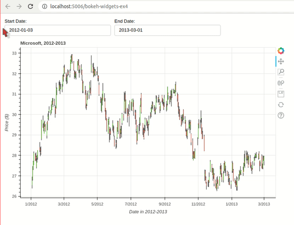
Example 4: Candlestick Chart with Date Pickers 
As a part of our fourth example, we have explained how to use date picker widget available from bokeh to filter candlesticks based on the date range.
We have created a candlestick chart using Microsoft stock dataset available from bokeh.
Then, we have created a date picker for selecting start and end dates of candlestick chart. We can filter date range for candlestick chart using these date pickers.
After defining widgets, we have created callback functions that get called whenever someone selects date from date pickers. They simply filter original dataframe based on a selected date range.
If you want to learn how to create candlestick charts using bokeh then please feel free to check below tutorial. It covers various ways to create candlestick charts using bokeh.
## bokeh-widgets-ex4.py
import bokeh
from bokeh import models
from bokeh.plotting import figure, curdoc, column, row
from bokeh.sampledata.stocks import MSFT

import pandas as pd
from datetime import datetime

msft_df = pd.DataFrame(MSFT)
msft_df["date"] = pd.to_datetime(msft_df["date"])
##Keeping data post 2012 for simplicity
msft_df = msft_df[msft_df["date"] > datetime(2012,1,1)].reset_index()

## Create Candlestick Charts
inc = msft_df.close > msft_df.open
dec = msft_df.open > msft_df.close

w = 12*60*60*1000

fig = figure(x_axis_type="datetime", plot_width=800, plot_height=500, title = "Microsoft, 2012-2013")

segments = fig.segment("date", "high", "date", "low", color="black", source=msft_df)

green_patterns = fig.vbar("date", w, "open", "close", fill_color="lawngreen", line_width=0,
                          source=msft_df[inc])

red_patterns = fig.vbar("date", w, "open", "close", fill_color="tomato", line_width=0,
                        source=msft_df[dec])

fig.xaxis.axis_label="Date in 2012-2013"
fig.yaxis.axis_label="Price ($)"


## Define Widgets
min_date = str(msft_df.date[0]).split(" ")[0]
max_date = str(msft_df.date[len(msft_df)-1]).split(" ")[0]

start_date_picker = models.DatePicker(title="Start Date: ", value=min_date, min_date=min_date, max_date=max_date)
end_date_picker = models.DatePicker(title="End Date: ", value=max_date, min_date=min_date, max_date=max_date)

## Define Callbacks

def modiy_chart(start_date, end_date):
    msft_intermediate = msft_df[(msft_df["date"] >= start_date) & (msft_df["date"] <= end_date)]

    inc = msft_intermediate.close > msft_intermediate.open
    dec = msft_intermediate.open > msft_intermediate.close

    segments.data_source.data = msft_intermediate
    green_patterns.data_source.data = msft_intermediate[inc]
    red_patterns.data_source.data = msft_intermediate[dec]

def start_date_modified(attr, old, new):
    year, month, day = map(int, new.split("-"))
    start_date = datetime(year, month, day)
    year, month, day = map(int, end_date_picker.value.split("-"))
    end_date = datetime(year, month, day)

    modiy_chart(start_date, end_date)


def end_date_modified(attr, old, new):
    year, month, day = map(int, start_date_picker.value.split("-"))
    start_date = datetime(year, month, day)
    year, month, day = map(int, new.split("-"))
    end_date = datetime(year, month, day)

    modiy_chart(start_date, end_date)

## Register Callbacks with Widgets
start_date_picker.on_change("value", start_date_modified)
end_date_picker.on_change("value", end_date_modified)


## Create GUI
GUI = column(row(start_date_picker, end_date_picker), fig)

curdoc().add_root(GUI)
We have saved code of our interactive bokeh app in bokeh-widgets-ex4.py file and executed it using below command in shell / command prompt.
bokeh serve --show bokeh-widgets-ex4.py
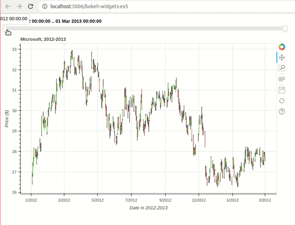
Example 5: Candlestick Chart with Date Range Slider 
As a part of our fifth example, we have explained how we can use date range slider widget available from bokeh. We are using a date range slider to select a date range for candlestick chart. We have created candlestick chart like our previous example with only change being that we are using date range slider to filter data instead of date pickers like our previous example.
We have created date range slider using DatetimeRangeSlider() constructor available from bokeh.
## bokeh-widgets-ex5.py
import bokeh
from bokeh import models
from bokeh.plotting import figure, curdoc, column, row
from bokeh.sampledata.stocks import MSFT

import pandas as pd
from datetime import datetime, date

msft_df = pd.DataFrame(MSFT)
msft_df["date"] = pd.to_datetime(msft_df["date"])
##Keeping data post 2010 for simplicity
msft_df = msft_df[msft_df["date"] > datetime(2012,1,1)].reset_index()

## Create Candlestick Charts
inc = msft_df.close > msft_df.open
dec = msft_df.open > msft_df.close

w = 12*60*60*1000

fig = figure(x_axis_type="datetime", plot_width=800, plot_height=500, title = "Microsoft, 2012-2013")

segments = fig.segment("date", "high", "date", "low", color="black", source=msft_df)

green_patterns = fig.vbar("date", w, "open", "close", fill_color="lawngreen", line_width=0,
                          source=msft_df[inc])

red_patterns = fig.vbar("date", w, "open", "close", fill_color="tomato", line_width=0,
                        source=msft_df[dec])

fig.xaxis.axis_label="Date in 2012-2013"
fig.yaxis.axis_label="Price ($)"


## Define Widgets
min_date = str(msft_df.date[0]).split(" ")[0]
max_date = str(msft_df.date[len(msft_df)-1]).split(" ")[0]

date_range_slider = models.DatetimeRangeSlider(value=(min_date, max_date), start=min_date, end=max_date)

## Define Callbacks
def modiy_chart(start_date, end_date):
    msft_intermediate = msft_df[(msft_df["date"] >= start_date) & (msft_df["date"] <= end_date)]

    inc = msft_intermediate.close > msft_intermediate.open
    dec = msft_intermediate.open > msft_intermediate.close

    segments.data_source.data = msft_intermediate
    green_patterns.data_source.data = msft_intermediate[inc]
    red_patterns.data_source.data = msft_intermediate[dec]

def date_range_modified(attr, old, new):
    start_date = datetime.fromtimestamp(new[0]/1000)
    end_date = datetime.fromtimestamp(new[1]/1000)

    modiy_chart(start_date, end_date)


## Register Callbacks with Widgets
date_range_slider.on_change("value", date_range_modified)


## Create GUI
GUI = column(date_range_slider, fig)

curdoc().add_root(GUI)
We have saved code of our interactive bokeh app in bokeh-widgets-ex5.py file and executed it using below command in shell / command prompt.
bokeh serve --show bokeh-widgets-ex5.py
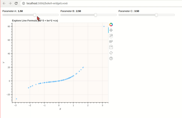
Example 6: Line Chart with Sliders 
As a part of our sixth example, we have explained how we can use float slider widget available from bokeh. We have created a simple scatter chart showing line formula (ax^3 + bx^2 + cx) that has 3 main parameters (a,b & c). The values of these 3 parameters can be changed using float sliders.
We have created float sliders using Slider() constructor available from models sub-module of bokeh.
## bokeh-widgets-ex6.py
import bokeh
from bokeh import models
from bokeh.plotting import figure, curdoc, column, row

import numpy as np

x = np.random.randn(100)

## Create Chart
fig = figure(width=600, height=500, title="Explore Line Formula (ax^3 + bx^2 +cx)",
             background_fill_color="snow"
             )

## Evaluate Line Formula
a,b,c = 1.5, 2.5, 3.5
y = a*x**3 + b*x**2 + c*x

formula_line = fig.circle(x=x, y=y, fill_color="white", color="dodgerblue")

fig.xaxis.axis_label="X"
fig.yaxis.axis_label="Y"

## Define Widgets
slider_a = models.Slider(start=-10., end=10., value=1.5, step=.1, title="Parameter A:")
slider_b = models.Slider(start=-10., end=10., value=2.5, step=.1, title="Parameter B:")
slider_c = models.Slider(start=-10., end=10., value=3.5, step=.1, title="Parameter C:")

## Define Callbacks
def slider_a_modified(attr, old, new):
    a,b,c = new, slider_b.value, slider_c.value
    y = a*x**3 + b*x**2 + c*x

    formula_line.data_source.data["y"] = y

def slider_b_modified(attr, old, new):
    a,b,c = slider_a.value, new, slider_c.value
    y = a*x**3 + b*x**2 + c*x

    formula_line.data_source.data["y"] = y

def slider_c_modified(attr, old, new):
    a,b,c = slider_a.value, slider_b.value, new
    y = a*x**3 + b*x**2 + c*x

    formula_line.data_source.data["y"] = y


## Register Callbacks with Widgets
slider_a.on_change("value", slider_a_modified)
slider_b.on_change("value", slider_b_modified)
slider_c.on_change("value", slider_c_modified)

## Create GUI
GUI = column(row(slider_a, slider_b, slider_c), fig)

curdoc().add_root(GUI)
We have saved code of our interactive bokeh app in bokeh-widgets-ex6.py file and executed it using below command in shell / command prompt.
bokeh serve --show bokeh-widgets-ex6.py
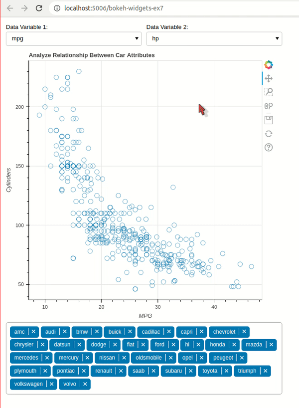
Example 7: Scatter Chart with Multi-Select (Multi-Choice) 
As a part of our seventh example, we have explained how we can use multi-select widgets available from bokeh. We have created a scatter plot showing relationship between columns of auto mpg dataset like our earlier examples. Then, we are letting select manufacturers use multi-select. By default, all manufacturers will be present. We can unselect the ones we don't want using a multi-select widget.
We have created a multi-select widget using MultiChoice() constructor.
## bokeh-widgets-ex7.py
import bokeh
from bokeh import models
from bokeh.plotting import figure, curdoc, column, row
from bokeh.io import show
from bokeh.sampledata.autompg import autompg_clean as autompg


## Scatter Plot
fig = figure(title="Analyze Relationship Between Car Attributes")

scatter= fig.scatter(x="mpg", y="hp", fill_color="mfr",
                    size=10, alpha=0.5,
                    source=autompg)

fig.xaxis.axis_label="MPG"
fig.yaxis.axis_label="Cylinders"

## Create Widgets
cols = ["mpg", "cyl", "displ", "hp", "weight", "accel", "yr"]

drop1 = models.Select(title="Data Variable 1:", value=cols[0], options=cols)
drop2 = models.Select(title="Data Variable 2:", value=cols[3], options=cols)

manufacturers = autompg.mfr.unique().tolist()

manufacturers_multi_select = models.MultiChoice(value=manufacturers, options=manufacturers)

## Define Callbacks
def modify_chart1(attr, old, new):
    scatter.glyph.x = new
    fig.xaxis.axis_label = new.capitalize()

def modify_chart2(attr, old, new):
    scatter.glyph.y = new
    fig.yaxis.axis_label = new.capitalize()

def modify_chart3(attr, old, new):
    scatter.data_source.data = autompg[autompg["mfr"].isin(new)]

## Register Callbacks with Widgets
drop1.on_change("value", modify_chart1)
drop2.on_change("value", modify_chart2)

manufacturers_multi_select.on_change("value", modify_chart3)

## Create GUI
GUI = column(row(drop1, drop2), fig, manufacturers_multi_select)

curdoc().add_root(GUI)
We have saved code of our interactive bokeh app in bokeh-widgets-ex7.py file and executed it using below command in shell / command prompt.
bokeh serve --show bokeh-widgets-ex7.py
This ends our small tutorial explaining how we can use widgets available from bokeh to create interactive GUI / apps.
References
Other Useful Bokeh Tutorials
- Bokeh: Interactive Charts
- Bokeh Charts Styling Guide
- Bokeh Layout Guide
- Add Annotations to Bokeh Charts
- Pandas-Bokeh: Create Bokeh Charts from Pandas Dataframe with One Line Of Code
- Maps using Bokeh
- Candlestick Charts using Bokeh
- Link Bokeh Charts with Ipywidgets widgets to Create Interactive GUIs
- Dashboard using Bokeh
Other Python Data Visualization Libraries
 Sunny Solanki
Sunny Solanki
Intro: Software Developer | Youtuber | Bonsai Enthusiast
About: Sunny Solanki holds a bachelor's degree in Information Technology (2006-2010) from L.D. College of Engineering. Post completion of his graduation, he has 8.5+ years of experience (2011-2019) in the IT Industry (TCS). His IT experience involves working on Python & Java Projects with US/Canada banking clients. Since 2020, he’s primarily concentrating on growing CoderzColumn.
His main areas of interest are AI, Machine Learning, Data Visualization, and Concurrent Programming. He has good hands-on with Python and its ecosystem libraries.
Apart from his tech life, he prefers reading biographies and autobiographies. And yes, he spends his leisure time taking care of his plants and a few pre-Bonsai trees.
Contact: sunny.2309@yahoo.in


![YouTube Subscribe]() Comfortable Learning through Video Tutorials?
Comfortable Learning through Video Tutorials?
If you are more comfortable learning through video tutorials then we would recommend that you subscribe to our YouTube channel.
![Need Help]() Stuck Somewhere? Need Help with Coding? Have Doubts About the Topic/Code?
Stuck Somewhere? Need Help with Coding? Have Doubts About the Topic/Code?
 Stuck Somewhere? Need Help with Coding? Have Doubts About the Topic/Code?
When going through coding examples, it's quite common to have doubts and errors.
If you have doubts about some code examples or are stuck somewhere when trying our code, send us an email at coderzcolumn07@gmail.com. We'll help you or point you in the direction where you can find a solution to your problem.
You can even send us a mail if you are trying something new and need guidance regarding coding. We'll try to respond as soon as possible.
![Share Views]() Want to Share Your Views? Have Any Suggestions?
Want to Share Your Views? Have Any Suggestions?
 Want to Share Your Views? Have Any Suggestions?
If you want to
- provide some suggestions on topic
- share your views
- include some details in tutorial
- suggest some new topics on which we should create tutorials/blogs
 Bokeh, widgets, Apps, GUI