Add Annotations to Plotnine Charts
When going through a book or article, many of us have a habit of taking notes. We even highlight things like high few words with marker, draw round / square shapes around things, make acronyms, etc to remember things or to draw attention to an essential part of the article.
It is generally referred to as annotation.
We can even annotate our charts. We can add annotations of different kinds like arrows and labels highlighting points, slope lines, polygons, vertical lines specifying spans, bands around lines, etc.
What Can You Learn From This Article?
As a part of this tutorial, we have explained how to annotate charts created using Python library plotnine with simple and easy-to-understand examples. Tutorial explains different types of annotations like labels, arrows, slopes, bands, spans, polygons, boxes, etc.
If you are new to plotnine, we recommend you check the links below as it'll get you started with library faster.
Below, we have listed essential sections of tutorial to give an overview of the material covered.
Important Sections Of Tutorial
- Label Annotation
- Arrow & Label Annotation
- Slope Annotation
- Band Annotation
- Span Annotation
- Polygon Annotation
Below, we have imported plotnine and printed version of it that we have used in our tutorial.
import plotnine

print("Plotnine Version : {}".format(plotnine.__version__))
Load Datasets
In this section, we have loaded datasets that we'll be using for plotting purposes in our tutorial. We have loaded below mentioned datasets.
- mtcars - The dataset is available from plotnine sub-module "data" and has information (name, mpg, cylinders, horsepower, disposition, weight, gears, etc.) about various car models.
- msleep - The dataset is available from plotnine sub-module "data" and has information (name, genus, vore, conservation, sleep hours, weight, brain weight, etc.) about various animals.
- apple OHLC - The dataset is downloaded from Yahoo finance as a CSV file.
All datasets are available as pandas dataframe which we'll use for our plotting purpose.
import pandas as pd
from plotnine.data import mtcars

mtcars.head()
from plotnine.data import msleep

msleep.head()
apple_df = pd.read_csv("~/datasets/AAPL.csv")
apple_df["Date"] = pd.to_datetime(apple_df["Date"])

apple_df.head()
1. Label Annotation 
The first annotation type that we'll discuss is label annotation. We'll be adding text labels to points in our chart.
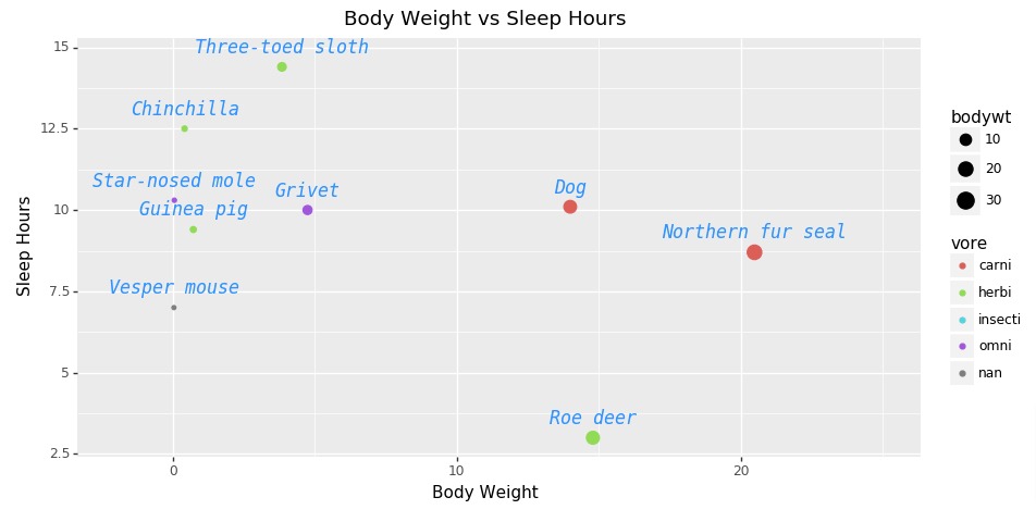
Below, we have created a scatter plot using "msleep" dataset showing relationship between body weight and sleep. The points are size-encoded by body weight and color-encoded by vore type (carnivore, herbivore, etc). For simplicity, we have plotted data for only first 10 animals.
The chart is created using geom_point() method.
Then, we have added text labels specifying animal names next to points using geom_text() method. We have also tried to modify label attributes like font size, font family, font style, font color, etc. The parameters nudge_y and va are used to align labels above points.
At last, we have combined all chart components that we created individually to create a full chart.
from plotnine import ggplot, aes, geom_point, labs, theme, geom_text, position_dodge, xlim

chart = ggplot()
points = geom_point(data=msleep[5:15],
                    mapping=aes(x="bodywt", y="sleep_total", size="bodywt", color="vore"),
                   )

## Adding Labels
text = geom_text(data=msleep[5:15],
                 mapping=aes(x="bodywt", y="sleep_total", label="name"),
                 color="dodgerblue", family="monospace", size=12, fontstyle="italic",
                 nudge_y=0.3, va="bottom")

labels = labs(x="Body Weight", y="Sleep Hours", title="Body Weight vs Sleep Hours")

scatter = chart + points + text + xlim(-2, 25) + labels + theme(figure_size=(10,5))

scatter
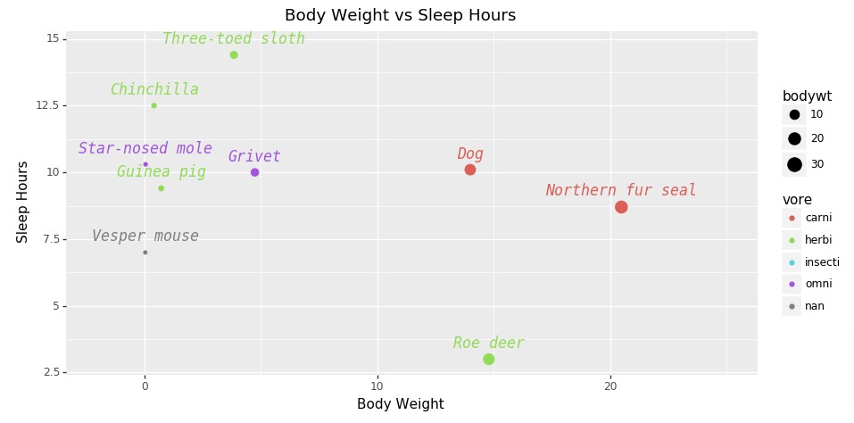
Below, we have again created same chart as previous cell but this time color-encoded labels according to vore-type.
from plotnine import ggplot, aes, geom_point, labs, theme, geom_text, position_dodge, xlim

chart = ggplot()
points = geom_point(data=msleep[5:15],
                    mapping=aes(x="bodywt", y="sleep_total", size="bodywt", color="vore"),
                   )

## Adding Labels
text = geom_text(data=msleep[5:15],
                 mapping=aes(x="bodywt", y="sleep_total", color="vore", label="name"),
                 family="monospace", size=12, fontstyle="italic", show_legend=False,
                 nudge_y=0.3, va="bottom")

labels = labs(x="Body Weight", y="Sleep Hours", title="Body Weight vs Sleep Hours")

scatter = chart + points + text + xlim(-2, 25) + labels + theme(figure_size=(10,5))

scatter
2. Arrow & Label Annotation 
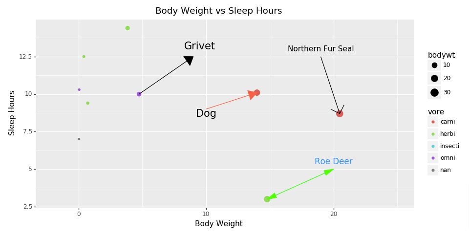
In this section, we have explained how we can add arrow and text labels as annotations to our plotnine charts.
First, we have created a scatter plot using "msleep" dataset showing relationship between body weight and sleep hours. The points are size-encoded by body weight and color-encoded by vore-type. For simplicity, we have created chart with data from only 10 animals.
Then, we have added four different types of arrows to chart using annotate() method. At the end of arrows, we have also added animal names as text labels using annotate() method.
The annotate() method let us add any type of geometric elements (plotnine methods starting with geom_) to chart. The first parameter of the method is the geometric element name and then the parameters needed by that geometric element.
Below, we have listed some commonly used elements:
- points - Available directly using geom_points() method.
- path - Available directly using geom_path() method.
- line - Available directly using geom_line() method.
- area - Available directly using geom_area() method.
- bar - Available directly using geom_bar() method.
- label - Available directly using geom_label() method.
- polygon - Available directly using geom_polygon() method.
- and many more.
We generally call geom_ methods when we have a dataset and we want to plot many geom elements using that dataset.
But when we want to add one or very few geom elements of a particular type then we can use annotate() method.
from plotnine import ggplot, aes, geom_point, labs, theme, geom_text, position_dodge, xlim
from plotnine import annotate, arrow

chart = ggplot()
points = geom_point(data=msleep[5:15],
                    mapping=aes(x="bodywt", y="sleep_total", size="bodywt", color="vore"),
                   )

## Adding Labels
annon_seal = annotate("path", x=[19, 20.490], y=[12.5, 8.7], arrow=arrow(length=0.2, type="open", ends="last", angle=45))
annon_text_seal = annotate("text", x=19, y=13, label="Northern Fur Seal")

annon_dog = annotate("path", x=[10, 14.0], y=[9, 10.1], color="tomato", arrow=arrow(length=0.2, type="closed", ends="last"))
annon_text_dog = annotate("text", x=10, y=8.7, label="Dog", size=15)

annon_deer = annotate("path", x=[20, 14.8], y=[5, 3.0], color="lime", arrow=arrow(length=0.2, type="closed", ends="both", angle=15))
annon_text_deer = annotate("text", x=20, y=5.5, label="Roe Deer", size=12, color="dodgerblue")

annon_grivet = annotate("path", x=[9, 4.75], y=[12.5, 10.0], arrow=arrow(length=0.2, type="closed", ends="first", angle=35))
annon_text_grivet = annotate("text", x=9.5, y=13.2, label="Grivet", size=15)

labels = labs(x="Body Weight", y="Sleep Hours", title="Body Weight vs Sleep Hours")

scatter = chart + points + xlim(-2, 25) + labels + theme(figure_size=(10,5))
scatter = scatter + annon_seal + annon_text_seal + annon_dog + annon_text_dog + annon_deer + annon_text_deer + annon_grivet +  annon_text_grivet

scatter
3. Slope Annotation 
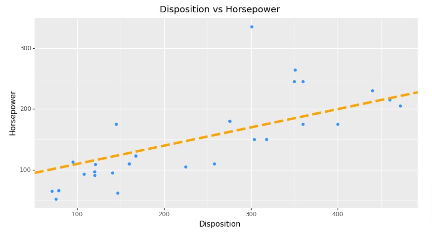
In this section, we have explained how we can add slope annotation to plotnine charts.
First, we have created scatter plot using "mtcars" dataset showing relationship between disposition and horsepower.
Then, we have created slope line using geom_abline() method. We need to provide slope and intercept parameters for creating a slope line. We have also modified styling attributes of a line like color, line style, width, etc.
from plotnine import ggplot, aes, geom_point, labs, theme, geom_text, position_dodge, xlim
from plotnine import geom_abline

chart = ggplot()
points = geom_point(data=mtcars,
                    mapping=aes(x="disp", y="hp"),
                    color="dodgerblue"
                   )

labels = labs(x="Disposition", y="Horsepower", title="Disposition vs Horsepower")

#annon_seal = annotate("path", x=[19, 20.490], y=[12.5, 8.7], arrow=arrow(length=0.2, type="open", ends="last", angle=45))

scatter = chart + points + labels + theme(figure_size=(10,5))
scatter = scatter + geom_abline(intercept=80, slope=0.3, linetype="dashed", size=2., color="orange")

scatter
Below, we have created same chart as previous cell with only difference being that we have created slope annotation using annotate() method.
from plotnine import ggplot, aes, geom_point, labs, theme, geom_text, position_dodge, xlim
from plotnine import geom_abline

chart = ggplot()
points = geom_point(data=mtcars,
                    mapping=aes(x="disp", y="hp"),
                    color="dodgerblue"
                   )

labels = labs(x="Disposition", y="Horsepower", title="Disposition vs Horsepower")

annon_abline = annotate("abline", intercept=80, slope=0.3, linetype="dashed", size=2., color="orange")

scatter = chart + points + labels + theme(figure_size=(10,5))
scatter = scatter + annon_abline

scatter
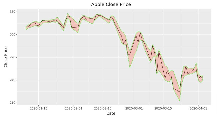
4. Band Annotation 
In this section, we have explained how to add band annotation around line in plotnine charts.
Below, we have first created a line chart using apple OHLC dataframe showing close price of apple stock. We have included only last 60 close prices in chart.
Then, we have added a band of low and high prices around close price line using geom_ribbon() method. This way we can notice in which range prices fluctuated based on band.
from plotnine import ggplot, aes, labs, theme, geom_text, position_dodge, xlim
from plotnine import geom_line, geom_ribbon

chart = ggplot()
points = geom_line(data=apple_df[-60:],
                    mapping=aes(x="Date", y="Close"),
                    color="black"
                   )

labels = labs(x="Date", y="Close Price", title="Apple Close Price")

bound = geom_ribbon(data=apple_df[-60:], mapping=aes(x="Date", ymin="Low", ymax="High"),
                    fill="tomato", color="lime", alpha=0.3, linetype="dashed")

scatter = chart + points + labels + theme(figure_size=(10,5))
scatter = scatter + bound

scatter
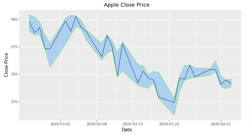
Below, we have again created a line chart and added band annotation to it but this time using annotate() method.
from plotnine import ggplot, aes, labs, theme, geom_text, position_dodge, xlim
from plotnine import geom_line, annotate

chart = ggplot()
points = geom_line(data=apple_df[-30:],
                    mapping=aes(x="Date", y="Close"),
                    color="black"
                   )

labels = labs(x="Date", y="Close Price", title="Apple Close Price")

bound = annotate("ribbon", x=apple_df[-30:]["Date"], ymin=apple_df[-30:]["Low"], ymax=apple_df[-30:]["High"],
                    fill="dodgerblue", color="lime", alpha=0.3, linetype="dashed")

scatter = chart + points + labels + theme(figure_size=(10,5))
scatter = scatter + bound

scatter
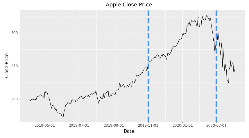
5. Span Annotation 
In this section, we have explained how we can add span or range annotation to plotnine charts. The span annotation is represented generally by two horizontal or vertical lines highlighting span of some data variable.
To explain span annotation, we have first created line chart showing close price of apple stock.
Then, we have added two vertical lines to chart at locations "2019-11-1" and "2020-3-1" using geom_vline() method. We have also modified line attributes like color, style, width, etc.
from plotnine import ggplot, aes, labs, theme, geom_text, position_dodge, xlim
from plotnine import geom_line, annotate, geom_vline
from datetime import datetime

chart = ggplot()
points = geom_line(data=apple_df,
                    mapping=aes(x="Date", y="Close"),
                    color="black"
                   )

labels = labs(x="Date", y="Close Price", title="Apple Close Price")

line1 = geom_vline(xintercept=datetime(2020,3,1), color="dodgerblue", size=2.0, linetype="dashed")
line2 = geom_vline(xintercept=datetime(2019,11,1), color="dodgerblue", size=2.0, linetype="dashed")

scatter = chart + points + labels + theme(figure_size=(10,5))
scatter = scatter + line1 + line2

scatter
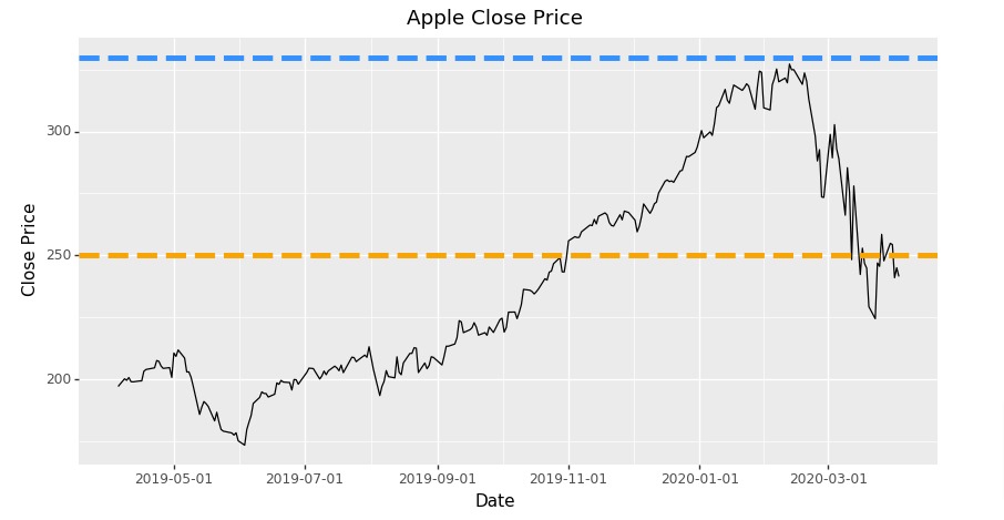
Below, we have explained how we can add horizontal span annotation. We have used geom_hline() method for adding horizontal lines.
We can add horizontal and vertical lines representing span to chart using annotate() method as well. We need to provide geometric object names as "hline" and "vline" based on need.
from plotnine import ggplot, aes, labs, theme, geom_text, position_dodge, xlim
from plotnine import geom_line, annotate, geom_hline
from datetime import datetime

chart = ggplot()
points = geom_line(data=apple_df,
                    mapping=aes(x="Date", y="Close"),
                    color="black"
                   )

labels = labs(x="Date", y="Close Price", title="Apple Close Price")

line1 = geom_hline(yintercept=250, color="orange", size=2.0, linetype="dashed")
line2 = geom_hline(yintercept=330, color="dodgerblue", size=2.0, linetype="dashed")

scatter = chart + points + labels + theme(figure_size=(10,5))
scatter = scatter + line1 + line2

scatter
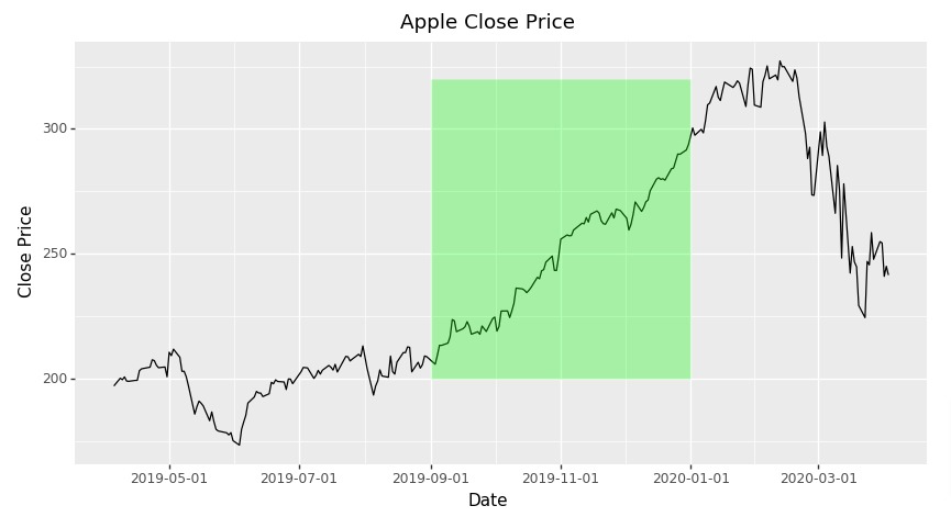
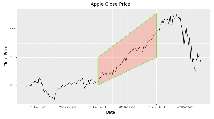
6. Polygon Annotation 
In this section, we have explained how to add polygon annotation to plotnine charts.
First, we have created line chart showing apple stock close prices.
Then, we have added a polygon to chart using annotate() method. In order to draw polygon, we need to provide coordinates of that polygon to method. We have added simple rectangle to highlight a particular area of chart.
from plotnine import ggplot, aes, labs, theme, geom_text, position_dodge, xlim
from plotnine import geom_line, annotate
from datetime import datetime

chart = ggplot()
points = geom_line(data=apple_df,
                    mapping=aes(x="Date", y="Close"),
                    color="black"
                   )

labels = labs(x="Date", y="Close Price", title="Apple Close Price")

start_date = datetime(2019,9,1)
end_date = datetime(2020,1,1)
polygon = annotate("polygon",
                   x=[start_date, start_date, end_date, end_date],
                   y=[200, 320, 320, 200],
                   fill="lime", alpha=0.3
                  )

scatter = chart + points + labels + theme(figure_size=(10,5))
scatter = scatter + polygon

scatter
Below, we have recreated example from previous section but this time we have used "rect" geometric object for creating polygon.
from plotnine import ggplot, aes, labs, theme, geom_text, position_dodge, xlim
from plotnine import geom_line, annotate
from datetime import datetime

chart = ggplot()
points = geom_line(data=apple_df,
                    mapping=aes(x="Date", y="Close"),
                    color="black"
                   )

labels = labs(x="Date", y="Close Price", title="Apple Close Price")

start_date = datetime(2019,9,1)
end_date = datetime(2020,1,1)
polygon = annotate("rect",
                   xmin=start_date, xmax= end_date,
                   ymin=320, ymax=200,
                   fill="lime", alpha=0.3
                  )

scatter = chart + points + labels + theme(figure_size=(10,5))
scatter = scatter + polygon

scatter
Below, we have created another example showing how to add polygon annotation to plotnine chart.
from plotnine import ggplot, aes, labs, theme, geom_text, position_dodge, xlim
from plotnine import geom_line, annotate
from datetime import datetime

chart = ggplot()
points = geom_line(data=apple_df,
                    mapping=aes(x="Date", y="Close"),
                    color="black"
                   )

labels = labs(x="Date", y="Close Price", title="Apple Close Price")

start_date = datetime(2019,9,1)
end_date = datetime(2020,1,1)
polygon = annotate("polygon",
                   x=[start_date, start_date, end_date, end_date],
                   y=[200, 250, 330, 250],
                   fill="tomato", alpha=0.3, color="lime"
                  )

scatter = chart + points + labels + theme(figure_size=(10,5))
scatter = scatter + polygon

scatter
 Sunny Solanki
Sunny Solanki
Intro: Software Developer | Youtuber | Bonsai Enthusiast
About: Sunny Solanki holds a bachelor's degree in Information Technology (2006-2010) from L.D. College of Engineering. Post completion of his graduation, he has 8.5+ years of experience (2011-2019) in the IT Industry (TCS). His IT experience involves working on Python & Java Projects with US/Canada banking clients. Since 2020, he’s primarily concentrating on growing CoderzColumn.
His main areas of interest are AI, Machine Learning, Data Visualization, and Concurrent Programming. He has good hands-on with Python and its ecosystem libraries.
Apart from his tech life, he prefers reading biographies and autobiographies. And yes, he spends his leisure time taking care of his plants and a few pre-Bonsai trees.
Contact: sunny.2309@yahoo.in


![YouTube Subscribe]() Comfortable Learning through Video Tutorials?
Comfortable Learning through Video Tutorials?
If you are more comfortable learning through video tutorials then we would recommend that you subscribe to our YouTube channel.
![Need Help]() Stuck Somewhere? Need Help with Coding? Have Doubts About the Topic/Code?
Stuck Somewhere? Need Help with Coding? Have Doubts About the Topic/Code?
 Stuck Somewhere? Need Help with Coding? Have Doubts About the Topic/Code?
When going through coding examples, it's quite common to have doubts and errors.
If you have doubts about some code examples or are stuck somewhere when trying our code, send us an email at coderzcolumn07@gmail.com. We'll help you or point you in the direction where you can find a solution to your problem.
You can even send us a mail if you are trying something new and need guidance regarding coding. We'll try to respond as soon as possible.
![Share Views]() Want to Share Your Views? Have Any Suggestions?
Want to Share Your Views? Have Any Suggestions?
 Want to Share Your Views? Have Any Suggestions?
If you want to
- provide some suggestions on topic
- share your views
- include some details in tutorial
- suggest some new topics on which we should create tutorials/blogs
 plotnine-charts, annotations