Plotnine: Simple Guide to Create Charts using Grammar of Graphics
Plotnine is a python data visualizations library that mimics the ggplot2 library of R programming. It was designed keeping R programming users in mind to let them use the same interface to develop charts in Python. It is commonly referred to as ggplot2 of Python.
The ggplot2 is based on the concept of grammar of graphics. The API of plotnine is very much like that of ggplot2.
What Can You Learn From This Article?
As a part of this tutorial, we have explained how to can create charts using plotnine with simple and easy-to-understand examples. Tutorial explains different chart types like scatter charts, bar charts, line charts, box plots, heatmaps, etc. Tutorial also covers various ways to improve look and feel of plotnine charts. Tutorial is a good starting point for someone who is new to plotnine.
What is Grammar of Graphics?
The grammar of graphics looks at visualization creation in layers where it starts with a simple figure and then adds components to it like points for scatter chart, bars for bar charts, figure title, x/y-axis labels, theme details. Grammar of graphics broadly divided figures into the below-mentioned layers.
- Data - Defining data is generally the first step.
- Aesthetics - We add information like encoding (color/size/shapes) of data variables, X/Y axis data variables, etc.
- Geometric Objects - We then define geometric objects like points for scatter charts, lines for line charts, a bar for bar charts, etc.
- Facets - We can create sub-charts within one chart to show more than one relationship.
- Scale - We scale some of the values if needed.
- Coordinate System - We decided on whether to use cartesian or polar or some other coordinate system.
- Statistics - We might need to include stats like mean, median, etc of some variables in a chart.
The chart creation using a grammar of graphics generally starts with the addition of layers one-by-one. Each layer helps use define individual aspects of the chart.
Below, we have highlighted important sections of tutorial to give an overview of the material covered.
Important Sections Of Tutorial
- Load Datasets
- Steps to Create Charts using Plotnine
- Scatter Charts
- Modify Chart Properties (Axes Labels, Titles, Figure size, etc)
- Bar Charts
- Horizontal Bar Chart
- Stacked Bar Chart
- Grouped Bar Chart
- Bar Chart with Text Labels
- Line Charts
- Area Charts
- Histograms
- Boxplot Charts
- Heatmap
Plotnine Video Tutorial
Please feel free to check below video tutorial if you are comfortable learning through videos. We have covered first three chart types in video.
We'll now start with our examples. We have imported plotnine, to begin with.
import plotnine

print("Plotnine Version : {}".format(plotnine.__version__))
Load Datasets
We'll be using 2 datasets available from plotnine for plotting our charts. The datasets are available as pandas dataframe through data sub-module of plotnine.
- autompg - It has information (model, cylinders, transmission, class, etc) about various car models produced by various vendors (Audi, honda, Chevrolet, etc).
- economics - It has time series data with information about attributes like population, unemployment rate, personal savings rate, etc for a population of the US from 1967 to 2015.
Below we have loaded both datasets and displayed few rows of both to give an idea about the contents of datasets.
from plotnine.data import mpg, presidential, economics
1. AutoMpg Dataset
mpg.head()
2. Economics Dataset
economics.head()
economics.tail()
Steps to Create Chart using Plotnine
As plotnine is based on a grammar of graphics creation of chart using it also involves providing details about chart creation in layers. Below are steps that we'll commonly use to create charts using plotnine.
- Create chart object with data and mapping.
- Add geometric objects (lines, bars, points, etc) to it.
- Add axes labels, titles, etc to it.
- Add chart theme details to it.
- Add any extra annotations (text or any other) to it.
- Add any other transformations or facet-related information to it.
- More steps for complicated charts.
The mapping in the first step refers to specifying which data columns to use for X-axis, Y-axis, color, size, shape, etc. These are data columns between whom we want to explore relationships. The mapping can be declared in the second step as well if not provided in the first step.
Please make a note that all the steps might not be present in all charts but a majority of them will be in most charts. Apart from this, the chart can have many more steps if it is a complicated chart and represents a lot of information but the majority of the simple chart will be done with the first 3-5 steps.
1. Scatter Plots 
As a part of this section, we'll explain how to create scatter charts using plotnine. We'll start with a simple scatter chart and build on it.
We'll be following the steps that we discussed above for creating a chart. Below is a list of functions that we'll be using for our purpose.
Important Functions of Plotnine Module
ggplot(mapping=None,data=None) - This method takes as input data for chart and mapping. The mapping parameter holds details about which column to use for which axis and details about encoding (color, size, shape, etc.) as well.
aes(x,y,kwargs) - This method lets us provide aesthetic details about chart. We can provide details like which data columns to use for the X and Y axis, which columns to use for color, shape, size encoding, etc. The output of this method will be assigned to mapping attributes of various methods.
geom_point(mapping=None,data=None,inherit_aes=True) - This method is responsible for plotting actual points on scatter chart. We can provide data and mapping details here as well if we have not provided them in ggplot() method. If it's provided in ggplot() method then this one will inherit it. We can disable inheritance by setting inherit_aes to False.
We'll be creating our first simple scatter plot by just using the above three methods.
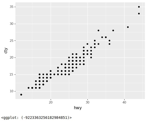
We have first created a chart using ggplot() method by providing it data and mapping details. We have used aes() method to provide mapping instructing that we want to use hwy column of data for X-axis of the chart and cty column of data for Y-axis of the chart.
We have then created points of the chart by calling geom_point() method.
At last, we have created a chart by summing up layers that we created to generate a final chart. We have created a scatter plot of highway MPG vs city MPG.
from plotnine import ggplot, aes, geom_point, labs, theme
chart = ggplot(data=mpg, mapping=aes(x="hwy", y="cty"))

points = geom_point()

scatter1 =  chart + points

scatter1
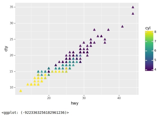
Below we have created another scatter chart that has the same X and Y-axis as our previous chart but this time we have colored points based on a number of cylinders.
We have provided data and mapping details to geom_point() method this time for explanation purposes We have also provided few extra details like the shape of points, size of points, and alpha (opacity) of points.
We have then generated a scatter chart by combining layers. We can notice from the output that now chart points are triangles and colored according to a number of cylinders.
chart = ggplot()
points = geom_point(data=mpg,
                    mapping=aes(x="hwy", y="cty", color="cyl"),
                    shape="^",
                    size=3,
                    alpha=0.8
                    )

scatter2 = chart + points

scatter2
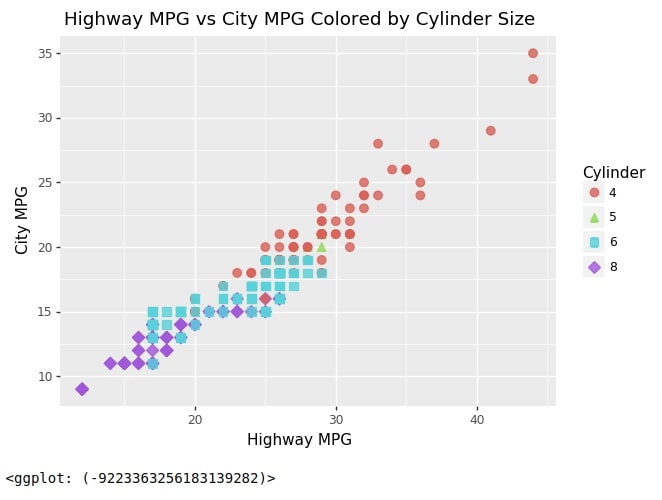
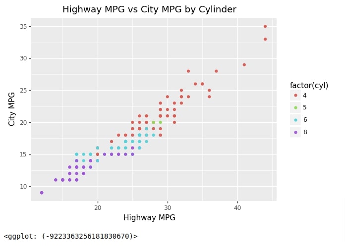
Below we have explained our third scatter chart. This time we have created a scatter chart of highway MPG vs city MPG as usual but we have added two encodings using cylinder column.
- Shape Encoding - This will choose different shapes for different values of a cylinder.
- Color Encoding - This will choose different shapes for different values of a cylinder.
We have created a chart object as usual with data and mapping details.
In mapping details, we have surrounded cylinder column name with factor string because by default plotnine considers columns as continuous and creates color bar from it. We want it to consider the cylinder column as categorical that’s why we have used factor string.
This time we have added X/Y axes labels and a title to the chart as well. We have also modified the legend name in the chart. We have set shape and color parameters of labs() method to string Cylinder to inform it that we want to use it as legend title.
Plotnine Function to Add Axes Labels and Title
- labs(x=None,y=None,title=None, **kwargs) - This method takes as input many parameters like X/Y axis, title of chart, etc. We can also provide a legend title by specifying a string with the same parameter names that we used for encoding.
We have created a chart as usual by summing up all individual layers.
chart = ggplot(data=mpg, mapping=aes(x="hwy", y="cty", shape="factor(cyl)", color="factor(cyl)"))
points = geom_point(size=3,alpha=0.8)
labels = labs(x="Highway MPG", y="City MPG",
              title="Highway MPG vs City MPG Colored by Cylinders",
              shape="Cylinder", color="Cylinder")

scatter3 = chart + points + labels

scatter3
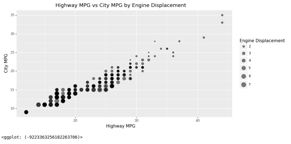
Below we have created another scatter chart of highway MPG vs city MPG size encoded by engine displacement.
This time we have introduced theme-related details using theme() method. We have provided figure size in theme() method in this example. The theme() method has lots of parameters that might need modification based on requirements.
We have not covered all parameters as a part of this tutorial. Please feel free to check this link if you want to know all parameters of it.
We have created a chart in layers as usual and then summed up all layers to create a final chart.
chart = ggplot(data=mpg, mapping=aes(x="hwy", y="cty", size="displ"))
points = geom_point(alpha=0.5)
labels = labs(x="Highway MPG", y="City MPG", title="Highway MPG vs City MPG by Engine Displacement", size="Engine Displacement")
theme_grammer = theme(figure_size=(10,5))

scatter4 = chart + points + labels + theme_grammer

scatter4
As a part of this example, we'll explain qplot() method which lets us create a plot quickly with just one line of code.
Plotnine Function to Create Charts Quick with One Line of Code
- qplot(x=None,y=None,data=None,geom='auto',facets=None,xlab=None,ylab=None,xlim=None,ylim=None,main=None,**kwargs) - This method takes as input data, columns names to use for X/Y axes, encoding column names, axes labels, titles, etc and creates chart from it.
- The geom parameter is set to 'auto' which will by default consider the chart of points (scatter chart). We can give different geometric object names to this parameter based on needs. The names are based on geom_*() methods. In below example, we have used point from geom_point() method.
If you are comfortable creating charts using this function then we have a tutorial where we create many different charts using qplot() function. Please feel free to check it from below link.
Below we have created a scatter chart of highway MPG vs city MPG color encoded by no of cylinders. We have added axes labels as well as the main title of the chart.
from plotnine import qplot

scatter5 = qplot(x="hwy",y="cty", data=mpg, geom="point", color="factor(cyl)",
                 xlab="Highway MPG", ylab="City MPG",
                 main="Highway MPG vs City MPG by Cylinder"
                )

scatter5
2. Bar Charts 
As a part of this section, we'll explain how to create bar charts using plotnine. We'll be explaining normal bar charts, stacked bar charts, and side-by-side grouped bar charts through our simple example.
The process of creating a bar chart is exactly the same as creating any other chart with plotnine. We'll be following exactly the same steps that we have followed till now.
Plotnine provides two methods for creating bar charts.
Plotnine Functions to Create Bar Charts
- geom_bar(data=None,mapping=None,stat='count',position='stack',\**kwargs) - This method let us create bar chart by providing only one column of data as X-axis value. It then creates a bar chart of counts of that column values because count is default statistics. We can provide other stat as well like average, mean, mediant, etc. It does not let us specify the height of the bar explicitly.
- geom_col(data=None,mapping=None,stat='identity',position='stack',**kwargs) - This method let us create bar chart by providing different bar X-axis values and their height as well. If we want to separately provide bar height then we should use this method.
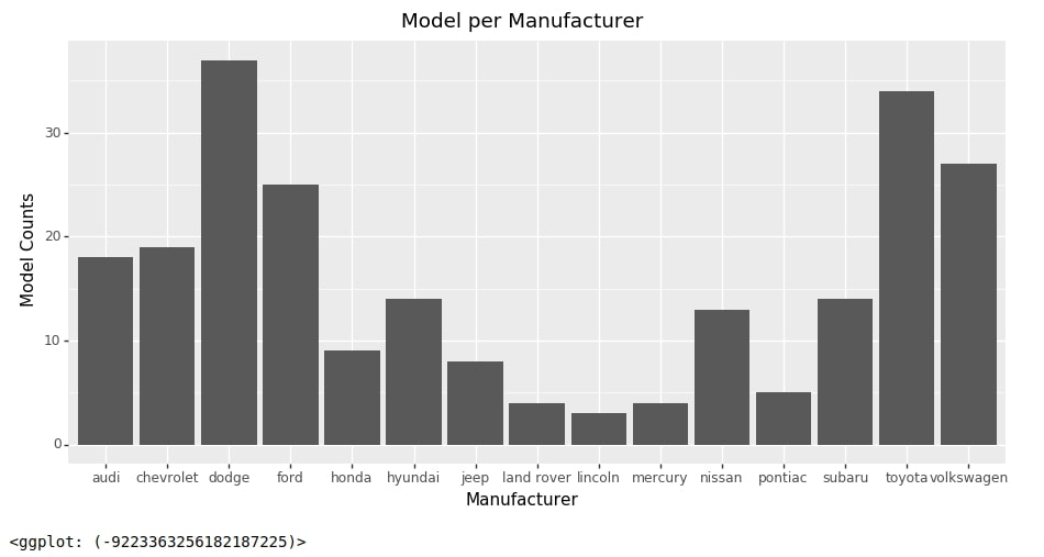
Below we have created our first bar chart which shows a count of models per manufacturer.
We have as usual created a chart first with our dataset and mapping.
For mapping, we have provided only one column name manufacturer to the x-axis. We have then created bars using geom_bar() method. We have then defined labels using labs() and theme details using theme() methods.
At last, we have summed up individual chart components to create a full bar chart.
from plotnine import geom_bar

chart = ggplot(data=mpg, mapping=aes(x="manufacturer"))
bars = geom_bar()
labels = labs(x="Manufacturer", y="Model Counts", title="Model per Manufacturer")
theme_grammer = theme(figure_size=(11,5))

bar1 = chart + bars + labels + theme_grammer

bar1
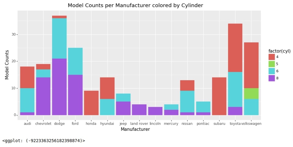
Stacked Bar Chart
Below we have created a stacked bar chart using geom_bar() method.
Our code for this example is exactly the same as our previous example with a minor change. We have set fill parameter with factor(cyl) when providing mapping.
This will color counts of manufacturers based on cylinders. It'll show us from total how many models are of particular no of cylinders.
chart = ggplot(data=mpg, mapping=aes(x="manufacturer", fill="factor(cyl)"))
bars = geom_bar()
labels = labs(x="Manufacturer", y="Model Counts", title="Model Counts per Manufacturer colored by Cylinder")
theme_grammer = theme(figure_size=(11,5))

bar2 = chart + bars + labels + theme_grammer

bar2
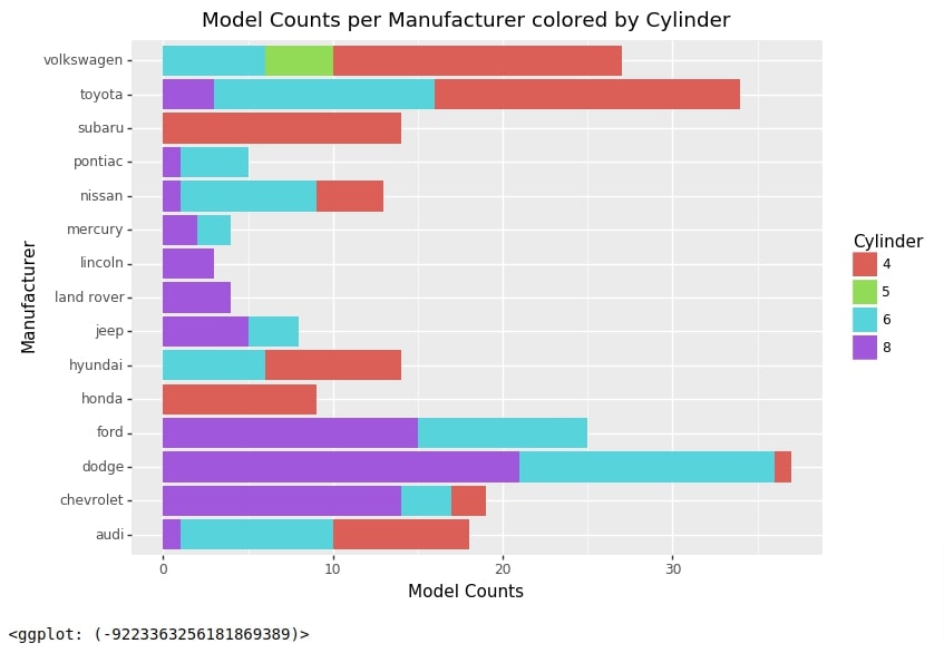
Horizontal Stacked Bar Chart
As a part of this section, we'll explain how we can create a horizontal bar chart.
The process of creating a horizontal bar chart is very simple with plotnine.
We just need to use method coord_flip() for this. It'll flip the coordinates system.
Below we have regenerated the chart from the previous example horizontally. We have added coord_flip() method at last to flip coordinates.
from plotnine import coord_flip

chart = ggplot(data=mpg, mapping=aes(x="manufacturer", fill="factor(cyl)"))
bars = geom_bar()
labels = labs(x="Manufacturer", y="Model Counts", title="Model Counts per Manufacturer colored by Cylinder", fill="Cylinder")
theme_grammer = theme(figure_size=(8,6))

bar3 = chart + bars + labels + theme_grammer

bar3 + coord_flip()
Bar Chart with Text Labels
We'll now explain the usage of geom_col() method with simple examples.
First, we have created an intermediate data frame that groups entries of a data frame by manufacturer and then take the average of those entries. This will generate a new data frame where we have columns of a data frame with average values of those columns per manufacturer.
mpg_by_manuf = mpg.groupby(by="manufacturer").mean().reset_index()

mpg_by_manuf
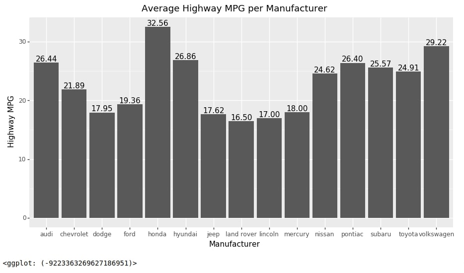
Below we have created a bar chart of the average highway MPG provided per manufacturer. We have also added labels (average values above bars) to the chart as a part of this example.
Our code for this example starts with the creation of a chart with data (dataframe from the previous cell) and mapping as usual. This time we have provided both x and y-axis values for mapping. The value provided as the y-axis will be used as the height of bars which is the average highway MPG in this case.
Then we have used geom_col() method to create bars from mapping. We have also added labels and theme details as usual. One extra thing that we have done is added bar labels using geom_text() method.
- geom_text(data=None,mapping=None,**kwargs) - This method works like any other geom_() methods. It takes input data and mapping and then puts the text in those positions based on the mapping. If mapping is not provided then it inherits from ggplot() method.
We have provided geom_text() method with mapping where label parameter is set to average highway MPG. It'll retrieve x and y-axis mapping from ggplot() method. We have set va parameter to bottom which will move labels above bars.
from plotnine import geom_col, geom_text

chart = ggplot(data=mpg_by_manuf, mapping=aes(x="manufacturer", y="hwy"))
bars = geom_col()
labels = labs(x="Manufacturer", y="Highway MPG", title="Average Highway MPG per Manufacturer")
theme_grammer = theme(figure_size=(11,5.5))
text = geom_text(mapping=aes(label="hwy"), format_string='{:.2f}', va="bottom")

bar4 = chart + bars + labels + theme_grammer + text

bar4
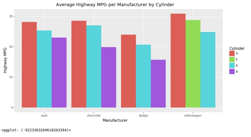
Grouped Bar Chart
We have now created a new data frame to explain how to create side by side grouped bar chart. Below we have created a new data frame by grouping entries based on manufacturer and cyl columns. Then we have taken the average of grouped entries. Then we have taken a subset of entries where manufacturer is one of the Audi, Chevrolet, Dodge, and Volkswagen. We'll be using this data frame for our next example.
mpg_by_manuf_cyl = mpg.groupby(by=["manufacturer","cyl"]).mean()\
                    .loc[["audi", "chevrolet", "dodge", "volkswagen"]].dropna().reset_index()

mpg_by_manuf_cyl
Below we have created side by side grouped bar chart which shows the average high MPG for selected manufacturers for models with different no of cylinders.
Our code for this example starts with chart creation using data and mapping as usual. We have set fill parameter to cyl this time to color bars based on no of cylinders.
Then we have created a bar using geom_col() method with only one difference. The default value of position parameter is stack which stacks bars on each other. We have set it this time to dodge which will put bars based on categories next to each other.
Then we have added labels and theme details to the chart.
chart = ggplot(data=mpg_by_manuf_cyl, mapping=aes(x="manufacturer", y="hwy", fill="factor(cyl)"))
bars = geom_col(position="dodge")
labels = labs(x="Manufacturer", y="Highway MPG",
              title="Average Highway MPG per Manufacturer by Cylinder",
              fill="Cylinder"
             )
theme_grammer = theme(figure_size=(11,5.5))

bar5 = chart + bars + labels + theme_grammer

bar5
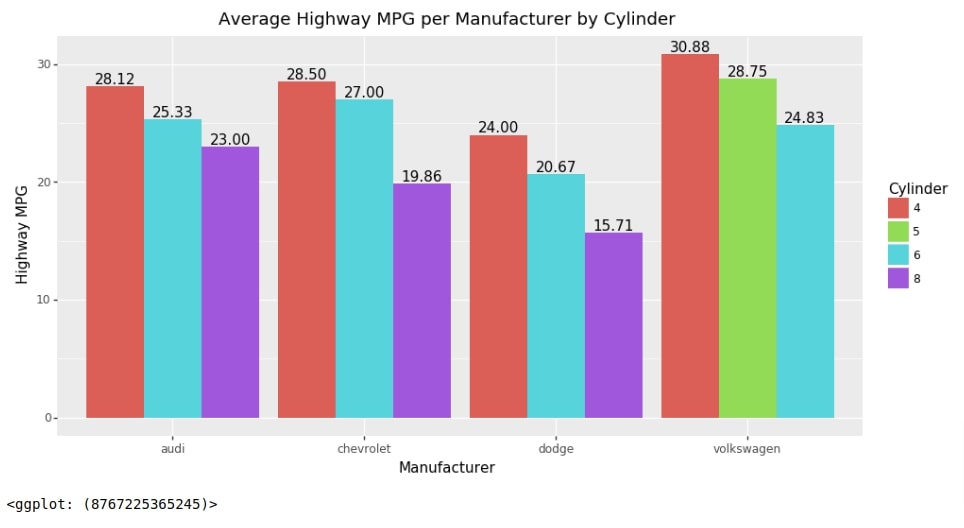
Below we have recreated the chart from the previous example with labels.
from plotnine import position_dodge

chart = ggplot(data=mpg_by_manuf_cyl, mapping=aes(x="manufacturer", y="hwy", fill="factor(cyl)"))
bars = geom_col(position="dodge")
labels = labs(x="Manufacturer", y="Highway MPG",
              title="Average Highway MPG per Manufacturer by Cylinder",
              fill="Cylinder"
             )
theme_grammer = theme(figure_size=(11,5.5))
text = geom_text(mapping=aes(label="hwy"),
                 position=position_dodge(width=0.9),
                 format_string='{:.2f}', va="bottom")

bar6 = chart + bars + labels + theme_grammer + text

bar6
3. Line Chart 
As a part of this section, we'll explain how to create line charts using plotnine.
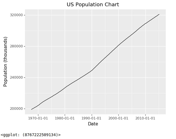
Below we have created a line chart using the economics time series dataset. We have represented date on X-axis and population on Y-axis.
Our code for this example starts with the creation of a plot with data as usual. We have provided mapping details to geom_line() method this time to create a line.
We have then created labels and a chart title using labs() method.
At last, we have summed up individual components to make a line chart out of it.
Plotnine Function to Create Line Charts
- geom_line(data=None,mapping=None, **kwargs) - This method works like other geom_() methods. It takes as input data, mapping and other attributes and then creates line from it.
from plotnine import geom_line

chart = ggplot(data=economics)
line = geom_line(mapping=aes(x="date", y="pop"))
labels = labs(x="Date", y="Population (thousands)", title="US Population Chart")

line_chart1 = chart + line + labels

line_chart1
We'll now explain another example of a line chart where we'll be adding 2 lines to the chart. There are different ways to create a line chart with more than one line to chart.
Below we have recreated the economics dataframe so that the new data frame has 3 columns.
- Date
- Attributes - This column has an entry of attributes that we want to add a line for. One entry per one line. We have used columns psavert and uempmed from our original dataframe. We want to create a line for both.
- Attr_Value - This column has data for date and attribute combination from an original data frame.
import pandas as pd

economics2 = pd.melt(economics, id_vars=["date"], value_vars=["psavert", "uempmed"], var_name="Attributes", value_name="Attr_Value")

economics2.head()
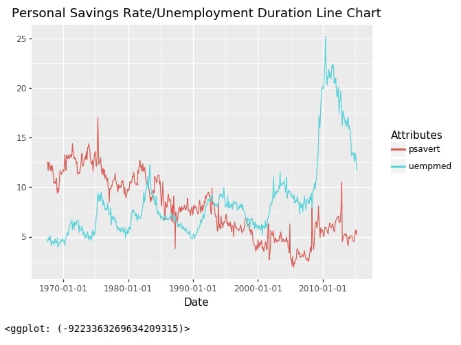
Below we have created a line chart with 2 lines in it.
- psavert line - Personal saving rate
- uempmed line - Unemployement Rate
Our code for this example starts by creating a chart, as usual, using ggplot() method with data provided to it. We have provided mapping to geom_line() method this time as well. We have provided color parameter Attributes column name in order to create different lines per entry. Then we have created labels and added up individual layers to create the final figure.
chart = ggplot(data=economics2)
line = geom_line(mapping=aes(x="date", y="Attr_Value", color="Attributes"))
labels = labs(x="Date", y="", title="Personal Savings Rate/Unemployment Duration Line Chart")

line_chart2 = chart + line + labels

line_chart2
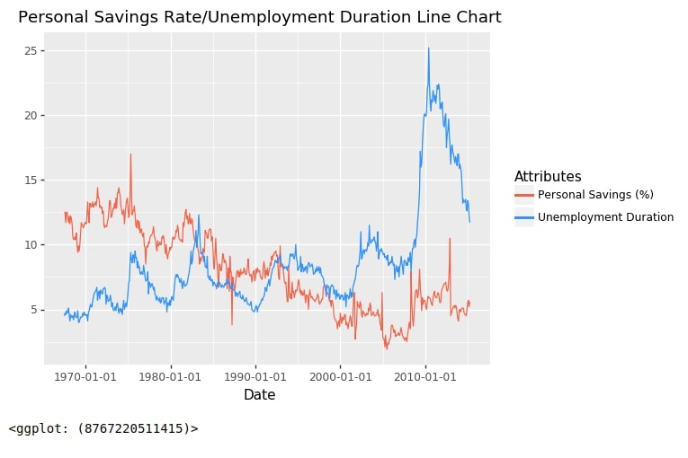
Below we have created the same chart as the previous step but using our main economics dataset.
We have created a chart first using ggplot() and data. We have added mapping of the only X-axis in ggplot() method.
We have then created two lines using geom_line() method. We have provided mapping for Y-axis in these calls of geom_line(). We have also provided color parameter to color lines. We have then created labels as usual.
At last, we have called method scale_color_identity() which will guide how to create a legend for individual lines.
from plotnine import scale_color_identity

chart = ggplot(data=economics, mapping=aes(x="date"))
line1 = geom_line(mapping=aes(y="psavert", color="'tomato'"))
line2 = geom_line(mapping=aes(y="uempmed", color="'dodgerblue'"))
labels = labs(x="Date", y="", title="Personal Savings Rate/Unemployment Duration Line Chart")
legend_guide = scale_color_identity(guide='legend',name='Attributes',
                        breaks=['tomato','dodgerblue'],
                        labels=['Personal Savings (%)','Unemployment Duration'])

line_chart3 = chart + line1 + line2 + labels + legend_guide

line_chart3
4. Area Chart 
As a part of this section, we'll explain how we can create an area chart using plotnine.
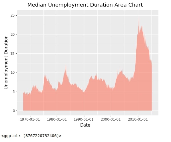
Below we have created an area chart using our economics data where we have highlighted areas covered by line using unemployment rate.
Our code for this example starts by creating a chart with data using ggplot() method.
It then creates area using geom_area() method. We have provided mapping detail as a part of this method. We have provided data as x-axis and unemployment column as y-axis. We have then created X/Y axes labels and a title of the chart.
At last, we have added all individual layers as usual to create the final area chart.
Plotnine Function to Create Line Charts
- geom_area(data=None,mapping=None, **kwargs) - This method works like other geom_() methods. It takes as input data, mapping and other attributes and then creates area from it.
from plotnine import geom_area

chart = ggplot(data=economics)
area = geom_area(mapping=aes(x="date", y="uempmed"), alpha=0.5, fill="tomato")
labels = labs(x="Date", y="Unemployment Duration", title="Median Unemployment Duration Area Chart")

area_chart1 = chart + area + labels

area_chart1
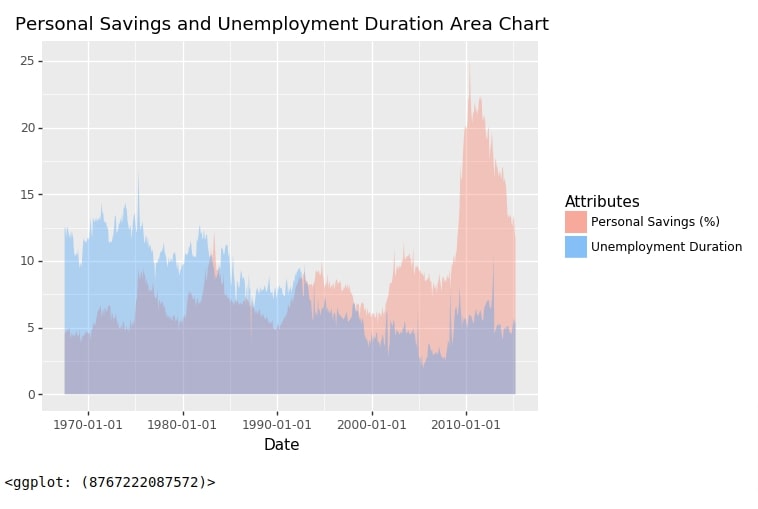
As a part of this example, we have explained how we can include more than one area in the area chart.
Our code for this example is exactly the same as our code for the last line chart example with the only difference that we have used geom_area() method instead of geom_line().
There is one more change compared to it which is that we have used scale_fill_identity() method for guiding legend creation.
from plotnine import geom_area, scale_fill_identity

chart = ggplot(data=economics)
area1 = geom_area(mapping=aes(x="date", y="uempmed", fill="'tomato'"), alpha=0.3)
area2 = geom_area(mapping=aes(x="date", y="psavert", fill="'dodgerblue'"), alpha=0.3)
labels = labs(x="Date", y="", title="Personal Savings and Unemployment Duration Area Chart")
legend_guide = scale_fill_identity(guide='legend',name='Attributes',
                                    breaks=['tomato','dodgerblue'],
                                    labels=['Personal Savings (%)','Unemployment Duration'])


area_chart2 = chart + area1 + area2 + labels + legend_guide

area_chart2
5. Histogram 
As a part of this section, we'll explain with simple examples how to create histograms using plotnine.
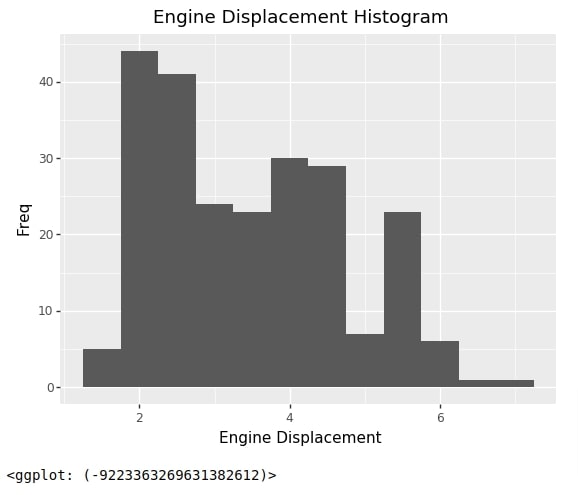
Our code for this example starts with the creation of a chart using data and mapping as usual. We have provided only one mapping this time which is the property engine displacement for which we want histogram.
We have then created a histogram using geom_histogram() method.
Then we have created X/Y axes labels and a chart title using labs() method.
At last, we have added individual layers that we created to create a final chart.
Plotnine Functions to Create Histograms
- geom_histogram(data=None,mapping=None, bins=None, binwidth=None, **kwargs) - This method works like other geom_() methods. It takes as input data, mapping and other attributes and then creates histogram from it.
from plotnine import geom_histogram

chart = ggplot(data=mpg, mapping=aes(x="displ"))
hist = geom_histogram(bins=10, binwidth=0.5)
labels = labs(x="Engine Displacement", y="Freq", title="Engine Displacement Histogram")

histogram1 = chart + hist + labels

histogram1
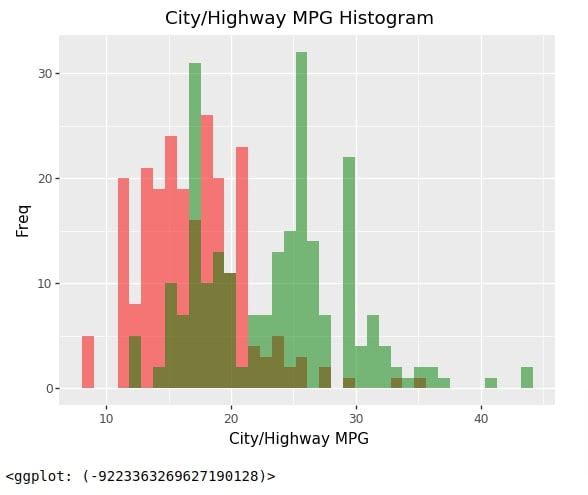
Below we have created a histogram of 2 properties of data.
- City MPG
- Highway MPG
Our code for this example works like earlier code examples where we added more than one line to the line chart and more than one area to the area chart.
chart = ggplot(data=mpg)
hist1 = geom_histogram(mapping=aes(x="cty"), bins=15, binwidth=0.95, fill="red", alpha=0.5)
hist2 = geom_histogram(mapping=aes(x="hwy"), bins=15, binwidth=0.95, fill="green", alpha=0.5)
labels = labs(x="City/Highway MPG", y="Freq", title="City/Highway MPG Histogram")

histogram2 = chart + hist1 + hist2 + labels

histogram2
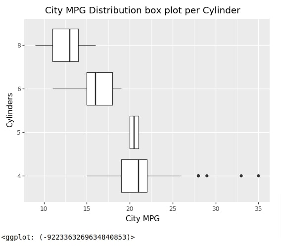
6. Box Plot 
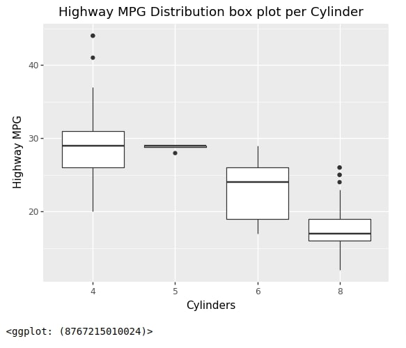
As a part of this section, we have explained how to create box plots using plotnine.
Our first box plot below depicts the distribution of highway MPG per no of cylinders in the car model.
Our code for this example starts by creating a chart with data using ggplot() as usual.
We have then created a boxplot using geom_boxplot() method by provided mapping to it. We have provided a number of cylinders as X-axis mapping and highway MPG as Y-axis mapping.
We have then created X/Y axes labels and a chart title.
At last, we have summed up individual layers to create a final chart.
Plotnine Functions to Create Box Plots
- geom_boxplot(data=None,mapping=None, **kwargs) - This method works like other geom_() methods. It takes as input data, mapping and other attributes and then creates boxplot from it.
Plotnine Functions to Create Violin Charts
- geom_violin(data=None,mapping=None, **kwargs) - This method works like other geom_() methods. It takes as input data, mapping and other attributes and then creates boxplot from it.
from plotnine import geom_boxplot

chart = ggplot(data=mpg)
boxes = geom_boxplot(mapping=aes(x="factor(cyl)", y="hwy"))
labels = labs(x="Cylinders", y="Highway MPG", title="Highway MPG Distribution box plot per Cylinder")

box_plot1 = chart + boxes + labels

box_plot1
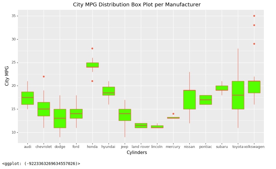
Below we have created another box plot where we are showing the distribution of City MPG per car manufacturer.
chart = ggplot(data=mpg)
boxes = geom_boxplot(mapping=aes(x="manufacturer", y="cty"), color="tomato", fill="lime")
labels = labs(x="Cylinders", y="City MPG", title="City MPG Distribution Box Plot per Manufacturer")
theme_grammer = theme(figure_size=(11,6))

box_plot2 = chart + boxes + labels + theme_grammer

box_plot2
Below we have recreated the boxplot from our earlier example with the only change that we have reversed coordinates to create a horizontal boxplot.
chart = ggplot(data=mpg)
boxes = geom_boxplot(mapping=aes(x="factor(cyl)", y="cty"))
labels = labs(x="Cylinders", y="City MPG", title="City MPG Distribution box plot per Cylinder")

box_plot3 = chart + boxes + labels + coord_flip()

box_plot3
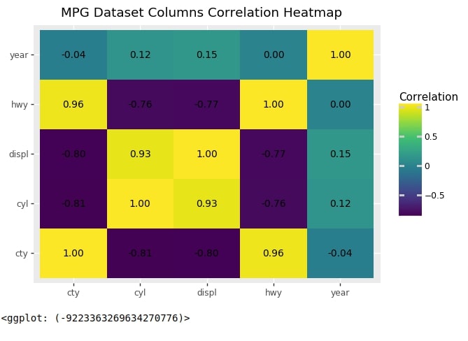
7. Heatmap 
As a part of this section, we'll explain how we can create a heatmap using plotnine.
The first heatmap that we'll create will be a heatmap of correlation between columns of mpg dataset.
First, we have created the dataframe necessary for the heatmap of correlation. We have created a correlation data frame by using corr() function on the original mpg data frame this will create another data frame where correlation details for correlation between each 2-column combinations will be present. We have then restructured the data frame of correlation so that we have an entry for each combination and correlation value between that combination.
mpg_corr = mpg.corr()

data = []
for val1 in mpg_corr.index:
    for val2 in mpg_corr.columns:
        data.append([val1, val2, mpg_corr.loc[val1, val2]])

mpg_corr = pd.DataFrame(data=data, columns=["Val1", "Val2", "Correlation"])

mpg_corr
Below we have created our first heatmap of correlation using the dataset we created in the previous example.
Our code starts by creating a chart using ggplot() method providing a dataframe created in the previous cell to it.
Then we have created tiles representing heatmap using geom_tile() method. We have provided mapping details to this method. The X-axis represents the first column, Y-axis represents the second column and the fill represents a correlation between those two columns.
We have then created correlation text using geom_text() method.
Then we have created X/Y axes labels and a chart title.
At last, we have added all individual layers to create a final heatmap of correlation.
Plotnine Functions to Create Heatmaps
- geom_tile(data=None,mapping=None, **kwargs) - This method works like other geom_() methods. It takes as input data, mapping and other attributes and then creates rectangles from it.
- geom_text(data=None,mapping=None,format_string=None,size=None,kwargs) - This method works like other geom_() methods. It takes as input data, mapping and other attributes and then adds text annotation from it. We can also provide string format details and size of font as well using format_string and size parameters.
from plotnine import geom_tile, geom_text

chart = ggplot(data=mpg_corr)
tile = geom_tile(mapping=aes(x="Val1", y="Val2", fill="Correlation"))
text = geom_text(aes(x="Val1", y="Val2", label='Correlation'),format_string='{:.2f}', size=10)
labels = labs(x="", y="", title="MPG Dataset Columns Correlation Heatmap")

heatmap1 = chart + tile + text + labels

heatmap1
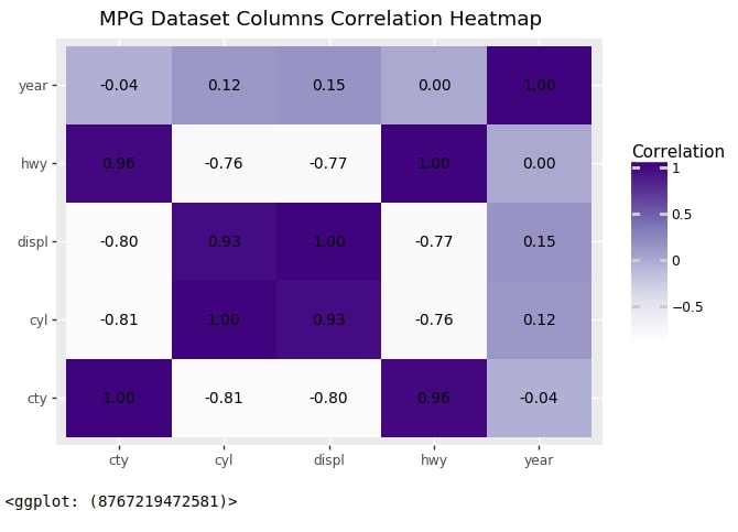
Below we have recreated the heatmap from the previous step but using a different colormap. We have added colormap changes using scale_fill_cmap() method.
from plotnine import scale_fill_cmap

heatmap1 + scale_fill_cmap(cmap_name="Purples")
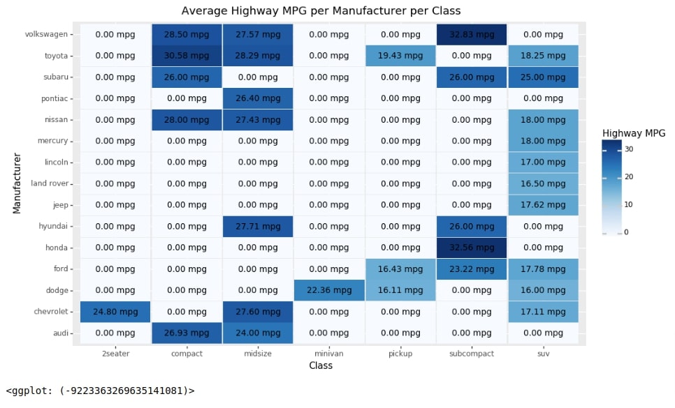
Below we have created another heatmap for an explanation of heatmap creation using plotnine.
We have first created a new data frame from our original mpg data frame that we'll be using for heatmap creation. We have grouped our original mpg dataframe based on manufacturer and class columns and then take the average value of each group so that we have the average value (for each column) for each combination of manufacturer and class. We'll be using this data frame for the creation of our second heatmap.
mpg2 = mpg.groupby(["manufacturer", "class"]).mean().fillna(0).reset_index()

mpg2
Below we have created another heatmap where we are showing average highway MPG for each combinations of manufacturer and class.
Our code starts as usual with chart creation.
We then create tiles using geom_tile() method providing mapping to it. We have used class column as X-axis, manufacturer column as Y-axis, and hwy column as fill value of rectangles.
We have then created text annotation using geom_text() method.
Then we have created labels, a chart title, and theme details.
At last, we have added them to create the final heatmap. We have also separately provided colormap details using scale_fill_cmap() method.
from plotnine import scale_fill_cmap

chart = ggplot(data=mpg2)
tile = geom_tile(mapping=aes(x="class", y="manufacturer", fill="hwy", width=.98, height=.98))
text = geom_text(aes(x="class", y="manufacturer", label='hwy'),format_string='{:.2f} mpg', size=10)
labels = labs(x="Class", y="Manufacturer", title="Average Highway MPG per Manufacturer per Class",
              fill="Highway MPG"
             )
theme_grammer = theme(figure_size=(11,7))


heatmap2 = chart + tile + text + labels + theme_grammer + scale_fill_cmap(cmap_name="Blues")

heatmap2
This ends our small tutorial explaining how to create simple charts using plotnine.
References
Other Useful Plotnine Tutorials
- Plotnine: Quick Plots with One Function Call
- Maps using Plotnine (Choropleth, Scatter, and Bubble Maps)
- Add Annotations to Plotnine Charts
Python Data Visualization Libraries
 Sunny Solanki
Sunny Solanki
Intro: Software Developer | Youtuber | Bonsai Enthusiast
About: Sunny Solanki holds a bachelor's degree in Information Technology (2006-2010) from L.D. College of Engineering. Post completion of his graduation, he has 8.5+ years of experience (2011-2019) in the IT Industry (TCS). His IT experience involves working on Python & Java Projects with US/Canada banking clients. Since 2020, he’s primarily concentrating on growing CoderzColumn.
His main areas of interest are AI, Machine Learning, Data Visualization, and Concurrent Programming. He has good hands-on with Python and its ecosystem libraries.
Apart from his tech life, he prefers reading biographies and autobiographies. And yes, he spends his leisure time taking care of his plants and a few pre-Bonsai trees.
Contact: sunny.2309@yahoo.in


![YouTube Subscribe]() Comfortable Learning through Video Tutorials?
Comfortable Learning through Video Tutorials?
If you are more comfortable learning through video tutorials then we would recommend that you subscribe to our YouTube channel.
![Need Help]() Stuck Somewhere? Need Help with Coding? Have Doubts About the Topic/Code?
Stuck Somewhere? Need Help with Coding? Have Doubts About the Topic/Code?
 Stuck Somewhere? Need Help with Coding? Have Doubts About the Topic/Code?
When going through coding examples, it's quite common to have doubts and errors.
If you have doubts about some code examples or are stuck somewhere when trying our code, send us an email at coderzcolumn07@gmail.com. We'll help you or point you in the direction where you can find a solution to your problem.
You can even send us a mail if you are trying something new and need guidance regarding coding. We'll try to respond as soon as possible.
![Share Views]() Want to Share Your Views? Have Any Suggestions?
Want to Share Your Views? Have Any Suggestions?
 Want to Share Your Views? Have Any Suggestions?
If you want to
- provide some suggestions on topic
- share your views
- include some details in tutorial
- suggest some new topics on which we should create tutorials/blogs
 plotnine, grammer-of-graphics, charts