Matplotlib - Secondary X and Y Axis | Python
Matplotlib is a widely used plotting library in Python that provides a comprehensive range of tools for creating visualizations. It offers a variety of options to customize plots such as setting axis limits, adding titles and labels, and creating legends. One of the key features of Matplotlib is its ability to create multiple axes on a single plot.
In some cases, it may be necessary to display two sets of data on a single plot with different scales. This is where secondary axes come in handy. Matplotlib allows users to create both secondary X and Y axes, which can be useful in various scenarios such as comparing two data sets with different units or visualizing data from two different domains.
What Can You Learn From This Article?
In this tutorial, we have explained how to create secondary axes (Secondary X axis and Secondary Y axis) in "Matplotlib" and demonstrated how they can be used to enhance your visualizations. We have covered the basic concepts of creating a plot with multiple axes, including the steps to create a secondary axis, customize its appearance, and plot data on it. Additionally, we have discussed some common use cases where secondary axes can be useful and demonstrate how to implement them in Python.
Video Tutorial
Please feel free to check below video tutorial if feel comfortable learning through videos.
Below, we have imported matplotlib and printed the version that we'll use for our purpose.
import matplotlib

print("Matplotlib Version : {}".format(matplotlib.__version__))
Load Wine Dataset
In this section, we have loaded a wine dataset available from Python ML library scikit-learn. The dataset has measurements of various ingredients used in preparation of 3 different types of wine. We have loaded dataset as pandas dataframe.
After loading dataset as a dataframe, in the next cell, we have grouped entries by wine type and calculated average values of ingredients per wine type. It's another dataframe that we'll use to create charts.
import pandas as pd
from sklearn.datasets import load_wine

wine  = load_wine()

print("Dataset Size : ", wine.data.shape)

wine_df = pd.DataFrame(data=wine.data, columns=wine.feature_names)
wine_df["WineType"] = [wine.target_names[typ] for typ in wine.target]

wine_df.head()
avg_wine_df = wine_df.groupby(by="WineType").mean().reset_index()

avg_wine_df
Example 1: Secondary Y-Axis
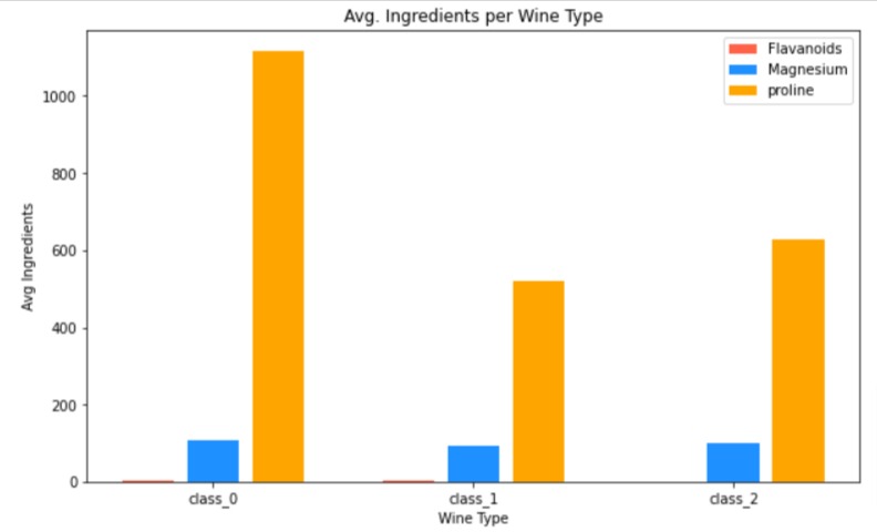
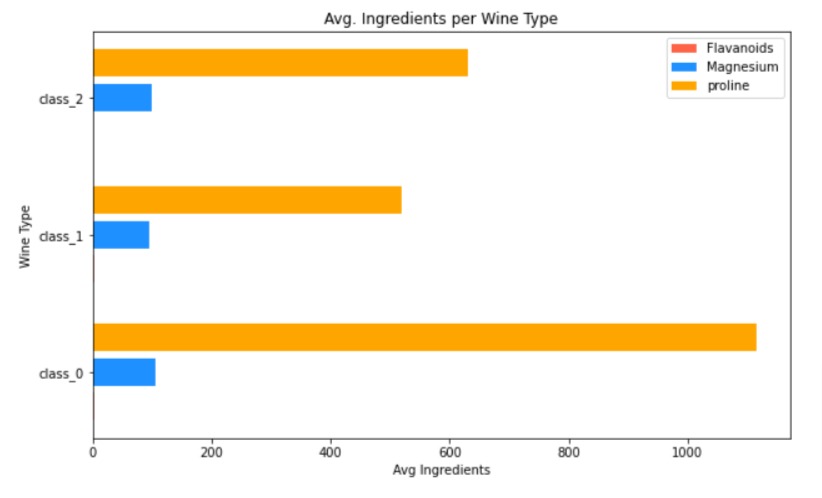
The below code imports the Matplotlib library and creates a new figure object with a size of 10x6 inches. It then creates three bar charts with heights corresponding to the "flavanoids", "magnesium", and "proline" columns of average wine dataframe.
Each bar chart is assigned a different color and label. This code creates a bar plot that compares the average levels of flavanoids, magnesium, and proline across different types of wine.
As we can see from bar chart, all ingredients are on quite different scales. The values of ingredient "proline" are quite high compared to ingredients "magnesium" and "flavanoids". Due to this, it seems to be suppressing those two bars.
In order to properly compare those three ingredients, we can add extra Y axes on right for "magnesium" and "flavanoids".
import matplotlib.pyplot as plt

fig = plt.figure(figsize=(10,6))

plt.bar(x=[0,4,8], height=avg_wine_df["flavanoids"], color="tomato", label="Flavanoids");
plt.bar(x=[1,5,9], height=avg_wine_df["magnesium"], color="dodgerblue", label="Magnesium");
plt.bar(x=[2,6,10], height=avg_wine_df["proline"], color="orange", label="proline");

plt.xticks([1,5,9], avg_wine_df.WineType);

plt.xlabel("Wine Type")
plt.ylabel("Avg Ingredients")
plt.title("Avg. Ingredients per Wine Type")
plt.legend(loc="best");
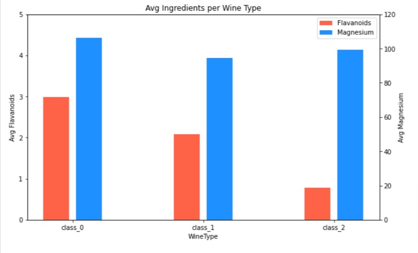
Below, we have created our first example explaining how to create a secondary Y axis. We have represented "magnesium" using a secondary Y-axis.
The code imports the Matplotlib library and creates a figure object with a size of 10x6 inches, with a single axis called "ax_main".
It creates two bar charts, one for "flavanoids" and one for "magnesium", with different colors and labels. It starts by creating a bar chart for "flavanoids".
Then, a second y-axis is added to the plot using the "twinx()" function and another bar chart is created for "magnesium" with a different color and label. As we can see, in order to create a secondary y-axis, we need to use "twinx()" function which creates another axes object whose X-axis is same as first but has new Y-axis on right side.
Finally, a legend is added to the plot using the "legend()" function, and a title is set using the "title()" function. This code creates a plot that compares the average levels of flavanoids and magnesium across different types of wine, with two y-axes for each bar chart.
import matplotlib.pyplot as plt

fig, ax_main = plt.subplots(figsize=(10,6))

bar1 = ax_main.bar(x=[0,4,8], height=avg_wine_df["flavanoids"], color="tomato", label="Flavanoids");
ax_main.set_xlabel("WineType")
ax_main.set_ylabel("Avg Flavanoids");
ax_main.set_ylim(0,5);
ax_main.set_xticks([0.5, 4.5, 8.5],avg_wine_df.WineType)

ax2 = ax_main.twinx()
bar2 = ax2.bar(x=[1,5,9], height=avg_wine_df["magnesium"], color="dodgerblue", label="Magnesium");
ax2.set_ylabel("Avg Magnesium");
ax2.set_ylim(0,120);


plt.legend(loc="best", handles=[bar1, bar2])
plt.title("Avg Ingredients per Wine Type");
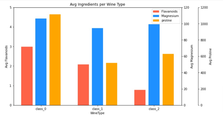
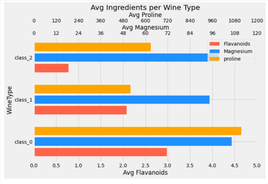
Below, we have created another example demonstrating how to create secondary Y-axis using matplotlib. This time, we have created two secondary Y axes, one to represent "magnesium" and another for "proline".
import matplotlib.pyplot as plt

fig, ax_main = plt.subplots(figsize=(10,6))

bar1 = ax_main.bar(x=[0,4,8], height=avg_wine_df["flavanoids"], color="tomato", label="Flavanoids");
ax_main.set_xlabel("WineType")
ax_main.set_ylabel("Avg Flavanoids");
ax_main.set_ylim(0,5);
ax_main.set_xticks([1, 5, 9],avg_wine_df.WineType)

ax2 = ax_main.twinx()
bar2 = ax2.bar(x=[1,5,9], height=avg_wine_df["magnesium"], color="dodgerblue", label="Magnesium");
ax2.set_ylabel("Avg Magnesium");
ax2.set_ylim(0,120);

ax3 = ax_main.twinx()
bar3 = ax3.bar(x=[2,6,10], height=avg_wine_df["proline"], color="orange", label="proline");
ax3.spines.right.set_position(("axes", 1.1));
ax3.set_ylabel("Avg Proline");
ax3.set_ylim(0,1200);

plt.legend(loc="best", handles=[bar1, bar2, bar3])
plt.title("Avg Ingredients per Wine Type");
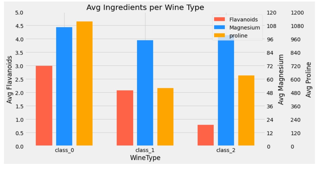
Below, we have recreated our previous example but tried to improve look of the chart by introducing theme to the chart. We also modified tick labels to align ticks of all 3 Y axes.
import matplotlib.pyplot as plt
import numpy as np

with plt.style.context("fivethirtyeight"):
    fig, ax_main = plt.subplots(figsize=(10,6))

    bar1 = ax_main.bar(x=[0,4,8], height=avg_wine_df["flavanoids"], color="tomato", label="Flavanoids");
    ax_main.set_xlabel("WineType")
    ax_main.set_ylabel("Avg Flavanoids");
    ax_main.set_ylim(0,5);
    ax_main.set_xticks([1, 5, 9],avg_wine_df.WineType);
    ax_main.set_yticks(np.arange(0,5.1,0.5), np.arange(0,5.1,0.5));

    ax2 = ax_main.twinx()
    bar2 = ax2.bar(x=[1,5,9], height=avg_wine_df["magnesium"], color="dodgerblue", label="Magnesium");
    ax2.set_ylabel("Avg Magnesium");
    ax2.set_ylim(0,120);
    ax2.grid(visible=False);
    ax2.set_yticks(np.arange(0,121,12), np.arange(0,121,12));

    ax3 = ax_main.twinx()
    bar3 = ax3.bar(x=[2,6,10], height=avg_wine_df["proline"], color="orange", label="proline");
    ax3.spines.right.set_position(("axes", 1.1));
    ax3.set_ylabel("Avg Proline");
    ax3.set_ylim(0,1200);
    ax3.grid(visible=False);
    ax3.set_yticks(np.arange(0,1201,120), np.arange(0,1201,120));

    plt.legend(loc="best", handles=[bar1, bar2, bar3])
    plt.title("Avg Ingredients per Wine Type");
Example 2: Secondary X Axis
In this section, we have explained how to create a secondary X-axis using matplotlib.
Below, we have again created our earlier bar chart example but have reversed X and Y axis data. As we can see from resulted bar chart, the wine type is represented on Y axis, and average values of ingredients are on X axis. We'll now try to solve same scale problem by introducing a secondary X axis for "magnesium" and "proline".
import matplotlib.pyplot as plt

fig = plt.figure(figsize=(10,6))

plt.barh(y=[0,4,8], width=avg_wine_df["flavanoids"], color="tomato", label="Flavanoids");
plt.barh(y=[1,5,9], width=avg_wine_df["magnesium"], color="dodgerblue", label="Magnesium");
plt.barh(y=[2,6,10], width=avg_wine_df["proline"], color="orange", label="proline");

plt.yticks([1,5,9], avg_wine_df.WineType);

plt.ylabel("Wine Type")
plt.xlabel("Avg Ingredients")
plt.title("Avg. Ingredients per Wine Type")
plt.legend(loc="best");
Below, we have created chart where we have added 2 secondary X axes. We have used the method named "twiny()" to add secondary X axis to represent values of ingredients "magnesium" and "proline". The majority of the code is same as earlier with only change that we are adding a new X axis using 'twiny()' function.
import matplotlib.pyplot as plt
import numpy as np

with plt.style.context("fivethirtyeight"):
    fig, ax_main = plt.subplots(figsize=(10,6))

    bar1 = ax_main.barh(y=[0,4,8], width=avg_wine_df["flavanoids"], color="tomato", label="Flavanoids");
    ax_main.set_ylabel("WineType")
    ax_main.set_xlabel("Avg Flavanoids");
    ax_main.set_xlim(0,5);
    ax_main.set_yticks([1, 5, 9],avg_wine_df.WineType);
    ax_main.set_xticks(np.arange(0,5.1,0.5), np.arange(0,5.1,0.5));

    ax2 = ax_main.twiny()
    bar2 = ax2.barh(y=[1,5,9], width=avg_wine_df["magnesium"], color="dodgerblue", label="Magnesium");
    ax2.set_xlabel("Avg Magnesium");
    ax2.set_xlim(0,120);
    ax2.grid(visible=False);
    ax2.set_xticks(np.arange(0,121,12), np.arange(0,121,12));

    ax3 = ax_main.twiny()
    bar3 = ax3.barh(y=[2,6,10], width=avg_wine_df["proline"], color="orange", label="proline");
    ax3.spines.top.set_position(("axes", 1.1));
    ax3.set_xlabel("Avg Proline");
    ax3.set_xlim(0,1200);
    ax3.grid(visible=False);
    ax3.set_xticks(np.arange(0,1201,120), np.arange(0,1201,120));

    plt.legend(loc="best", handles=[bar1, bar2, bar3])
    plt.title("Avg Ingredients per Wine Type");
This ends our small tutorial explaining how to add secondary X and Y axis to our matplotlib charts.
- twinx() - Create a new Axes with an invisible x-axis and an independent y-axis positioned opposite to the original one (i.e. at right).
- twiny() -Create a new Axes with an invisible y-axis and an independent x-axis positioned opposite to the original one (i.e. at top)
References
 Sunny Solanki
Sunny Solanki
Intro: Software Developer | Youtuber | Bonsai Enthusiast
About: Sunny Solanki holds a bachelor's degree in Information Technology (2006-2010) from L.D. College of Engineering. Post completion of his graduation, he has 8.5+ years of experience (2011-2019) in the IT Industry (TCS). His IT experience involves working on Python & Java Projects with US/Canada banking clients. Since 2020, he’s primarily concentrating on growing CoderzColumn.
His main areas of interest are AI, Machine Learning, Data Visualization, and Concurrent Programming. He has good hands-on with Python and its ecosystem libraries.
Apart from his tech life, he prefers reading biographies and autobiographies. And yes, he spends his leisure time taking care of his plants and a few pre-Bonsai trees.
Contact: sunny.2309@yahoo.in


![YouTube Subscribe]() Comfortable Learning through Video Tutorials?
Comfortable Learning through Video Tutorials?
If you are more comfortable learning through video tutorials then we would recommend that you subscribe to our YouTube channel.
![Need Help]() Stuck Somewhere? Need Help with Coding? Have Doubts About the Topic/Code?
Stuck Somewhere? Need Help with Coding? Have Doubts About the Topic/Code?
 Stuck Somewhere? Need Help with Coding? Have Doubts About the Topic/Code?
When going through coding examples, it's quite common to have doubts and errors.
If you have doubts about some code examples or are stuck somewhere when trying our code, send us an email at coderzcolumn07@gmail.com. We'll help you or point you in the direction where you can find a solution to your problem.
You can even send us a mail if you are trying something new and need guidance regarding coding. We'll try to respond as soon as possible.
![Share Views]() Want to Share Your Views? Have Any Suggestions?
Want to Share Your Views? Have Any Suggestions?
 Want to Share Your Views? Have Any Suggestions?
If you want to
- provide some suggestions on topic
- share your views
- include some details in tutorial
- suggest some new topics on which we should create tutorials/blogs
 matplotlib, secondary-y-axis, secondary-x-axis