Yellowbrick - Text Data Visualizations
The yellowbrick is a Python library designed on top of scikit-learn and matplotlib to visualize various machine learning metrics. It provides API to visualize metrics related to classification, regression, text data analysis, clustering, feature relations, and many more. We have already created a tutorial explaining the usage of yellowbrick to create classification and regression metrics. This tutorial will specifically concentrate on text data analysis metrics available with yellowbrick.
Below is a list of visualizations available with yellowbrick to visualize text data to better understand it:
- Term Frequency Bar Chart - It displays the frequency of words as a bar chart in ascending/descending order.
- t-SNE Corpus Visualization - It uses sklearn t-SNE (t-distributed stochastic neighbor embedding) clustering algorithm to transform document data to 2-dimensional data using probability distributions from original dimensionality and decomposed dimensionality. It can easily detect clusters. The two-dimensional data is then plotted as a scatter chart.
- Dispersion Plot - The dispersion plot shows how often a list of words is appearing in a corpus of data.
- UMAP Corpus Visualization - It uses UMAP (Uniform Manifold Approximation and Projection) dimensionality reduction algorithm for reducing the dimensionality of data to 2 dimensions which is then plotted as a scatter chart. It's also very useful in detecting clusters.
- PosTag Visualization - It displays parts of speech (verbs, nouns, prepositions, adjectives) distribution in text corpus as a bar chart.
We'll start by loading the necessary libraries.
import yellowbrick
import matplotlib.pyplot as plt
import warnings

warnings.filterwarnings("ignore")
Load Dataset
We'll be using a spam/ham dataset available from UCI for explaining text data analysis visualizations available with yellowbrick. We have first downloaded the dataset, unzipped it, and then loaded data from the file as a list of emails and their labels. The dataset has the content of mails and their labels (spam/ham).
!wget https://archive.ics.uci.edu/ml/machine-learning-databases/00228/smsspamcollection.zip
!unzip smsspamcollection.zip
import collections

with open('SMSSpamCollection') as f:
    data = [line.strip().split('\t') for line in f.readlines()]

y, text = zip(*data)

collections.Counter(y)
Token Frequency Distribution
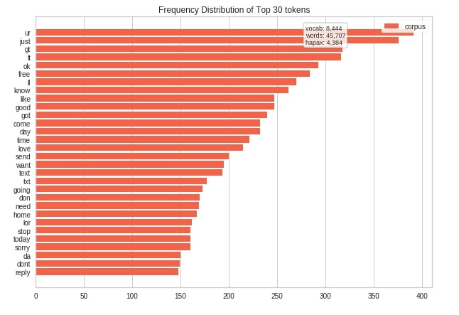
The yellowbrick provides a token frequency distribution bar chart as a part of the FreqDistVisualizer class. We have first transformed text data to float of word counts using the CountVectorizer feature extractor from scikit-learn.
We have then created an instance of FreqDistVisualizer by giving it a list of feature names and a count of how many top words we want to display as n parameter. We have then fitted then transformed text data to the visualizer object. At last, we have generated visualization by calling the show() method on the FreqDistVisualizer visualizer object.
from sklearn.feature_extraction.text import CountVectorizer, TfidfVectorizer

vec = CountVectorizer(stop_words="english")

transformed_data = vec.fit_transform(text)
from yellowbrick.text import FreqDistVisualizer

fig = plt.figure(figsize=(10,7))
ax = fig.add_subplot(111)

freq_dist_viz = FreqDistVisualizer(features=vec.get_feature_names(), color="tomato", n=30, ax=ax)

freq_dist_viz.fit(transformed_data)

freq_dist_viz.show();
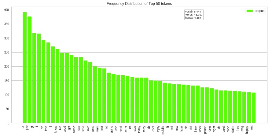
The yellowbrick also provides easy to use methods if we don't want to use the class approach. Below we have created a token frequency distribution bar chart using the fredist method of the yellowbrick.text module. We have this time laid out a bar chart as vertically by setting the orient parameter to v.
from yellowbrick.text import freqdist

fig = plt.figure(figsize=(15,7))
ax = fig.add_subplot(111)

freqdist(vec.get_feature_names(), transformed_data, orient="v", color="lime", ax=ax);
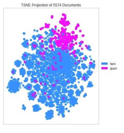
t-SNE Corpus Visualization
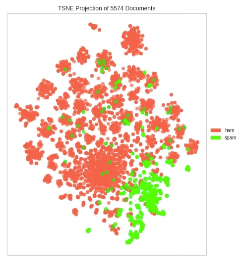
The yellowbrick lets us create t-SNE corpus clustering detection visualization using the TSNEVisualizer class. We have first transformed our original text data to float using TfidfVectorizer from sklearn. We have then created an instance of the TfidfVectorizer visualizer and fitted transformed data to it. The TfidfVectorizer class has few important parameters.
decompose- It provides us with two options to choose from to decompose data.svd- This is defaultpca
decompose_by- It lets us specify how many components to use to create decomposition. The default is 50.
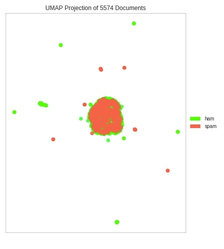
We can see from the below visualization that the majority of spam and ham emails are grouped together.
from yellowbrick.text import TSNEVisualizer
from sklearn.feature_extraction.text import TfidfVectorizer

vec = TfidfVectorizer(stop_words="english")
transformed_text = vec.fit_transform(text)

fig = plt.figure(figsize=(9,9))
ax = fig.add_subplot(111)

tsne_viz = TSNEVisualizer(ax=ax,
                          decompose="svd",
                          decompose_by=50,
                          colors=["tomato", "lime"],
                          random_state=123)

tsne_viz.fit(transformed_text.toarray(), y)

tsne_viz.show();
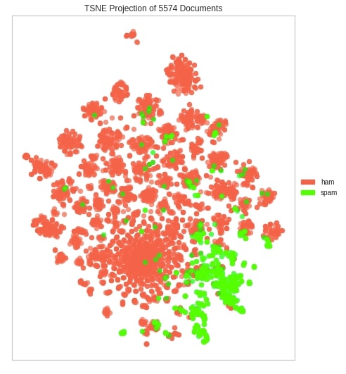
Below we have created another t-SNE visualization on our dataset but this time using pca decomposition.
fig = plt.figure(figsize=(9,9))
ax = fig.add_subplot(111)

tsne_viz = TSNEVisualizer(ax=ax,
                          decompose="pca",
                          decompose_by=50,
                          colors=["tomato", "lime"],
                          random_state=123)

tsne_viz.fit(transformed_text.toarray(), y)

tsne_viz.show();
Now, we have created t-SNE visualization using the tsne() method available from yellowbrick. We have used 100 components this time for decomposition.
from yellowbrick.text.tsne import tsne

vec = TfidfVectorizer(stop_words="english")
transformed_text = vec.fit_transform(text)

fig = plt.figure(figsize=(7,7))
ax = fig.add_subplot(111)

tsne(transformed_text.toarray(), y, ax=ax, decompose="pca", decompose_by=100, colors=["dodgerblue", "fuchsia"]);
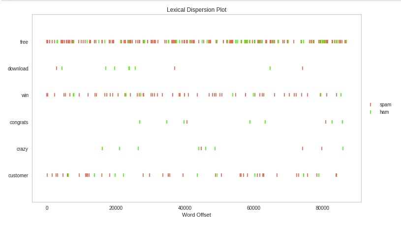
Dispersion Plot
The yellowbrick provides us with class DispersionPlot to create a dispersion plot. We have first split each individual mail into a list of words. We have then listed down target words for which we want to see dispersion in a text corpus.
We have then created an instance of DispersionPlot by giving is a list of words for which we want dispersion. We have then fitted transformed text data to it and at last, called show() method to display the chart.
from yellowbrick.text import DispersionPlot

total_docs = [doc.split() for doc in text]

target_words = ["free", "download", "win", "congrats", "crazy", "customer"]

fig = plt.figure(figsize=(15,7))
ax = fig.add_subplot(111)

visualizer = DispersionPlot(target_words,
                            ignore_case=True,
                            color=["lime", "tomato"],
                            ax=ax)
visualizer.fit(total_docs, y)
visualizer.show();
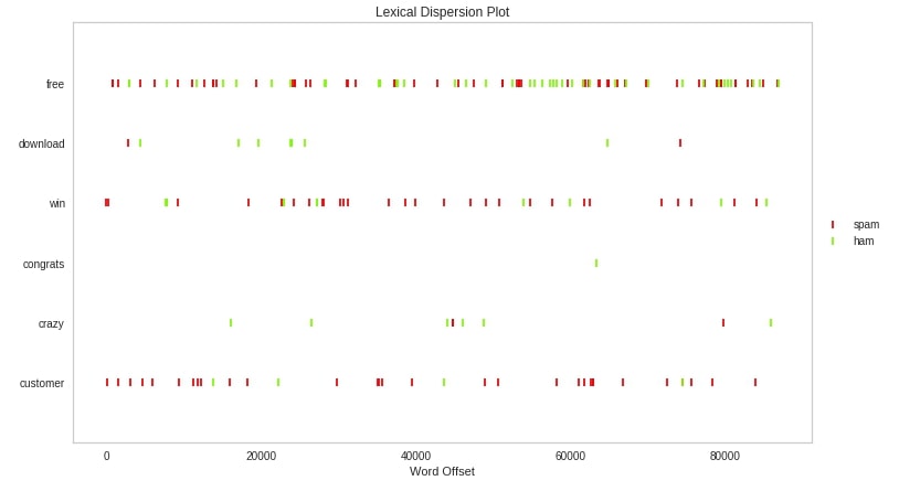
Below we have created a dispersion chart using the dispersion() method available from yellowbrick. Please make a note that this time we have taken the case into consideration by setting ignore_case to False hence words Free and free will be treated differently rather than one word.
from yellowbrick.text import dispersion

target_words = ["free", "download", "win", "congrats", "crazy", "customer"]

fig = plt.figure(figsize=(15,7))
ax = fig.add_subplot(111)

dispersion(target_words, total_docs, y=y, ax=ax, ignore_case=False, color=["lawngreen", "red"]);
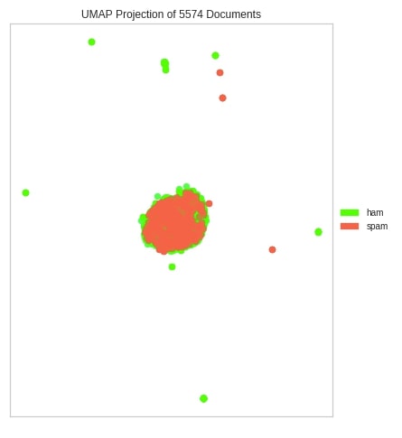
UMAP Corpus Visualization
The third chart type that we'll explain is UMAP corpus visualization using UMAPVisualizer from yellowbrick. We have first transformed text data using TfidfVectorizer. We have then created an instance of UMAPVisualizer, fitted text data to it, and generated visualization using the show() method.
from yellowbrick.text import UMAPVisualizer


vec = TfidfVectorizer(stop_words="english")
transformed_text = vec.fit_transform(text)

fig = plt.figure(figsize=(8,8))
ax = fig.add_subplot(111)

umap = UMAPVisualizer(ax=ax, colors=["lime", "tomato"])
umap.fit(transformed_text, y)
umap.show();
Below we have explained the second way of generating UMAP corpus using umap() method.
from yellowbrick.text import umap

vec = TfidfVectorizer(stop_words="english")
transformed_text = vec.fit_transform(text)

fig = plt.figure(figsize=(8,8))
ax = fig.add_subplot(111)

umap(transformed_text, y, ax=ax, colors=["lime", "tomato"]);
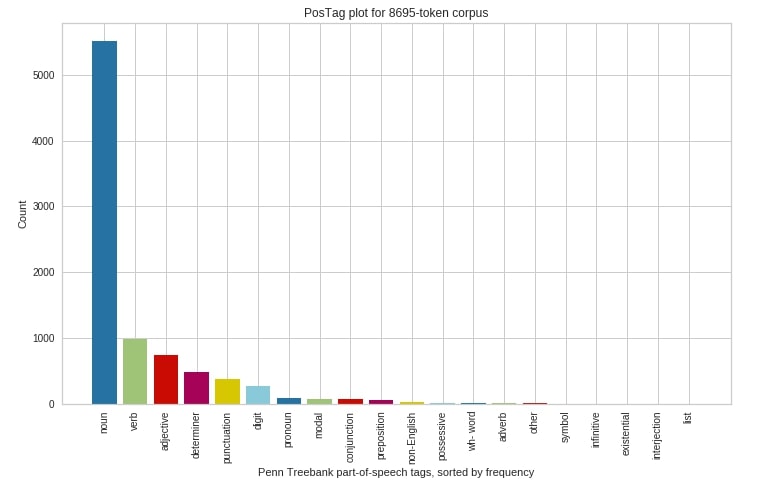
PosTag Visualization
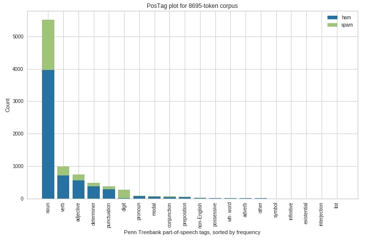
The PosTag visualization is available using PosTagVisualizer from yellowbrick. The PosTagVisualizer takes as input list for each sentence where the individual element of the list of word and its parts speech tag (noun, verb, adjectives, etc). The nltk library provides an easy way to generate parts of speech tags for a list of texts.
We have created an instance of PosTagVisualizer first and then fitted parts of speech tags data to it. We have then generated visualization using the show() method.
from yellowbrick.text import PosTagVisualizer
import nltk

pos_tags_first_sents = [[val] for val in nltk.pos_tag_sents(text[:100])]

fig = plt.figure(figsize=(12,7))
ax = fig.add_subplot(111)

viz = PosTagVisualizer(ax=ax, frequency=True)
viz.fit(pos_tags_first_sents, y[:100])
viz.show();
Below we have explained another way to generate PosTag visualization but this time we have separated parts of speech tags distribution per class of classification dataset.
fig = plt.figure(figsize=(12,7))
ax = fig.add_subplot(111)

viz = PosTagVisualizer(ax=ax, frequency=True, stack=True)
viz.fit(pos_tags_first_sents, y[:100])
viz.show();
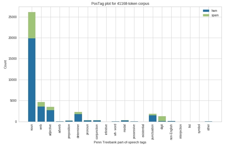
At last, we have explained how the above visualization can be created using postag() method of yellowbrick.
from yellowbrick.text.postag import postag

pos_tags_first_sents = [[val] for val in nltk.pos_tag_sents(text[:500])]

fig = plt.figure(figsize=(12,7))
ax = fig.add_subplot(111)

postag(pos_tags_first_sents, y[:500], ax=ax, stack=True);
This ends our small tutorial explaining the features of text data. Please feel free to let us know your views in the comments section.
References
- Yellowbrick - Visualize Sklearn Classification and Regression Metrics in Python
- Scikit-Plot - Visualizing Machine Learning Algorithm Results and Performance
- How to Use eli5 to Understand Sklearn Models, their Performance and their Predictions?
- How to Use lime to understand sklearn Model's Predictions?
- SHAP - Explain Machine Learning Model Predictions using Game-Theoretic Approach
- Treeinterpreter - Interpreting Tree-based Models Prediction of Individual Sample
- interpret-text - Interpret NLP Models and Their Predictions
- dice-ml - Diverse Counterfactual Explanations for ML Models
- interpret-ml - Explain Machine Learning Models and Their Predictions
 Sunny Solanki
Sunny Solanki
Intro: Software Developer | Youtuber | Bonsai Enthusiast
About: Sunny Solanki holds a bachelor's degree in Information Technology (2006-2010) from L.D. College of Engineering. Post completion of his graduation, he has 8.5+ years of experience (2011-2019) in the IT Industry (TCS). His IT experience involves working on Python & Java Projects with US/Canada banking clients. Since 2020, he’s primarily concentrating on growing CoderzColumn.
His main areas of interest are AI, Machine Learning, Data Visualization, and Concurrent Programming. He has good hands-on with Python and its ecosystem libraries.
Apart from his tech life, he prefers reading biographies and autobiographies. And yes, he spends his leisure time taking care of his plants and a few pre-Bonsai trees.
Contact: sunny.2309@yahoo.in


![YouTube Subscribe]() Comfortable Learning through Video Tutorials?
Comfortable Learning through Video Tutorials?
If you are more comfortable learning through video tutorials then we would recommend that you subscribe to our YouTube channel.
![Need Help]() Stuck Somewhere? Need Help with Coding? Have Doubts About the Topic/Code?
Stuck Somewhere? Need Help with Coding? Have Doubts About the Topic/Code?
 Stuck Somewhere? Need Help with Coding? Have Doubts About the Topic/Code?
When going through coding examples, it's quite common to have doubts and errors.
If you have doubts about some code examples or are stuck somewhere when trying our code, send us an email at coderzcolumn07@gmail.com. We'll help you or point you in the direction where you can find a solution to your problem.
You can even send us a mail if you are trying something new and need guidance regarding coding. We'll try to respond as soon as possible.
![Share Views]() Want to Share Your Views? Have Any Suggestions?
Want to Share Your Views? Have Any Suggestions?
 Want to Share Your Views? Have Any Suggestions?
If you want to
- provide some suggestions on topic
- share your views
- include some details in tutorial
- suggest some new topics on which we should create tutorials/blogs
 yellobrick, ml-metrics, visualization, text-data